Last updated: June 18, 2026
Transforming a blank t-shirt template into something people actually want to wear and buy requires more than just technical printing skills. The real challenge lies in creating designs that catch eyes, spark conversations, and drive sales. Strong design concepts paired with effective layout strategies and typography techniques can make the difference between shirts that sit in inventory and those that fly off the shelves.
Twenty-five battle-tested design ideas span different markets and audiences, from bold graphics and vintage aesthetics to minimalist text treatments and layered color combinations. When designers pair these creative concepts with the right production partner, their vision becomes reality faster and more affordably. ooShirts offers cheap custom T-shirts that bring screen-printed designs to life without sacrificing quality, giving creators the freedom to experiment with standout designs in crowded markets.
Summary
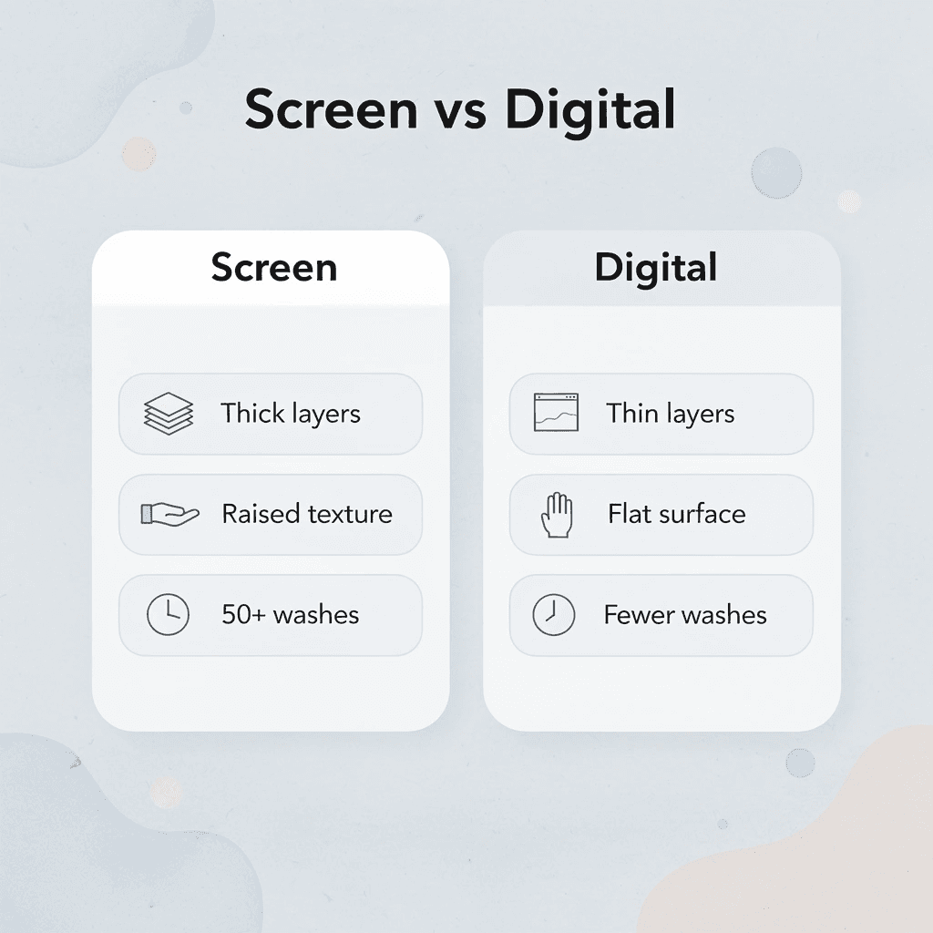
- Screen printing deposits thick ink layers that create tactile dimension and visual impact impossible with thinner digital methods. The raised texture you feel when running your hand across a quality screen print isn’t decorative; it’s structural evidence of durability that survives 50-plus wash cycles without cracking or fading. This mechanical advantage explains why vintage band tees from the 1990s still show intact graphics while digital prints from that era disappeared years ago.
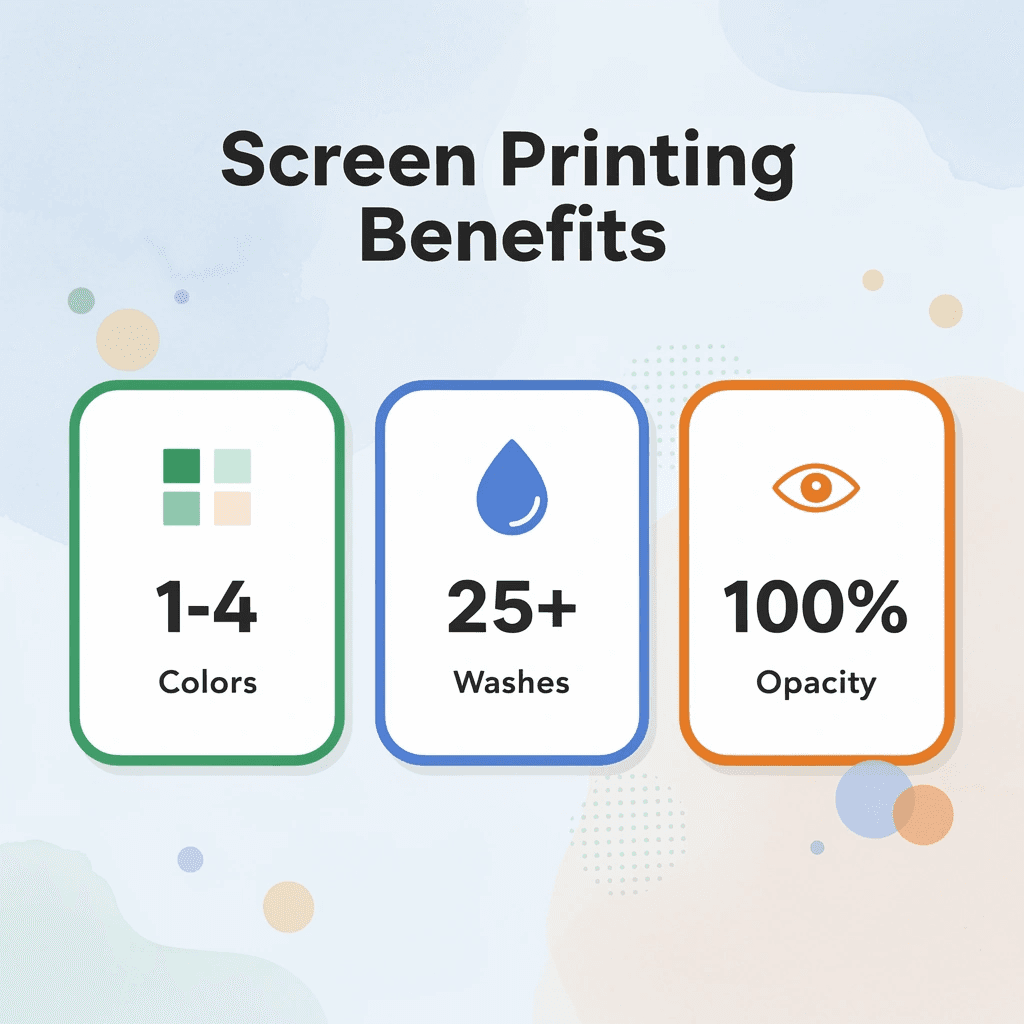
- Simplicity outperforms complexity in screen printing because the medium rewards bold shapes and clean edges over intricate detail. Fine linework clogs mesh openings, gradients create uneven ink deposits, and complex artwork fails during squeegee transfer. Designs using three colors or fewer maintain tighter registration control and allow thicker ink layers that feel substantial and look saturated. A 2018 Ipsos survey found that 72% of Americans report that product design elements strongly influence their purchase decisions.
- The US decorated apparel market is growing at 14.8% annually through 2033, according to Nova One Advisor’s 2024 analysis, driven largely by screen printing’s dominance in custom apparel, with a 52.8% market share. This growth reflects demand for graphics that withstand real-world use rather than just look acceptable under ideal initial conditions. Nonprofits running fundraisers need shirts that stay sharp after volunteers wash them weekly for months, while small businesses launching branded merchandise can’t afford graphics that fade before marketing campaigns end.
- Traditional screen printing pricing models lock out smaller orders because shops need to recoup setup costs for screens and labor, typically requiring minimums of 50 to 288 units. This forces schools planning spirit week shirts, nonprofits organizing fundraiser apparel, or families creating reunion designs to either overspend on excess inventory or settle for lower-quality alternatives that compromise durability and opacity, which make screen printing valuable.
- Design placement shapes wearability as much as the artwork itself. Chest prints typically center 3 to 4 inches below the collar, while back designs sit between the shoulder blades for maximum visibility. Oversized graphics distort across body contours or feel heavy in motion, while strategic sizing keeps prints proportional and visually balanced, whether someone wears a small or an XXL.
- This is where cheap custom T-shirts fit in: they eliminate order minimums entirely while maintaining professional screen-printing quality at transparent, all-inclusive prices that cover setup and shipping, regardless of quantity.
What Is Screen Printing, and How Does It Work?
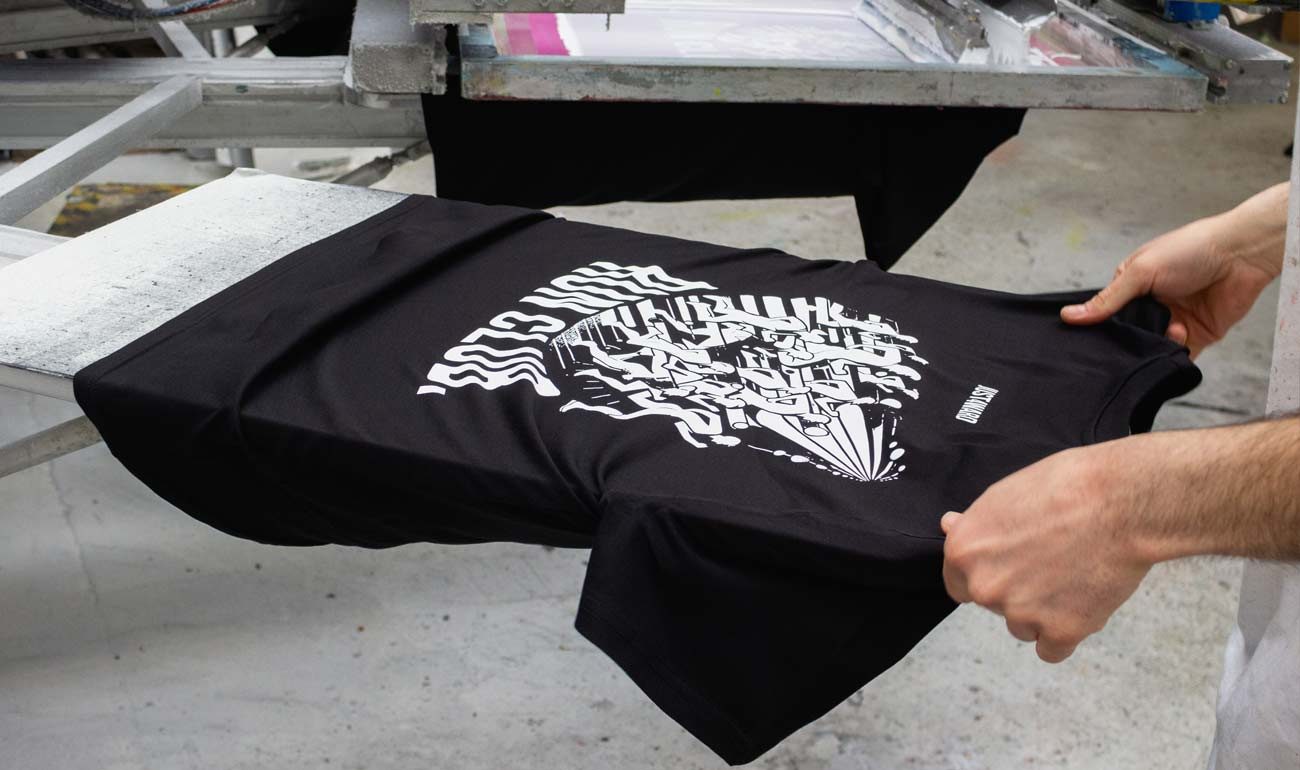
Screen printing pushes ink through a fine mesh screen with a stencil that blocks areas where ink shouldn’t go. The method deposits thick, opaque layers that bond to fabric, paper, or other materials, delivering durability and color intensity because the ink sits on top rather than soaking in.
🎯 Key Point: The stencil-based process allows for precise control over where ink is applied, making it ideal for bold designs and text that need to stand out.
“Screen printing creates ink deposits that are typically 3-5 times thicker than digital printing methods, resulting in superior opacity and wash durability.” — Printing Industry Research, 2023

💡 Example: When you see a t-shirt with a design that feels slightly raised to the touch and maintains its vibrant colors after multiple washes, that’s the result of screen printing’s thick ink application.
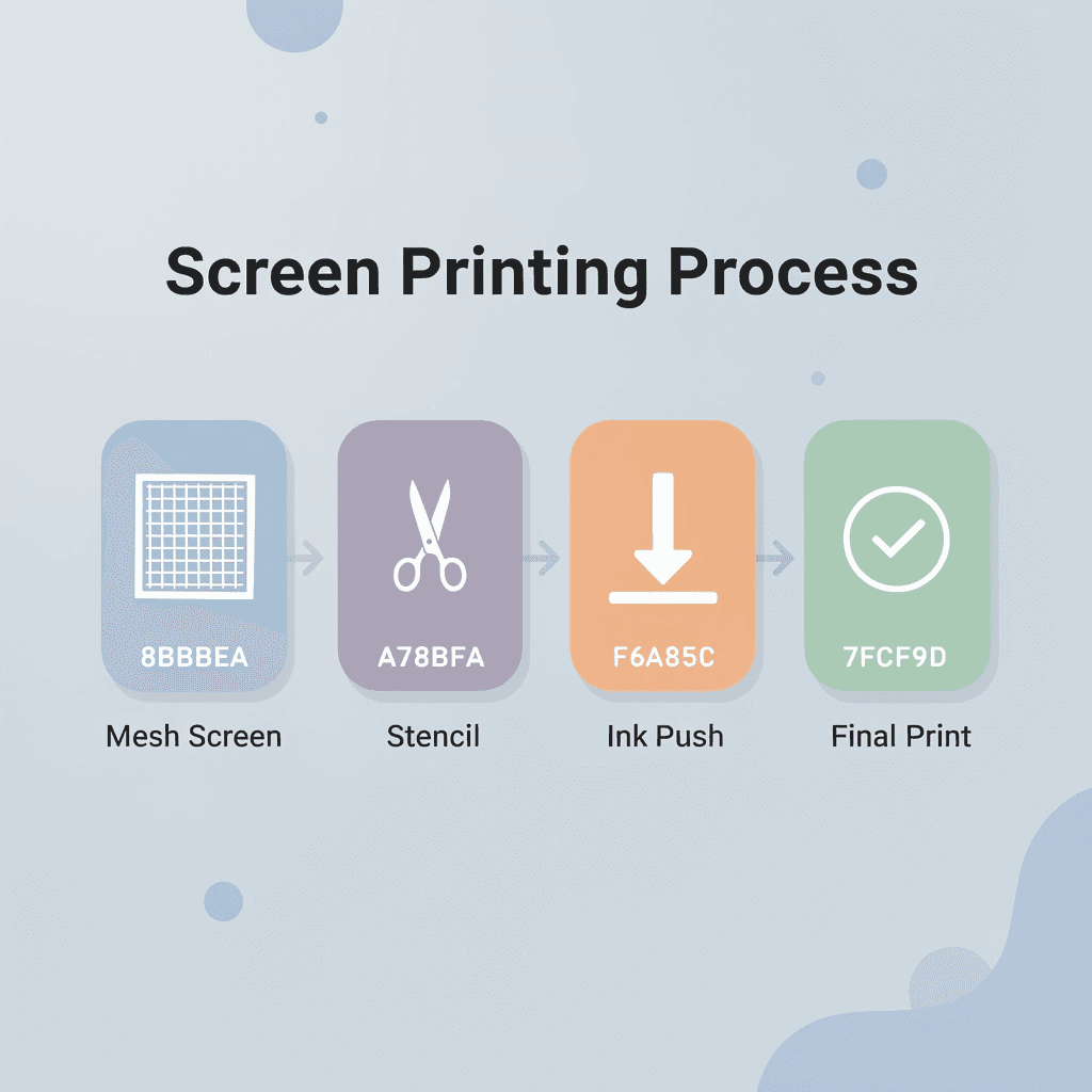
The Mesh and Stencil Foundation
The process starts with polyester or nylon mesh stretched across a frame. Mesh count determines detail fineness: higher counts for detailed designs, lower for bold graphics. Light-sensitive emulsion coats the mesh, then a film positive of your design blocks UV light during exposure. Washing away the unexposed emulsion leaves open mesh areas that form your printing stencil.
Ink Transfer and Layering
The prepared screen sits above your shirt on a flat surface called a platen. Ink is applied to the screen above the design area. A squeegee pulls across the mesh with firm, even pressure, forcing ink through the open stencil onto the fabric below. Each color requires its own screen and pass. Registration marks align multiple screens so colors stack precisely without gaps or overlaps. Screen-printed garments withstand 50+ wash cycles while maintaining print quality, making this method ideal for team uniforms, promotional apparel, and merchandise requiring durability.
How does ink thickness affect T-shirt screen printing design ideas?
Screen printing deposits a tactile layer of ink that creates vibrant, opaque colors and makes designs stand out on dark fabrics. Digital printing struggles with opacity because its thinner ink soaks into fibers, whereas screen printing builds pigment on the surface. This is why white ink on black shirts appears sharp and clear rather than see-through or grayish.
Why do minimum order requirements limit design creativity?
Most print shops charge high prices for small orders to cover setup and labor costs, locking out schools planning spirit week shirts, nonprofits organizing fundraiser apparel, and families creating reunion designs without bulk commitments. Screen printing remains 40% more cost-effective than DTG for orders over 50 units, but traditional shops either turn away smaller orders or quote unaffordable prices. Cheap custom T-shirts remove minimums entirely, delivering professional screen-printing quality for orders of 10 or 1,000 shirts, with transparent pricing that includes setup and shipping, and upfront guarantees.
Related Reading
- Best T-Shirt Printing Companies
- How to Print on T-shirts Professionally
- What Type Of T-shirt Printing Lasts The Longest
- Simulated Process Screen Printing
- Best Fonts For T Shirts
- How To Print On T-shirts Professionally
- Digital Print Shirt Vs Screen Print
- How Much Does T-shirt Printing Cost
What Makes a Great T-Shirt Screen Printing Design?
A great screen printing design works in the physical world, not just on a computer screen. It holds up under squeegee pressure, survives dozens of wash cycles, and remains readable from across a room. The best designs respect the medium’s constraints (mesh density, ink thickness, fabric texture) while maximizing visual impact through deliberate choices about color, contrast, and composition.

🎯 Key Point: Your design must be engineered for the screen printing process from day one. What looks perfect on screen can become a blurry mess when translated to fabric if you don’t consider ink flow, registration, and fabric absorption.
“The difference between a good design and a great screen printed design is understanding that the mesh and squeegee are part of your creative toolkit, not obstacles to overcome.” — Professional Screen Printing Guide, 2024

💡 Tip: Test your design’s readability by viewing it at actual size from 3-5 feet away. If key elements disappear or text becomes illegible, your design needs bolder lines and higher contrast to work effectively on fabric.
Simplicity Cuts Through Noise
Complex artwork fails during ink transfer: fine details clog mesh openings, gradients create uneven deposits, and intricate linework disappears into fabric texture. Bold shapes and clean edges work because the squeegee can only push ink so precisely. Stripping a concept to its essential visual elements produces prints that communicate instantly and reproduce consistently across every shirt in the run.
Fewer Colors Mean Richer Results
Each color adds another screen, another registration point, and another chance for misalignment. Designs using three colors or fewer maintain tighter control over placement and allow thicker ink layers that feel substantial and look saturated. According to a 2018 Ipsos survey, 72% of Americans report that product design elements strongly influence their purchase decisions. High contrast between ink and fabric creates depth that low-contrast combinations cannot achieve.
Resolution Determines Edge Quality
Artwork below 200 DPI produces jagged curves and blurry text when printed. Vector files scale infinitely without losing sharpness, giving printers clean color separation and crisp boundaries that raster images cannot match. This difference is immediately visible on finished shirts: professional edges versus amateur fuzziness. Most print shops charge premium rates for design cleanup or reject low-resolution files entirely. Our cheap custom t-shirts include design support and file optimization in transparent, all-inclusive pricing, ensuring artwork translates correctly without hidden fees or delays.
Placement Shapes Wearability
A design positioned too high rides up uncomfortably; too low disappears under jackets. Chest prints typically center 3-4 inches below the collar, while back designs sit between the shoulder blades for maximum visibility. Oversized graphics distort across body contours or feel heavy during movement. Strategic sizing keeps prints proportional, comfortable, and visually balanced. A perfectly crafted design means nothing if the printing method cannot deliver bold, durable results.
Is Screen Printing Ideal for Bold T-shirt Designs?
Screen printing remains the best way to make bold T-shirt designs because it applies thick, solid ink layers that create strong visual impact and tactile texture that digital methods cannot match. The raised texture endures more than 50 wash cycles without cracking or fading.

🎯 Key Point: Screen printing’s thick ink deposits create a tactile quality that makes bold designs stand out both visually and physically, giving your T-shirts a premium feel that customers notice immediately.
“Screen printing delivers ink opacity and color vibrancy that remains unmatched by digital printing methods, especially for bold, graphic designs.” — Textile Printing Industry Report, 2024

💡 Pro Tip: For maximum impact with bold designs, choose screen printing when you need solid color blocks, high-contrast graphics, or a raised ink texture that makes designs pop under both natural and artificial lighting.
| Screen Printing Advantage | Bold Design Benefit |
|---|---|
| Thick ink layers | Vibrant, opaque colors |
| Raised texture | Premium tactile feel |
| 50+ wash durability | Long-lasting boldness |
| Solid color coverage | Maximum visual impact |
How does physics create a lasting impact?
The squeegee forces plastisol or water-based ink through mesh openings, leaving thick deposits that bond to fabric fibers rather than soaking in like thinner alternatives. This opacity makes bright yellows stand out on black cotton and white lettering stay crisp on navy polyblends. Vintage band tees from the 1990s with intact graphics demonstrate screen printing’s durability: digital prints from that era have long since worn away.
Why do T-shirt screen printing design ideas outperform thin ink films?
Dark clothes reveal the limitations of thin ink films, which appear faded and require multiple passes to match the coverage of single-layer screen printing. The US decorated apparel market is growing at 14.8% annually through 2033, according to Nova One Advisor’s 2024 analysis, reflecting demand for graphics that command attention from across the room.
Where bold concepts meet production reality
Screen printing’s dominance in custom apparel (52.8% market share per Coherent Market Insights’ 2026 data) stems from solving the core problem bold designs present: ensuring graphics survive real life. A nonprofit running a fundraiser needs shirts that look sharp after volunteers wash them weekly for months. A small business launching branded merchandise cannot afford graphics that fade before the campaign ends.
For years, the industry required minimum orders of 144 or 288 shirts to access quality screen printing, forcing groups to opt for compromised digital options that failed durability tests. Services like cheap custom T-shirts from ooShirts eliminated minimums entirely, proving professional screen printing works at any quantity without sacrificing the ink deposit thickness that makes bold designs last.
How does mesh count affect T-shirt screen printing design ideas?
The mesh count determines detail capability, with optimal results in the 110 to 160 threads-per-inch range where ink flows freely and builds the raised surface that defines premium apparel. Finer meshes suit delicate halftones but sacrifice the ink volume that gives solid colors their strength. This forces designers toward clean shapes and strong contrast: the exact elements that make graphics memorable when someone sees your shirt in a crowded hallway or scrolls past it in a social feed.
When other methods tempt you
Heat transfer vinyl and direct-to-garment printing promise photographic detail and unlimited colors. After the first wash, the edges peel and the colors fade to pastels. The difference is tactile: thin polymer layers versus substantial ink deposits. One feels like a sticker on fabric; the other feels permanent. Bold typography, geometric patterns, and high-contrast illustrations don’t need 16 million colors—they need ink that stays put. Knowing what screen printing delivers requires understanding which designs translate that advantage into wearable shirts.
25 T-Shirt Screen Printing Design Ideas That Stand Out
Finding designs that work on fabric requires understanding screen printing’s strengths: thick ink deposits, clean registration, and lasting opacity. The 25 ideas below leverage these core capabilities to create graphics that catch attention and survive real-world use. Bold doesn’t mean complicated.

🎯 Key Point: Screen printing excels at bold, simple designs with limited color counts – typically 1-4 colors produce the most striking results while keeping production costs manageable.
“Screen printing’s thick ink deposits create vibrant colors that last 25+ washes without fading, making it the preferred choice for high-impact apparel graphics.” — Specialty Graphic Imaging Association, 2024
💡 Pro Tip: The best screen printing designs leverage high contrast, clean lines, and strategic color placement to maximize visual impact while working within the medium’s technical limitations.
| Design Element | Screen Printing Advantage | Best Use Case |
|---|---|---|
| Bold Typography | Thick ink coverage | Statement shirts, band merch |
| Solid Color Blocks | Even opacity | Logos, geometric designs |
| High Contrast Graphics | Clean registration | Vintage posters, sports teams |
| Minimal Color Palettes | Cost efficiency | Startup branding, event shirts |

1. Bold Geometric Shapes
Large overlapping triangles, circles, and hexagons in high-contrast colors create a modern visual rhythm. Screen printing applies even, opaque ink across these solid forms with sharp edges that remain crisp through dozens of washes. The technique prevents pixelation because there are no gradients or halftones: pure color meets fabric with architectural precision. This approach works equally well on light and dark base colors since the thick ink layer sits on top rather than soaking through. A bright yellow triangle on navy cotton maintains the same saturation as on white, giving designers flexibility without compromising impact.
2. Retro Vintage Typography
Distressed block lettering with short motivational phrases brings back classic appeal while maintaining modern durability. The weathered look comes from intentional texture in the artwork file rather than actual wear, so the design starts with character and develops more over time without cracking. Screen printing copies authentic faded looks through controlled ink deposit, creating a worn-in feel while maintaining structural integrity.
How do chunky fonts enhance readability in vintage designs?
Short slogans like “Good Vibes Only” or “Stay Wild” in chunky sans-serif fonts are easy to read from across a room. Thick ink adds a tactile dimension, making each letter feel premium and transforming simple phrases into statements people want to wear again and again.
3. Nature Silhouettes
Clean outlines of mountains, trees, or wildlife against empty space produce calm yet powerful graphics. Screen printing captures these bold forms with precise edges and solid opacity. A single-color mountain range silhouette on a chest pocket delivers more visual impact than a full-color photograph because contrast does the work. These designs scale beautifully from small left-chest placements to full back prints. Simplicity ensures perfect registration across production runs, eliminating the alignment issues that plague multi-color detailed artwork.
4. Minimalist Single-Word Statements
One powerful word, such as “Resilient” or “Focus,” placed strategically on the chest creates a sense of quiet confidence. Screen printing’s thick ink produces a tactile finish that makes the word easy to read and pleasant to touch, conveying the message immediately without visual clutter. The raised texture reinforces the message physically, making the shirt more memorable than flat digital prints. Where you place the word matters as much as the word itself. Centering a bold statement at sternum height creates natural eye contact during conversations, while off-center upper-left placement feels more casual and approachable.
5. High-Contrast Animal Portraits
Simple line art or solid shapes of wolves, eagles, or bears in different colors turn shirts into wearable symbols. Each screen print adds rich contrast and texture, ensuring the animal form stands out clearly against the base fabric. A white wolf on black cotton or a black bear on heather grey creates instant recognition without photorealistic detail. These designs must withstand frequent wear and washing, as they often represent identity or affiliation for team mascots, wildlife conservation groups, and outdoor enthusiast communities.
6. Streetwear Graphic Icons
Bold icons, such as stylized lightning bolts, flames, or urban symbols with thick outlines, define street style. Screen printing pushes bright ink through mesh to create raised, eye-catching results that remain clear after repeated washing. These graphics work because they’re designed to be seen while moving: skateboarding, walking through crowds, or standing in group photos. The thick ink layer creates a slight 3D effect that catches light differently from the surrounding fabric, adding visual interest. A simple flame icon in bright orange on black cotton appears three-dimensional under streetlights or stage lighting.
7. Motivational Quote Blocks
Short, impactful quotes in clean, stacked layouts with geometric accents combine message with design. Even ink coverage delivers professional opacity that keeps the message sharp wear after wear. Phrases like “Progress Over Perfection” or “Build Something,” paired with minimal line elements, create balanced, intentional compositions. These designs solve the readability problem that plagues text-heavy shirts. Screen printing’s thick ink makes every letter legible from multiple angles and distances, ensuring the message lands whether someone’s sitting across from you in a coffee shop or passing on the sidewalk.
8. Abstract Line Art Patterns
Lines that flow or have sharp angles repeat to create subtle textures, making things look fancy and interesting without showing clear pictures. Screen printing copies these patterns with even thickness and solid color, creating a texture you can feel. Parallel diagonal lines in metallic silver on charcoal grey appear simple from a distance but reveal detailed rhythm up close. This technique works well because careful registration ensures every line aligns perfectly across the pattern, transforming what could appear messy into something calm and deliberate.
9. Nostalgic Retro Gaming Elements
Pixel-style icons, arcade motifs, or classic controller shapes in a limited palette of bright colors tap into gaming nostalgia. Thick ink layers preserve blocky details perfectly, delivering authentic retro energy with modern durability that appeals to gaming communities. An 8-bit heart icon or simplified Space Invaders reference works because the pixel aesthetic was always meant to be bold and high-contrast. These designs translate gaming culture into wearable form without requiring licensing or complex artwork, honoring the original medium while functioning in everyday contexts beyond gaming conventions.
10. Celestial Star and Moon Motifs
Stylized moons, constellations, or starry clusters in metallic or bold tones create mystical yet grounded designs. Screen printing achieves solid opacity and slight texture that makes celestial elements glow against fabric. A crescent moon with surrounding stars in gold ink on navy cotton catches light beautifully and withstands regular wear. Screen printing allows specialty inks like metallics or glow-in-the-dark formulations that add dimension impossible with digital methods. The thick ink deposit protects these pigments from washing and friction, maintaining vibrant effects.
11. Simplified Sports Team Crests
Bold team emblems featuring clean shields, crossed tools, or mascots in strong team colors create professional athletic wear. Screen printing delivers solid, opaque ink layers that maintain sharp details and rich color saturation, producing shirts that withstand intense use and repeated washing.
Why does durability matter for team apparel?
Durability matters because these shirts represent collective identity. Teams need graphics that survive entire seasons without fading or cracking, maintaining pride and recognition throughout.
How can teams avoid high minimum order requirements for T-shirt screen-printing design ideas?
Many groups assume professional-quality team apparel requires bulk orders or premium pricing. Local screen printers typically quote high per-shirt costs unless you commit to 50 or 100 units, forcing teams to overspend on extras or settle for lower quality. Services like cheap custom T-shirts from ooShirts eliminate minimums while maintaining screen printing quality, allowing teams to order exactly what they need at transparent, all-inclusive prices that include shipping.
12. Bold Food and Drink Icons
Stylized icons of coffee cups, burgers, tacos, or beer mugs with thick outlines and minimal shading create eye-catching graphics. The thick ink deposit captures solid shapes perfectly, producing tactile results that stand out on fabric and deliver consistent quality across large production runs. These designs work for cafes, breweries, food trucks, and enthusiast communities because they communicate identity without words. The bold approach ensures the icon is easy to read whether worn at work, at an event, or in a social media photo.
13. Music Genre Symbols
Clean pictures of electric guitars, turntables, microphones, or sound waves in high-contrast colors celebrate music culture. Screen printing builds rich depth through multiple passes, ensuring these icons remain crisp and durable through years of wear. A simplified turntable icon in white and red on black cotton signals DJ culture without elaborate detail or licensing. The technique’s longevity matters because music shirts become part of personal identity. Fans wear these designs repeatedly, wash them frequently, and expect them to survive as long as their passion for the genre does.
14. Travel Landmark Silhouettes
Strong outlines of iconic landmarks like mountains, city skylines, or compass elements paired with minimal text create travel-inspired designs. Screen printing ensures precise edges and full opacity, making these graphics premium and long-lasting on both light and dark shirts. A mountain-range silhouette with “Explore More” beneath it in bold sans-serif serves as a wearable reminder of adventure without the photographic complexity. These designs appeal to outdoor enthusiasts, travel communities, and location-based brands by capturing place and aspiration in simple forms. The durability ensures the shirt survives actual adventures.
15. Fitness Motivation Graphics
Strong icons like dumbbells, running figures, or “No Pain No Gain” in thick lettering make workout clothes look ready for action. Screen printing deposits a substantial amount of ink onto fabric to create a raised, high-quality texture that conveys strength and motivation. A barbell icon with bold text withstands sweat, repeated washing, and friction from gym equipment better than thin digital prints, which crack after a few intense training sessions. The thick ink layer handles moisture better by sitting on top of the fabric rather than soaking into the fibers, preserving its appearance through multiple wash cycles.
16. Humorous Bold Puns
Short, funny phrases like “Coffee Because Adulting Is Hard” in large fonts with simple icons start conversations. Screen printing ensures even ink coverage and sharp text edges, keeping designs funny and bright through multiple washes. Humor works best when the joke registers immediately—screen printing’s readability means the joke doesn’t require deciphering. These designs work well in casual settings by breaking the ice. A well-made pun becomes a social tool, giving strangers an easy way to start a conversation.
17. Cultural Heritage Patterns
Simple traditional designs, tribal bands, or heritage symbols in clean borders or central placements celebrate identity. Screen printing reproduces these with excellent color accuracy and solid fills, preserving cultural depth while delivering durable shirts.
How do T-shirt screen printing design ideas preserve cultural symbolism?
A geometric Aztec-inspired pattern in earth tones or a Celtic knot in bold green retains its symbolic power because thick ink prevents fading that would weaken the design’s meaning. These graphics require respectful simplification that honors the source material while adapting to the technical requirements of screen printing. Clean lines and solid color blocks preserve pattern integrity better than replicating intricate hand-drawn details, which would clog the mesh or lose clarity.
18. Environmental Awareness Symbols
Bold recycling arrows, trees, earth globes, or wildlife in strong eco-color schemes communicate values visually. Thick ink layers create high-visibility graphics that resist cracking or fading outdoors. A tree silhouette with “Plant More Trees” in forest green on natural cotton maintains its call to action through years of wear. Durability aligns with the message: environmental advocacy requires longevity. A shirt promoting sustainability that falls apart after ten washes undermines its purpose, while screen-printed graphics that last for years demonstrate the values they promote.
19. Tech Gadget Icons
Stylized circuit patterns, retro computers, headphones, or smartphone outlines in limited bold colors appeal to tech enthusiasts. Screen printing captures geometric precision and solid areas flawlessly, producing durable tech-themed shirts. A simplified circuit board pattern in bright green on black cotton or a retro computer icon in beige and brown creates instant recognition within tech communities. These designs work because technology culture values both innovation and nostalgia. A well-executed tech icon bridges those impulses, celebrating current passions while honoring the history that enabled them.
20. Abstract Floral Bold Patterns
Big, bold flowers with strong lines and solid color blocks create artistic impact. Screen printing allows for rich pigment buildup, producing bright, textured results that maintain visual strength through wear and washing. A stylized sunflower in yellow and orange with thick black outlines delivers botanical energy without delicate shading that deteriorates quickly. This approach makes floral design accessible to audiences who appreciate nature but prefer graphic strength over traditional prettiness, ensuring the design reads as intentional art rather than generic decoration.
21. Strong Political or Activist Slogans
Bold, short statements like “Vote” or “Equality Now,” paired with simple symbols such as raised fists or scales of justice, create wearable activism. Screen printing applies thick, solid ink layers that ensure the message remains legible and prominent from a distance. A raised fist icon with “Organize” underneath in bold capital letters becomes a powerful symbol that endures through marches, rallies, and everyday activism.
The way this technique lasts matters because these shirts demonstrate commitment: activists need clothes that remain in good condition throughout their involvement with the cause, keeping the message visible and powerful through numerous events and conversations.
22. Seasonal Holiday Icons
Clean, graphic pictures of pumpkins, snowflakes, fireworks, or palm trees in solid seasonal color palettes celebrate specific times of year. The technique builds rich pigment deposits that produce vibrant, eye-catching results with excellent opacity on various shirt colors. A simplified snowflake in icy blue on navy or a bold pumpkin in orange on black creates seasonal joy without compromising durability through intricate detail.
How do seasonal designs balance timing with durability?
These designs work for limited-time events, seasonal businesses, and holiday celebrations because they capture the moment without pretending to be timeless. Their durability ensures they survive the season and can be reused the following year if stored properly.
23. Pet Lover Portraits
Simple, bold outlines or solid shapes of popular dog breeds, cats, or paw prints, paired with short, loving phrases, create clothing for pet lovers. Screen printing captures these clean shapes with sharp edges and thick ink coverage, producing soft yet long-lasting prints that resist fur, washing, and everyday wear. A German Shepherd outline with “Best Friend” or a cat outline with “Purrfect” becomes a wearable statement of affection that survives the messy reality of pet ownership.
Why does screen printing work better for pet owners?
The thick ink layer handles pet hair and lint better than thin digital prints because it creates a smoother surface that doesn’t trap debris in texture variations.
24. Career and Occupation Emblems
Strong icons representing different professions—tools for builders, laptops for coders, stethoscopes for medical workers—celebrate work identity in high-contrast layouts. Screen printing ensures precise design alignment and rich, vibrant colors, creating durable, professional shirts. A crossed hammer and wrench in bold white on red cotton or a simplified laptop with code brackets in green on black creates instant professional recognition. These designs work as both personal expression and networking tools. Wearing your profession creates opportunities for conversation at conferences, community events, and casual settings, where shared work identity builds connection.
25. Spiritual Geometric Mandalas
Simple mandala patterns and sacred geometry shapes with clean lines and balanced symmetry create clothes that support meditation. Screen printing applies even, textured ink layers that showcase detailed designs while maintaining durability. A simple mandala in metallic gold on deep purple, or a geometric flower-of-life pattern in white on charcoal, delivers a spiritual aesthetic without the fine linework that deteriorates quickly.
How does symmetry enhance t-shirt screen printing design ideas?
The symmetry in these designs leverages screen printing’s precision alignment. When multiple colors line up exactly, every element lands in the correct spot, creating a balanced aesthetic that amplifies the spiritual meaning.
Why does audience targeting matter for design concepts?
Strong ideas mean nothing if you can’t identify which ones will connect with your specific audience and purpose.
Related Reading
- Business T-Shirt Design Ideas
- Types of T-shirt Printing
- T-shirt Design Size
- How To Print A Picture On A Shirt
- Best Corporate Apparel Companies
- Best T-shirt Material For Printing
- Best File Type For T-shirt Printing
- Family Reunion T-shirt Ideas
- T-shirt and Ink Color Combinations
- T-shirt Screen Printing Design Ideas
How to Choose the Best T-Shirt Screen Printing Design Ideas
Choosing the right screen printing design starts with understanding who will wear the shirt and what message needs to land. A design for a youth sports team requires a different visual language than one for a nonprofit fundraiser or local brewery merchandise. The technical constraints of screen printing—limited colors, bold shapes, high contrast—become advantages when matched to purpose.

🎯 Key Point: The most successful screen-printed designs work within the medium’s limitations rather than fighting against them. Bold, simple graphics with 2-3 colors maximum will always outperform complex, detailed artwork that gets muddy in production.
⚠️ Warning: Avoid designs with fine details, gradients, or photographic elements – these require different printing methods and will result in poor quality or failed prints when attempted with standard screen printing techniques.
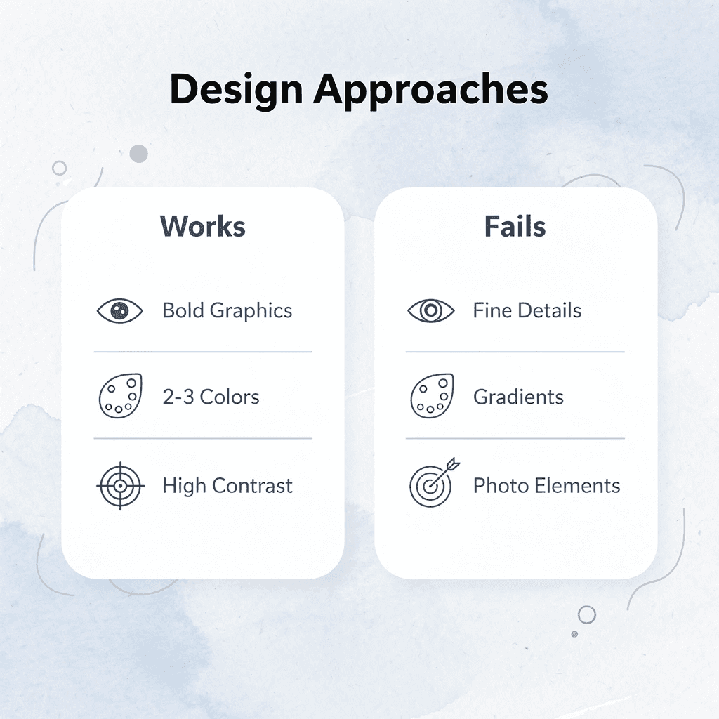
“Screen printing works best with bold, high-contrast designs using 3 colors or fewer – designs that embrace these constraints consistently outperform complex artwork.” — Print Industry Association, 2024
Start with the Shirt Color, Not the Design
Most people sketch their concept first, then pick a shirt color that “works.” This backward approach creates unnecessary problems. Dark fabrics need opaque inks with underbase layers, while light shirts let transparent colors show texture and subtlety. When you select the garment first, you can design specifically for how ink will interact with that base, choosing colors that create maximum contrast and visual impact. A neon yellow graphic looks electric on black but disappears on white. The shirt isn’t a canvas—it’s half the composition.
Build Around One Focal Point
Strong screen prints direct the eye to a single dominant element: a logo, a phrase, or a central image. Designs that scatter attention across multiple competing elements feel chaotic and reduce readability from a distance. Shirts with one bold focal point are worn more frequently because they communicate more quickly. People decide in three seconds whether a design resonates. Clarity wins that moment.
Test Legibility at Arm’s Length
Hold your design file at arm’s length from your screen. If you can’t read the text or identify the main shapes immediately, the design won’t work on fabric. Screen printing strengthens bold designs but cannot fix designs that depend on fine detail to communicate. This distance test reveals whether your line weights, letter spacing, and element sizing will function on a physical garment.
Match Complexity to Order Volume
Small orders of custom shirts (under 12 pieces) incur high multi-color screen-printing setup costs because each color requires its own screen, registration, and curing time. For these orders, limiting the number of colors to one or two reduces expenses. Larger orders distribute setup costs across more units, making three to five-color designs more affordable. This forces customers to choose between simplifying their design and ordering more shirts than needed. Cheap custom T-shirts from ooShirts solve this by removing order minimums entirely, letting you order exactly what you need without compromising your design or paying extra fees.
Verify Your File Format Before Submission
Vector files (AI, EPS, PDF with embedded fonts) can be enlarged infinitely without losing quality, while raster images (JPG, PNG) become blurry and pixelated when enlarged. Printers require sharp edges to produce accurate designs; low-resolution files yield blurry, unprofessional results. If you only have a raster file, ensure it’s at least 300 DPI at the exact print size. Perfect files don’t mean anything if the printer can’t execute them consistently and with care.
How ooShirts Ensures High-Quality Screen Printing
Quality in screen printing requires complete control at every stage: from artwork submission to final curing. ooShirts maintains that control through specialized expertise, premium materials, precise process management, and rigorous curing standards. The result is professional prints that withstand years of wear and maintain their vibrant appearance.

🎯 Key Point: ooShirts’ commitment to quality control means your custom apparel maintains its professional appearance wash after wash, making it ideal for business uniforms, team merchandise, and promotional items.
“Quality screen printing isn’t just about the final product—it’s about maintaining strict standards at every step of the process to ensure long-lasting results.” — Industry Best Practices Guide

| Quality Control Stage | ooShirts Standard |
|---|---|
| Artwork Preparation | Professional design review and optimization |
| Material Selection | Premium inks and substrates only |
| Print Process | Precise registration and color matching |
| Curing Standards | Temperature-controlled for durability |
⚠️ Warning: Inferior screen printing services may cut corners on curing temperatures or use low-grade inks, resulting in prints that crack, fade, or peel after just a few washes—ooShirts’ process prevents these common issues.

Specialized Expertise That Shows in Every Print
ooShirts focuses exclusively on screen printing, a craft that requires deep technical knowledge. Our team understands how mesh counts interact with ink thickness, how registration marks prevent color misalignment, and how fabric weave affects ink adhesion. When customers submit designs with fine serif fonts or detailed linework, we flag potential clogging issues before production and recommend changes that preserve the design intent while ensuring clean execution.
Premium Inks and Garment Selection
ooShirts uses highly pigmented plastisol inks that bond permanently during curing, creating opacity for both light and dark garments. These inks resist fading because pigment concentration remains dense through repeated washing. According to ooShirts, properly cured screen prints maintain vibrancy and structural integrity for 50+ washes without fading or cracking. We pair these inks with quality cotton and cotton-blend garments selected for optimal ink bonding.
Rigorous Multi-Step Process Control
Screen printing requires careful attention at every step. ooShirts makes film positives with sharp edges, coats screens with light-sensitive emulsion to uniform thicknesses, exposes them under controlled UV light, and washes out unexposed emulsion with precision. During printing, each color gets its own screen with registration marks that ensure perfect alignment across all layers. The squeegee pressure, angle, and stroke speed remain consistent across every shirt in the run, eliminating the variation that causes some prints to appear saturated while others fade.
How does advanced curing ensure long-term durability?
After printing, ooShirts runs garments through conveyor dryers at about 320°F to bond the ink tightly to fabric fibers. This curing process transforms wet ink into a durable layer that withstands friction, stretching, and detergent exposure without peeling or cracking. Prints that aren’t fully cured may appear fine initially but fail after a few washes because the ink hasn’t fully bonded. Our temperature and time controls ensure complete curing across every garment, producing shirts that maintain their professional appearance through hundreds of wash cycles.
Why does specialized focus matter for T-shirt screen printing design ideas?
Most custom apparel providers treat screen printing as one option among many, spreading their attention across multiple techniques. Teams using cheap custom T-shirts from ooShirts benefit from our specialized focus: fewer surprises, faster turnaround, and prints that consistently meet expectations, because our entire operation optimizes for screen-printing excellence rather than juggling competing priorities. But perfect execution means nothing if the process feels unclear or risky to customers ordering custom apparel for the first time.
Start Designing Your Custom Shirts Today
Being honest and clear matters when you trust someone with your project budget and timeline. You’ve spent time picking design ideas that reflect who your team is, what your event represents, or what your brand stands for. ooShirts eliminates uncertainty with instant quotes that include everything, free screen setup, and a guarantee of satisfaction. If prints fall short, we redo the order for free. You know exactly what you’ll pay and what you’ll get before spending any money.
🔑 Takeaway: With instant quotes and free setup, you get complete transparency on pricing before making any commitment.

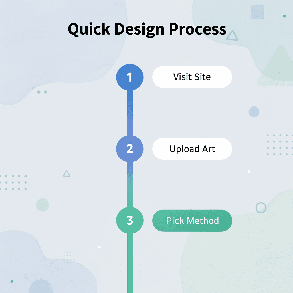
Getting started takes a few minutes. Go to ooShirts.com, click Start Designing, and upload your artwork or create something new using our design tools. Select screen printing, specify 12 or more shirts, and view your full price immediately with free setup and free standard shipping included. No credit card is required to see costs. Our expert team reviews every file to identify problems before production, ensuring geometric patterns print with sharp edges, vintage lettering retains its worn look, and bright colors display fully on any fabric color.
“Professional screen printing with free setup and transparent pricing removes all barriers to creating high-quality custom shirts.” — ooShirts Quality Promise
💡 Tip: Upload your design first for an instant quote – no credit card required to see your exact costs upfront.
Professional-quality screen printing doesn’t require large orders or expensive budgets. Start your design now at cheap custom T-shirts and create shirts that match your idea’s quality.
Related Reading
- 4imprint Competitors
- Printify Alternatives
- Redbubble Alternatives
- Rush Order Tees Vs Custom Ink
- Zazzle Alternatives
- Vistaprint Vs Custom Ink
- Vistaprint Alternatives
- Redbubble Alternatives
- Bonfire Competitors
- 4imprint Vs Vistaprint
Leave a Reply