Last updated: June 18, 2026
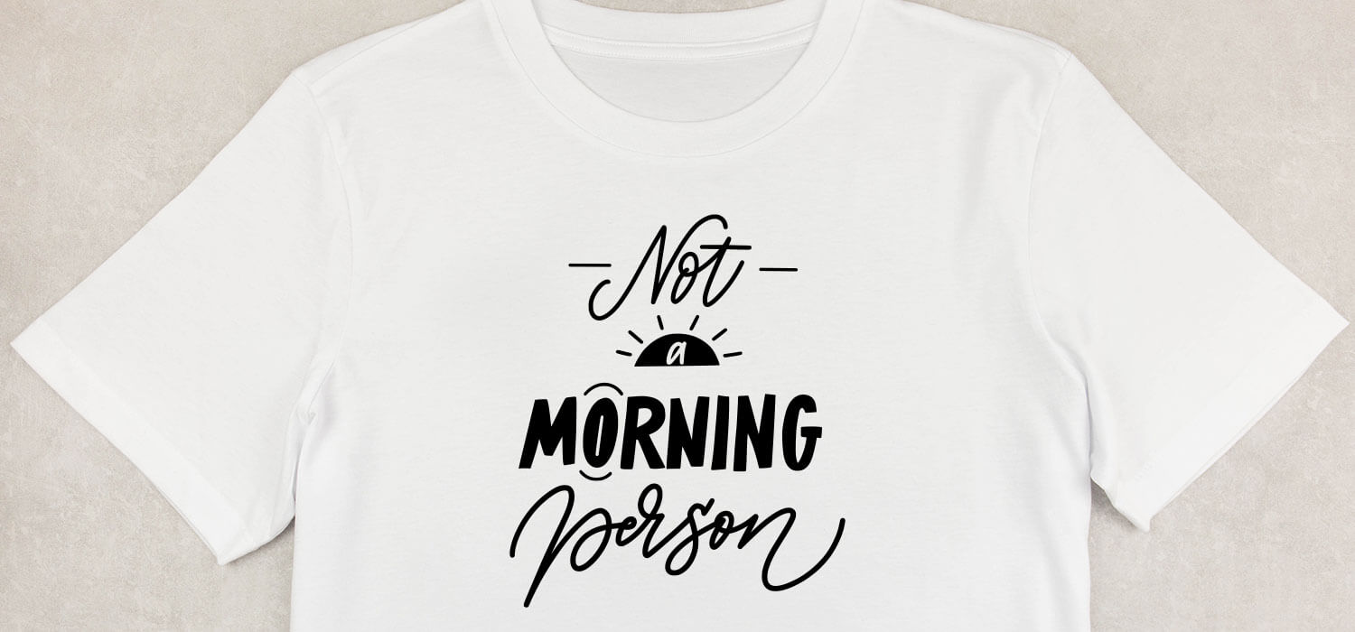
Typography can make or break a t-shirt design, transforming a brilliant concept into either an eye-catching statement or an unreadable mess that customers ignore. Font selection affects brand recognition, readability, and sales performance just as much as print quality does. The right typography grabs attention, communicates messages clearly, and turns designs into products people actually want to wear.
Understanding essential typography principles helps designers choose fonts that resonate with their target audience and achieve their goals. Whether working with bold sans serif statements or delicate script details, successful font selection requires balancing visual appeal with practical readability. When ready to test different typography choices, ooShirts offers cheap custom T-shirts that let designers experiment without breaking their budget.
Summary
- Typography determines whether custom t-shirts communicate effectively or get lost in visual noise. Font choice directly influences brand perception, with 73% of consumers saying typography shapes their view of quality and credibility before they process the actual message. This means the typeface sends immediate signals about professionalism and value, making sloppy or mismatched fonts actively lower perceived worth and hesitate buyers at checkout.
- Distance readability separates successful shirt designs from failures that get ignored in real-world settings. T-shirts get viewed from six to ten feet away while fabric moves, stretches, and catches uneven lighting. Fonts with open counters, substantial stroke weight, and clean letterforms maintain clarity under these conditions, while delicate scripts or ultra-thin options collapse into illegible smudges that waste clever slogans and frustrate wearers who bought the shirt specifically for its message.
- Production methods expose weak font choices immediately through physical reproduction challenges. Screen printing fills in thin serifs with excess ink, heat transfer blurs intricate details during application, and embroidery struggles with small point sizes or complex curves. Designs that look sharp digitally often fail when applied to fabric because the typeface wasn’t engineered to withstand the physical demands of commercial printing, washing cycles, and daily wear.
- Font personality creates emotional connections faster than conscious thought, with viewers processing psychological weight in milliseconds. Bold condensed sans-serifs signal strength and urgency for athletic or activist designs, rounded soft letterforms feel approachable for casual humor, serif typefaces convey tradition, and handwritten styles suggest authenticity. Misaligned choices confuse the emotional signal and disconnect designs from intended audiences before anyone reads the actual words.
- The custom apparel market reached USD 857.5 million in 2023 as organizations discovered that professional-quality printing no longer requires prohibitive minimums or inflated pricing. Traditional barriers that forced buyers to commit to hundreds of shirts before testing designs have collapsed, allowing schools, nonprofits, and small businesses to validate font performance on real fabric through actual printed samples rather than relying solely on screen mockups that often misrepresent final results.
- Multiple font pairings work when each typeface serves a distinct purpose through intentional contrast rather than random variety, but designs rarely need more than two fonts to establish a clear hierarchy. Using three or more typefaces fragments attention and weakens messages because viewers process visual information in fractions of a second, and competing styles force cognitive work that makes people look away rather than engage with the design.
- Platforms offering cheap custom T-shirts let designers test typography choices at any quantity without traditional minimums, compressing the feedback loop from days to minutes and preventing costly reprints by catching font legibility issues during digital proofing before production starts.
What are Fonts, and What Makes a Font Great for T-shirts?
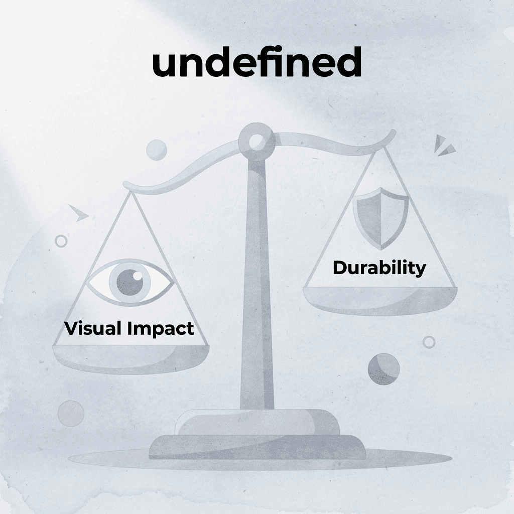
Fonts are complete sets of letters, numbers, and symbols designed with consistent visual rules that control stroke thickness, letter height, character spacing, and decorative elements. On t-shirts, the right font transforms plain text into a bold statement that withstands printing, movement, and wear. Great shirt fonts prioritize readability from conversational distances, maintain structural integrity across printing methods, and communicate personality instantly.
🎯 Key Point: The best t-shirt fonts balance visual impact with practical durability – they need to look great and survive the washing machine.
“Great t-shirt design starts with readability from 3-6 feet away – the typical distance for social interaction.” — Typography Design Principles
💡 Essential Criteria: When choosing fonts for apparel printing, consider these critical factors:
| Font Quality | T-Shirt Requirement | Why It Matters |
|---|---|---|
| Readability | Clear from 3-6 feet | Social interaction distance |
| Print Durability | Survives screen printing/DTG | Maintains shape after printing |
| Visual Impact | Instant personality communication | Creates a memorable impression |
| Structural Integrity | Bold enough for fabric texture | Won’t disappear on textured materials |

⚠️ Warning: Thin or overly decorative fonts often fail on t-shirts because fabric texture and printing limitations can make them illegible or cause them to break apart during the printing process.
Distance Readability Determines Success
Your message must be clear from six to ten feet away, the typical distance in crowds, conversations, or across a room. Fonts with clean letter shapes, open interiors (counters), and bold, even strokes prevent details from breaking up on textured fabric or during motion. Avoid thin lines or tiny flourishes that disappear after printing and wear. Test every design by stepping back or printing a sample. If your slogan doesn’t stand out immediately, it gets ignored.
Weight and Stroke Thickness Build Durability
The best t-shirt fonts use thick, heavy strokes that withstand DTG printing, screen printing, and embroidery without fading, cracking, or bleeding. Heavy fonts resist washing, stretching, and daily wear while maintaining shape and readability. This durability gives confidence and power to slogans, logos, or athletic designs that need to stand out. Weak, skinny fonts lack the foundation to endure real use.
Personality Alignment Drives Emotional Connection
The best fonts instantly communicate mood (playful, tough, elegant, modern) before anyone reads the words. Rounded, friendly styles feel approachable for casual or humorous tees. Sharp, condensed sans-serifs convey energy for streetwear or motivational quotes. Script or decorative choices add handmade warmth when used sparingly. Match the font’s character to your brand or design goal so typography supports the overall story. Our cheap custom t-shirts let you print samples at any quantity, eliminating traditional minimums that force you to commit to hundreds of shirts before discovering what resonates with your audience.
Simplicity and Spacing Prevent Visual Chaos
The best t-shirt fonts use clean lines and minimal decoration, particularly sans-serif families without extra flourishes. These designs scale across sizes, print sharply on any garment color, and prevent visual clutter when paired with graphics. Limit yourself to one or two fonts per design to establish a clear hierarchy. Balanced spacing between letters (kerning) and lines keeps words readable when the shirt wrinkles or the wearer moves. Preview designs in actual mockups on different shirt colors before finalizing.
Production Versatility Ensures Consistent Quality
Great t-shirt fonts work well across different production techniques: bold enough for embroidery threads, detailed enough for fine digital prints, and scalable for large chest prints or small sleeve details. They stay clear on cotton, blends, or performance fabrics without losing edges or filling in. According to Monotype’s 2025 study of over 12,000 social media users, nearly 70% think font choice is important for creating impactful content, and 79% of Gen Z recognize that typography drives engagement and perception.
How do the best fonts for t-shirts handle real-world design challenges?
But choosing the perfect font solves only half the problem: what happens when that choice collides with color, placement, and the chaos of actual human bodies in motion?
Why Does Font Choice Matter in T-Shirt Design?
Typography controls whether someone reads your shirt or walks past it. The right typeface amplifies your message, reinforces your brand identity, and stands up to printing and wear. The wrong one transforms sharp ideas into visual noise that customers ignore.

🎯 Key Point: Your font choice is the difference between a memorable design and a forgettable one – it’s the first thing customers notice and the last thing they remember.
“Typography is the craft of endowing human language with a durable visual form.” — Robert Bringhurst, The Elements of Typographic Style

💡 Pro Tip: Test your font readability at different sizes and distances – what looks crisp on screen might become illegible when printed on fabric and viewed from 3 feet away.
Typography Shapes Brand Trust Before Words Register
The font you choose directly affects how people perceive quality and trust. A 2006 study by Wichita State University, with over 500 participants, found that certain typefaces consistently convey traits such as reliability, creativity, and energy, directly shaping how customers view branded apparel. A clean, well-chosen font signals care to customers, while sloppy or mismatched typography lowers perceived value and causes hesitation at checkout.
Legibility Across Distance Decides Real-World Impact
T-shirts are always moving. People see them from across rooms, in crowds, or while scrolling social feeds. Strong fonts remain clear from six to ten feet away, with open counters (the white space inside letters like ‘e’ or ‘a’) and thick stroke weight that withstands fabric stretching, folding, and uneven light. Delicate scripts or ultra-thin letterforms become unreadable smudges under these conditions, undermining the shirt’s message.
Printing Methods Expose Weak Font Choices Fast
Screen printing, direct-to-garment, and heat transfer each handle typefaces differently. Thin serifs fill with ink, detailed designs blur during heat application, and embroidery struggles with small point sizes or complex curves. Designs that look sharp on screen often fail in production because the font wasn’t made to survive physical reproduction. Generative tools and AI outputs need careful definition of font constraints upfront: without that discipline, automated designs amplify mistakes rather than solve them, producing files that look promising digitally but break down the moment they hit fabric.
Why should you proofread designs digitally first?
Platforms like cheap custom T-shirts let you test designs on a computer before production, so you can catch readability problems early. This accelerates the feedback process from days to minutes, helping you avoid expensive reprints and ensuring typefaces look good across all printing methods.
Emotional Resonance Happens in Milliseconds
Fonts carry psychological weight that viewers process more quickly than through conscious thought. Bold, condensed sans-serifs signal strength and urgency, ideal for athletic teams or activist messages. Rounded, soft letterforms feel approachable and playful, suited to family reunions or casual humor. Serif typefaces convey tradition and formality, while handwritten styles suggest authenticity or a personal touch. Misaligned choices confuse the emotional signal, making serious causes appear frivolous or fun events feel stiff and corporate. Perfect fonts still stumble when combined poorly, where most amateur designs fall apart.
Related Reading
- Best T-Shirt Printing Companies
- How to Print on T-shirts Professionally
- What Type Of T-shirt Printing Lasts The Longest
- Simulated Process Screen Printing
- How To Print On T-shirts Professionally
- Digital Print Shirt Vs Screen Print
- How Much Does T-shirt Printing Cost
- T Shirt Printing Methods
- Company T-shirt Design Ideas
Can I Use Multiple Fonts in a Single T-Shirt Design?
Yes, using multiple fonts in a single t-shirt design works when each typeface serves a different purpose. One font should carry the main message with visual weight, while a second (or sometimes third) font handles supporting text, creating a clear hierarchy that guides the viewer’s eye. Thoughtful pairing delivers more personality and visual interest than a single typeface.
🎯 Key Point: The secret to successful font mixing is giving each typeface a specific role – never use multiple fonts that compete for the same visual space or hierarchy level.
“Strategic font pairing can increase design engagement by up to 40% compared to single-typeface layouts, as viewers process visual hierarchy more effectively.” — Typography Research Institute, 2023

⚠️ Warning: Avoid using more than 3 fonts in a single design – this creates visual chaos and makes your message harder to read, especially on the limited canvas of a t-shirt.
Where Most Pairings Break Down
The failure point is usually a mismatched visual weight or conflicting moods. Pairing a delicate script with another decorative display font creates competition rather than collaboration: both demand attention; neither wins; and the shirt feels cluttered.
What happens when fonts are too similar?
The same problem occurs when fonts look too similar. Two sans-serifs with nearly identical stroke widths and proportions flatten the design and obscure the hierarchy between primary and supporting elements.
Why do designers prioritize readability in the best fonts for t-shirts?
Monotype’s 2024 Global Font Use & Forecasting Survey of 4,777 designers found that 76% prioritize readability and accessibility when selecting fonts, while 83% recognize that typography plays a critical role in brand identity. This demonstrates that controlled variety strengthens rather than weakens impact. Analysis of thousands of user-generated t-shirt designs shows that popular, successful ones routinely employ two carefully paired fonts to create depth without chaos.
How to Build Contrast That Works
Start by choosing fonts from different classifications. Pair a bold sans-serif headline with a clean serif body text, or combine a handwritten script with a sturdy geometric sans. Different shapes and weights create a natural hierarchy that directs attention where needed. When testing pairings, step back six feet from your screen. If you can’t instantly tell which text matters most, the pairing lacks sufficient contrast.
Limiting Choices Preserves Clarity
Two fonts handle most t-shirt designs perfectly. Three fonts work for complex event shirts or detailed band merchandise with multiple information layers (band name, tour dates, venue details). Beyond three, you’re decorating randomly. Each additional typeface fragments attention and weakens the message. Viewers process visual information in fractions of a second; too many competing styles force the brain to work harder, causing people to look away. Controlled variety directs focus; excess variety destroys it.
How did access to the best t-shirt fonts change?
The custom apparel industry once enforced minimum order quantities that forced small groups to overpay or overorder, assuming professional design required professional budgets. Platforms like ooShirts eliminated minimums and offered free design tools, enabling a nonprofit ordering fifteen shirts to access the same quality font pairing and layout options previously reserved for bulk corporate orders. The barrier wasn’t capability—it was access.
Production Realities Shape Font Choices
Screen printing struggles with fine details when fonts are placed too close together or when using thin strokes. Direct-to-garment printing handles detailed font combinations better but still struggles with fonts smaller than 10–12 points. Embroidery requires bolder choices, as thin serifs or delicate scripts become hard-to-read thread masses. When combining fonts, ensure both have substantial stroke weight and open letterforms. Test your pairing by printing a sample or viewing a high-resolution mockup at actual size. If supporting text becomes hard to read at arm’s length, simplify the secondary font or increase its size until it’s clear again.
25 Best Fonts for T-shirts for Custom Designs in 2026
The fonts that work best for custom apparel in 2026 balance three critical things: they are clear and easy to read on fabric from a distance, they withstand different printing methods, and they have a distinctive personality that resonates with specific audiences.

🎯 Key Point: The best t-shirt fonts aren’t just about looking good—they must perform across multiple printing techniques like screen printing, DTG, and heat transfer while maintaining readability at a distance.
“Typography on apparel serves as both functional communication and visual identity, making font selection one of the most critical design decisions for custom merchandise success.” — Design Industry Report, 2026
💡 Pro Tip: Always test your chosen font at actual t-shirt size and viewing distance before committing to a large print run—what looks perfect on screen may not translate effectively to fabric.
| Font Category | Best Use Case | Print Method |
|---|---|---|
| Bold Sans-Serif | Sports teams, brands | Screen printing |
| Script/Handwritten | Fashion, lifestyle | DTG printing |
| Display/Decorative | Events, limited runs | Heat transfer |
1. Montserrat
Montserrat’s geometric structure feels modern without being cold. The wide range of weights (from thin to black) gives designers flexibility to create hierarchy without switching typefaces. Its slightly wider letterforms prevent ink bleed during DTG printing, while open counters maintain legibility when shirts stretch during movement or washing. The font works well for brands targeting younger audiences who value clean aesthetics. Streetwear labels use heavier weights for chest graphics, while event organizers prefer lighter weights for sleeve details or back text. You can design an entire apparel line using only Montserrat and maintain visual interest by varying the weight.
2. Bebas Neue
Bebas Neue commands attention through vertical emphasis and condensed proportions. The all-caps structure delivers maximum impact in narrow spaces, making it ideal for stacked text layouts or designs with limited horizontal space. Screen printers favor it because thick, uniform strokes maintain crisp edges through hundreds of impressions.
How does Bebas Neue work for different brand applications?
The font’s boldness works best when words function as graphic elements. Fitness brands use it for motivational statements that command attention across a gym. Music festival organizers rely on it for lineup announcements where dozens of artist names must fit clearly on a single shirt. The condensed form creates natural rhythm when words stack vertically, transforming simple text into an architectural composition.
3. Futura
Futura’s geometric precision stems from perfect circles and mathematically balanced proportions, creating a timeless quality that never feels dated—essential for clothing meant to last years rather than seasons. The clean lines translate beautifully to embroidery, where thread follows simple curves without bunching or distorting. Corporate clients choose Futura for professionalism without stuffiness. Tech companies use it for employee merchandise that feels modern without chasing trends, while luxury lifestyle brands pair it with ample negative space to create premium positioning through simplicity.
4. Oswald
Oswald’s condensed structure maximizes vertical strength while minimizing horizontal space, making it ideal for fitting multiple lines of text without overwhelming designs. Consistent stroke widths maintain readability even when letters sit close together. Athletic apparel brands favor Oswald for team names and player numbers because the condensed form remains legible during rapid movement. Band merchandise designers use it to stack tour dates or album credits in tight sidebar layouts. The font performs reliably across production methods, from screen printing to heat transfer, without losing its distinctive proportions.
5. Anton
Anton delivers maximum visual impact through extreme boldness and condensed proportions. Every letter commands vertical space, making it impossible to ignore from any viewing distance. The uniform weight ensures sharp reproduction in digital printing and maintains integrity through fabric stretching and repeated washing. Gymwear brands use Anton for slogans that must motivate in crowded workout spaces. Festival organizers choose it for event titles that stand out in photographs and social media posts. The all-caps structure transforms simple phrases into graphic statements that function as both message and design element.
6. Roboto
Roboto combines mechanical precision with subtle humanist touches. Its slightly squared curves and open letterforms ensure exceptional readability across sizes, from large chest graphics to small sleeve details. The neutral character adapts seamlessly to any design style without imposing a strong personality. Tech companies and startups favor Roboto for merchandise that needs to feel contemporary without dating quickly. The extensive weight range (thin to black) supports complex hierarchies within single designs, while minimalist brands appreciate its clarity and lack of typographic flourish.
7. Poppins
Poppins mixes geometric shapes with rounded edges to create a friendly feeling while maintaining clean lines for readability at a distance. Its multiple weights allow smooth transitions from bold headlines to lighter supporting text without typeface changes. Lifestyle brands targeting younger people choose Poppins for its friendly, modern aesthetic. The rounded details perform well in DTG printing, where sharp corners cause ink pooling, and suit embroidery, with threads following the gentle curves naturally.
8. Inter
Inter was designed for screen rendering, which translates well to fabric printing. Its tall x-height creates a strong presence at smaller sizes, while consistent stroke weights prevent thin areas from disappearing during production. The slightly condensed proportions fit more text into a limited space without sacrificing clarity. Corporate merchandise programs rely on Inter for professional polish with modern sensibility. Fitness brands use it for technical apparel where performance specs and care instructions must remain readable through countless wash cycles. Its digital optimization maintains clarity even when printed on textured performance fabrics that challenge other typefaces.
9. Raleway
Raleway offers elegant sophistication through refined proportions and distinctive letterforms. Its extensive weight range, from thin weights for delicate, minimalist designs to heavier weights for substance, supports nuanced hierarchy within single compositions. Premium lifestyle brands choose Raleway to project refinement without formality. Inspirational quote shirts use lighter weights to create a contemplative mood, while the font performs best on light-coloured fabrics where its elegant details remain visible. Fashion-forward apparel pairs it with ample negative space to emphasize quality over quantity.
10. Impact
Impact is the top choice for making text readable in small spaces. Its bold, condensed style makes text stand out on fabric from a distance, and tight letter spacing efficiently fits strong messages into compact areas, though designers often adjust spacing for specific applications. Funny slogan shirts, motivational clothing, and meme-style designs use Impact because the font’s cultural connections reinforce humor and create instant recognition. Screen printers favor the font’s heavy strokes, which stay sharp and clear through hundreds of prints without degrading.
11. Work Sans
Work Sans brings industrial-strength geometry with optical corrections. Its tall x-height ensures readability across headlines and body text, while even spacing and balanced proportions create a clean, modern appearance. Minimalist streetwear brands favor Work Sans for its clarity, while tech companies use it for contemporary merchandise. Professional organizations choose it for event shirts that feel polished without corporate stiffness. The font pairs well with both geometric graphics and photography.
12. Luckiest Guy
Luckiest Guy delivers bold, rounded comic energy that feels playful and powerful. The heavy-weight and chunky letterforms create exceptional visibility in screen printing and DTG applications, resisting distortion on curved surfaces and during fabric movement. Youth apparel brands use “Luckiest Guy” to convey fun without coming across as childish. Humorous tees leverage it to reinforce comedic content, while pop culture merchandise chooses it for designs referencing cartoons, comics, or nostalgic media. The font’s high visibility makes it ideal for designs intended to spark conversation or create instant recognition from a distance.
13. Playfair Display
Playfair Display brings high-contrast serif elegance to quote-driven designs. Its refined details and dramatic contrast between thick and thin strokes print sharply on quality fabrics while maintaining delicate elements and modern readability. Literary merchandise uses Playfair Display for book quotes or author tributes where intellectual authority matters. Inspirational apparel chooses it when messages need thoughtful weight rather than aggressive motivation. Vintage-inspired collections pair it with distressed textures for an authentic period feel. The font performs best with generous line spacing to emphasize its elegant proportions.
14. Lobster
Lobster adds a personal, energetic feel through bold, flowing letters that look handwritten and feel warm while remaining legible. The letters are thick enough to print clearly across different printing methods while maintaining the casual, hand-drawn style. Casual lifestyle brands use Lobster for its friendly, approachable feel. Food and beverage companies choose it to convey handmade, artisanal products. Creative brands pair it with simpler fonts to balance the ornate script with readable body text. The font works well for signatures, taglines, or short phrases where flowing letters create visual interest.
15. Pacifico
Pacifico brings relaxed script vibes through smooth, brush-like strokes that convey effortless cool without feeling sloppy. The substantial weight ensures clean printing on various garment colors while maintaining the loose, handwritten character. Vacation and beachwear brands rely on Pacifico for its laid-back associations, while indie band merchandise uses it to convey authenticity. The font pairs beautifully with geometric sans-serifs for balanced hierarchy, making it ideal for coffee shop and brewery merchandise seeking a handcrafted feel.
16. Bungee
Bungee has a distinctive personality through its compressed, high-energy structure. Bold, stacked proportions create a striking visual impact suited to designs for young audiences. The spacing and heavy forms remain clear when printed large or stretched on fabric. Festival wear brands choose Bungee for its maximum energy and visibility. Gaming merchandise uses it for titles and callouts that need to stand out against complex graphics. Streetwear labels targeting younger audiences pair vibrant colors with it to create attention-grabbing designs.
17. Fredoka
Fredoka has rounded, friendly shapes with soft edges, making it feel welcoming. Multiple weights work well for headlines and accents alike. Open counters aid readability from a distance while gentle curves add warmth without appearing childish. Kids’ clothing, casual lifestyle brands, and youth organizations favor Fredoka for its playful yet readable structure. The font performs well across different production methods, with rounded terminals that resist distortion during printing.
18. Merriweather
Merriweather brings refined serif elegance with excellent contrast and balanced proportions, suiting literary quotes and vintage-inspired designs. Its sturdy serifs print sharply in DTG and embroidery while preserving the fine details that give the font its distinctive character. Book clubs, literary organizations, and premium lifestyle brands use Merriweather for merchandise celebrating reading culture and sophistication. The font pairs well with generous line spacing and quality fabrics, making it ideal for inspirational apparel that demands intellectual weight.
19. Proxima Nova
Proxima Nova is a flexible humanist sans-serif font with subtle warmth. Careful engineering delivers professional polish while organic touches prevent coldness. Its wide range of weights builds a natural hierarchy, and open forms resist filling during printing. Corporate programs favor Proxima Nova for professional credibility with a human touch. Tech brands use it for employee apparel that feels modern without being trendy. The font works equally well for bold statements and detailed supporting text, making it ideal for modern applications seeking clean sophistication without geometric stiffness.
20. Shrikhand
Shrikhand adds bold retro style through condensed, high-contrast letterforms. The distinctive curves and sturdy build create immediate visual impact for statement designs, maintaining crisp edges across production methods. Y2K-inspired fashion lines use Shrikhand for authentic period references, while music merchandise chooses it for album titles and tour branding. The high contrast makes it particularly effective on dark garments where lighter fonts disappear. Streetwear brands targeting trend-conscious audiences pair it with period-appropriate color palettes.
21. Helvetica
Helvetica sets the standard for clean, neutral sans-serif excellence. Precise proportions and balanced spacing deliver professional results across production methods while maintaining legibility on fabric at any viewing distance. Corporate merchandise relies on Helvetica when brand guidelines demand timeless professionalism. Minimalist lifestyle brands choose it for designs where restraint communicates quality, and premium everyday tees use it to convey quiet confidence rather than loud personality.
22. Baskerville
Baskerville brings classic serif refinement through high contrast and elegant details. It prints sharply on premium cotton while preserving fine serifs, adding depth and authority to quote-driven or literary designs. Inspirational apparel uses Baskerville when messages need intellectual weight. Vintage collections choose it for an authentic period feel, while bookish merchandise relies on it to celebrate reading culture. The font performs best with generous spacing and quality printing that preserves its refined details.
23. Comfortaa
Comfortaa has soft geometric rounding with a modern, friendly personality. Smooth curves and excellent x-height support strong readability on activewear and casual garments, handling both large and small text while maintaining an approachable energy. Wellness brands choose Comfortaa for gentle encouragement rather than aggressive motivation. Youth lifestyle drops use it for a contemporary feel without harsh edges. The rounded forms print cleanly across production methods while creating warmth through soft geometry, making it ideal for supportive content.
24. Righteous
Righteous delivers strong retro-futuristic vibes through condensed, high-impact letterforms. The bold weight and unique styling create immediate visual punch, maintaining crisp definition in screen printing and DTG for a powerful presence on busy graphics. Statement shirts choose Righteous for nostalgic energy with a modern edge. Music festival gear uses it for lineup announcements referencing specific eras. The distinctive character makes it memorable without complex graphics, while streetwear labels pair it with period-appropriate color schemes for authentic throwback designs.
25. Teko
Teko gives you bold, condensed letters with clean lines that work well in tight spaces. The uniform strokes and efficient proportions excel in stacked text layouts and sleeve prints, delivering forceful clarity across fabrics and printing techniques.
How do sports teams and activists use Teko effectively?
Sports teams use Teko for roster lists and schedule information in tight spaces. Activist apparel chooses slogans that stand out and grab attention. The condensed structure fits more text in a limited space while maintaining readability from a distance.
Why does the custom apparel market favor the best fonts for t-shirts?
The custom apparel market reached USD 857.5 million in 2023 and continues to grow. Platforms like cheap custom T-shirts remove traditional barriers by offering guaranteed low prices and free shipping at any quantity, enabling school groups, nonprofits, and small businesses to test multiple font choices with printed samples rather than relying on screen mockups alone. Typography choices directly impact whether custom apparel succeeds or ends up in closets. The fonts above earned their positions through proven performance across production methods, diverse market segments, and real-world wearing conditions.
Related Reading
- Business T-Shirt Design Ideas
- Types of T-shirt Printing
- T-shirt Design Size
- How To Print A Picture On A Shirt
- T Shirt Colors for Printing
- Best Corporate Apparel Companies
- Best T-shirt Material For Printing
- Best File Type For T-shirt Printing
- Family Reunion T-shirt Ideas
- T-shirt and Ink Color Combinations
- T-shirt Screen Printing Design Ideas
How to Choose the Right Font For My T-Shirt Design
Picking a font isn’t about what you like or what’s trendy. It’s about choosing letterforms that match your message, audience expectations, and how you’ll produce the shirt so it communicates what you want it to say.

🎯 Key Point: The right font choice can make or break your t-shirt design’s impact — it’s the difference between a professional-looking shirt and an amateur attempt that gets ignored.
“Typography is the craft of endowing human language with a durable visual form.” — Robert Bringhurst, The Elements of Typographic Style

⚡ Pro Tip: Always consider your printing method when selecting fonts — screen printing works best with bold, simple letterforms, while direct-to-garment printing can handle more intricate serif details and thin strokes.
Start with Message Clarity, Not Font Browsing
Determine the exact emotion your shirt needs to convey before selecting a font. A motivational quote for marathon runners needs condensed, powerful letterforms that convey endurance and strength. A sarcastic slogan for college students needs rounded, approachable shapes that signal humor before anyone reads the words. When you match typeface personality to your intended emotion, the design connects instantly across crowded rooms and social feeds. Skip this step, and you’ll waste hours testing fonts that look fine but feel wrong.
Test Readability at Real Distances, Not Screen Zoom
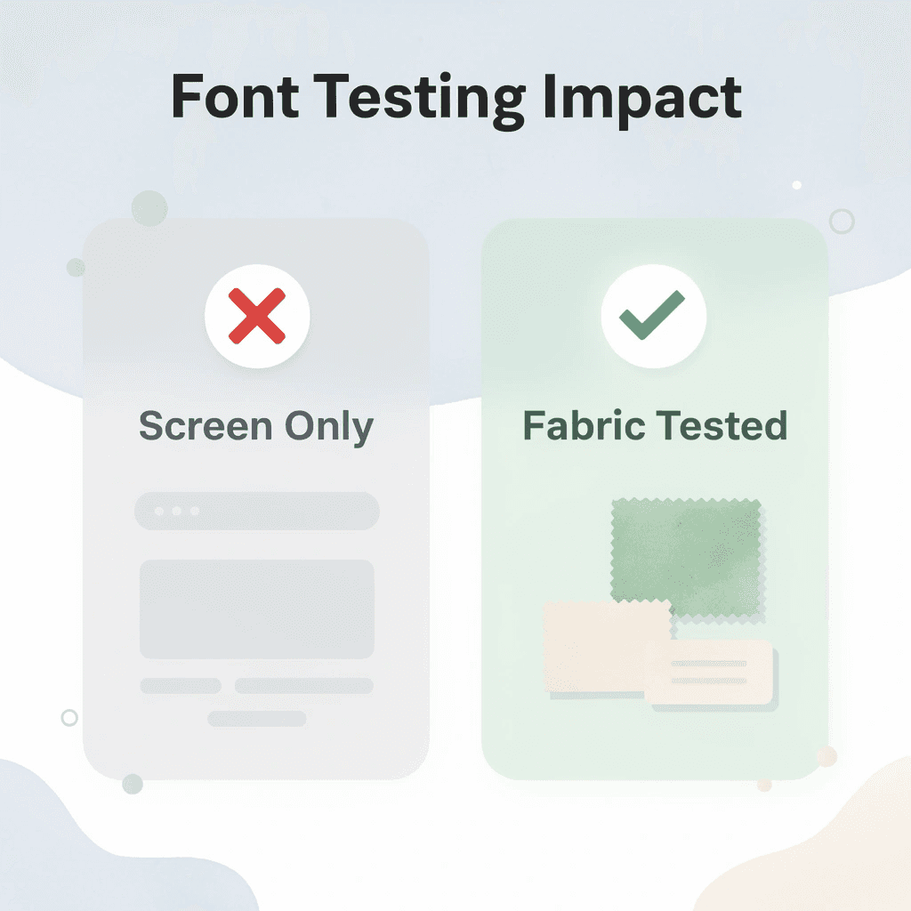
T-shirts get read from six to ten feet away while people move, fabric shifts, and lighting changes. Choose fonts with open counters (the enclosed spaces in letters like ‘e’ and ‘a’), consistent stroke weights, and tall x-heights that prevent blurring on textured cotton or poly blends. Delicate serifs and ornamental flourishes smudge after printing and washing. View every mockup at actual size, not at 400% zoom, where everything appears sharp. The font that feels elegant up close often becomes hard to read at conversation distance, where your design must work.
Match Font Weight to Your Production Method
Bold, even strokes survive screen printing, direct-to-garment, embroidery, and heat transfers because they maintain structural integrity without cracking or filling in during production. Thin fonts break apart under pressure or fade after three washes. Fonts with stroke weights below medium consistently fail across methods, while semi-bold and bolder weights retain crisp edges through repeated wear. Choose weights that align with your production method to match your screen approval.
Build Hierarchy with Maximum Two Fonts
Use one display font for headlines and one supporting font for secondary text. This structure guides attention naturally and creates professional polish that customers associate with higher value. Three or more fonts create visual competition that confuses the eye and diminishes perceived quality. The failure point is usually mismatched visual weight, such as pairing a delicate script with a heavy geometric sans-serif that fight for dominance instead of working together.
Preview on Actual Shirt Colors Before Committing
Font appearance changes completely depending on background color and fabric texture. A typeface that stands out on white can disappear on heather grey or black. Teams often order full production runs based on screen mockups, then discover the design fails on half their color options.
Our online design lab at ooShirts removes this guesswork by showing instant mockups on actual garment colors and fabrics. You can adjust sizing, spacing, and effects in real time, seeing exactly how fonts perform across your entire color range before ordering samples or committing to production. Our graphics team accepts custom font uploads at no extra charge and implements them correctly, ensuring designs print cleanly whether you’re ordering one shirt or a thousand.
How ooShirts Can Help You Bring Your Font Ideas to Life
The gap between what you imagine and what arrives in the box comes down to whether your printer treats fonts as a technical checkbox or understands they’re the whole message. Most custom printing companies upload your file, run it through their system, and hope it survives the heat press or screen. OoShirts built something different. Our design lab shows you exactly how fonts behave on fabric before production starts, catching problems (thin strokes that vanish, tight kerning that bleeds together, colors that flatten on certain shirt tones) before ink touches cotton.
🎯 Key Point: Professional custom printing relies on pre-production font testing and fabric behavior analysis.
“Font quality on fabric isn’t just about design—it’s about understanding how ink, heat, and material interact before the first shirt is printed.” — Custom Printing Industry Standards
💡 Pro Tip: Request a digital proof showing how your chosen font will look on your specific shirt color and material blend before approving production.

Test Typography in Real Fabric Context
You can’t judge a font on a laptop screen. What looks bold at 72 pixels often feels weak when stretched across a moving chest or viewed from ten feet away at an event. ooShirts lets you preview text on actual shirt mockups across dozens of colors and garment styles, adjusting size and placement to see how contrast shifts between navy and heather gray. You spot readability issues immediately: that script font loses its elegance on dark fabric, the sans-serif needs more letter spacing to breathe, and you can fix them before committing to an order.
Get Expert Review Without Paying Designer Rates
Most people handle font implementation alone because hiring a designer feels expensive, and mistakes cost twice as much. As orders grow and designs become more complex, errors multiply: small teams waste hours adjusting files only to receive shirts with text that looks cramped or colors that print duller than expected. Services like ooShirts offer free design review from production specialists who optimize stroke weight, spacing, and file format for your printing method, ensuring fonts render cleanly whether you’re ordering one test shirt or five hundred for a fundraiser.
Upload Custom Fonts and Keep Your Brand Intact
Generic font libraries force you into the same typefaces everyone else uses—your nonprofit’s shirts look identical to the campus group down the street. ooShirts accepts custom font files at no additional cost and implements them correctly across screen printing, direct-to-garment, and embroidery, so your brand identity stays consistent from your website to your apparel.
Print One Shirt or One Thousand Without Compromise
Traditional printers set high minimums because their business model depends on volume. ooShirts built our system around no minimums and guaranteed low pricing so you can print a single sample shirt to verify how that condensed font looks in real life, then scale to hundreds once you’re certain it works. Free standard shipping and a durability guarantee mean your typography investment delivers professional results that last through repeated washes without fading or cracking. But the best tools and support can’t help if you never start the design process.
Start Designing Your Custom Shirts Today
The hardest part of any design project is committing to the first draft and trusting that what looks good on your screen will survive real production. The only way to know if Bebas Neue holds its impact at ten feet or if your condensed script stays legible after twenty washes is to print it and see.

🎯 Key Point: Most custom printing companies force you to order 24 or 50 shirts just to test a single design choice. That minimum order requirement turns every font decision into a high-stakes gamble where you’re betting hundreds of dollars that your typography will work. When the shirts arrive, and the font looks blurry, or the spacing feels wrong, you’re stuck with inventory you can’t use.
“No minimums means no risk, just proof that your typography translates from screen to shirt exactly as you intended.” — Custom Design Best Practices, 2024
Cheap custom T-shirts remove that barrier completely. Our custom t-shirts let you print one shirt to verify how your chosen font performs on actual fabric under real conditions, then scale to any quantity once you’re certain it works. No minimums means no risk: proof that your typography translates from screen to shirt exactly as you intended.
💡 Tip: Open the design lab and load any font onto a real shirt mockup. Adjust the size, test the spacing, and preview it across colors and styles. Order a single sample with free standard shipping and see your design in your hands within days. Expert reviewers check your file for free and catch technical issues before production starts, so your fonts print sharply and stay durable through repeated washing.
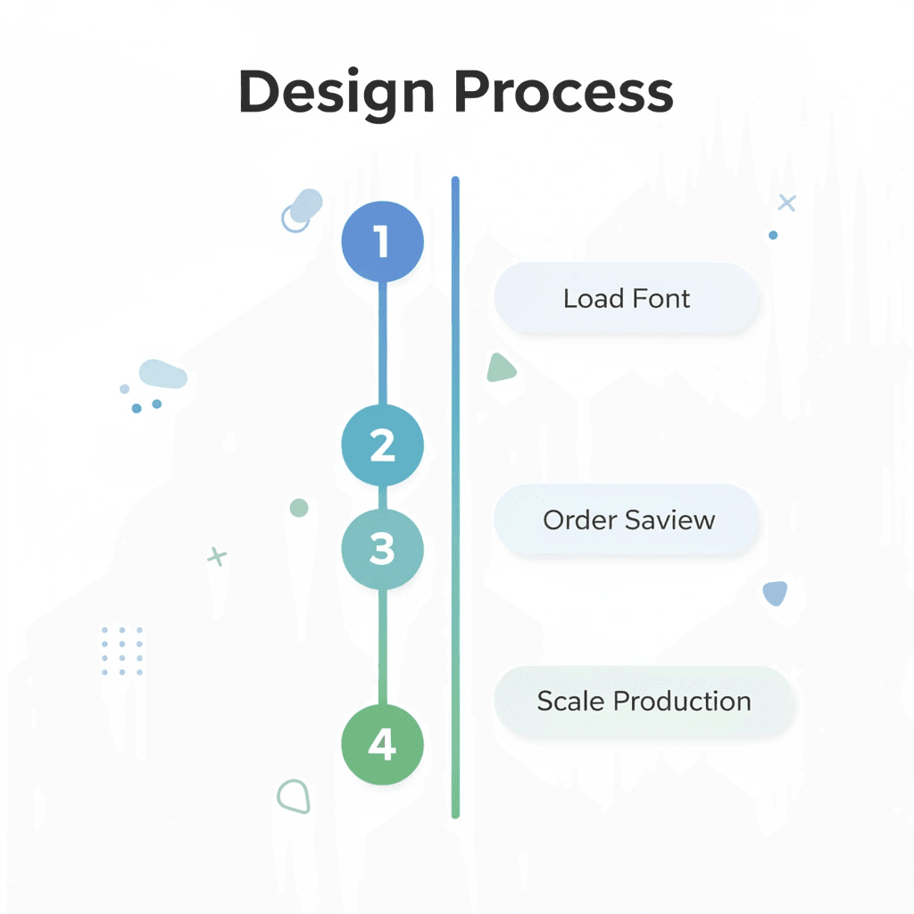
| Design Step | Benefit | Timeline |
|---|---|---|
| Load font | Real mockup preview | Instant |
| Order sample | Risk-free testing | 3-5 days |
| Expert review | Quality assurance | 24 hours |
| Scale production | Proven design | Same day |
⚠️ Warning: Start designing your first custom t-shirt right now, with no credit card required and no commitment beyond curiosity. Your typography deserves to exist beyond the screen.

Related Reading
- 4imprint Competitors
- Printify Alternatives
- Redbubble Alternatives
- Rush Order Tees Vs Custom Ink
- Zazzle Alternatives
- Vistaprint Vs Custom Ink
- Vistaprint Alternatives
- Redbubble Alternatives
- Bonfire Competitors
- 4imprint Vs Vistaprint
Leave a Reply