Last updated: June 18, 2026
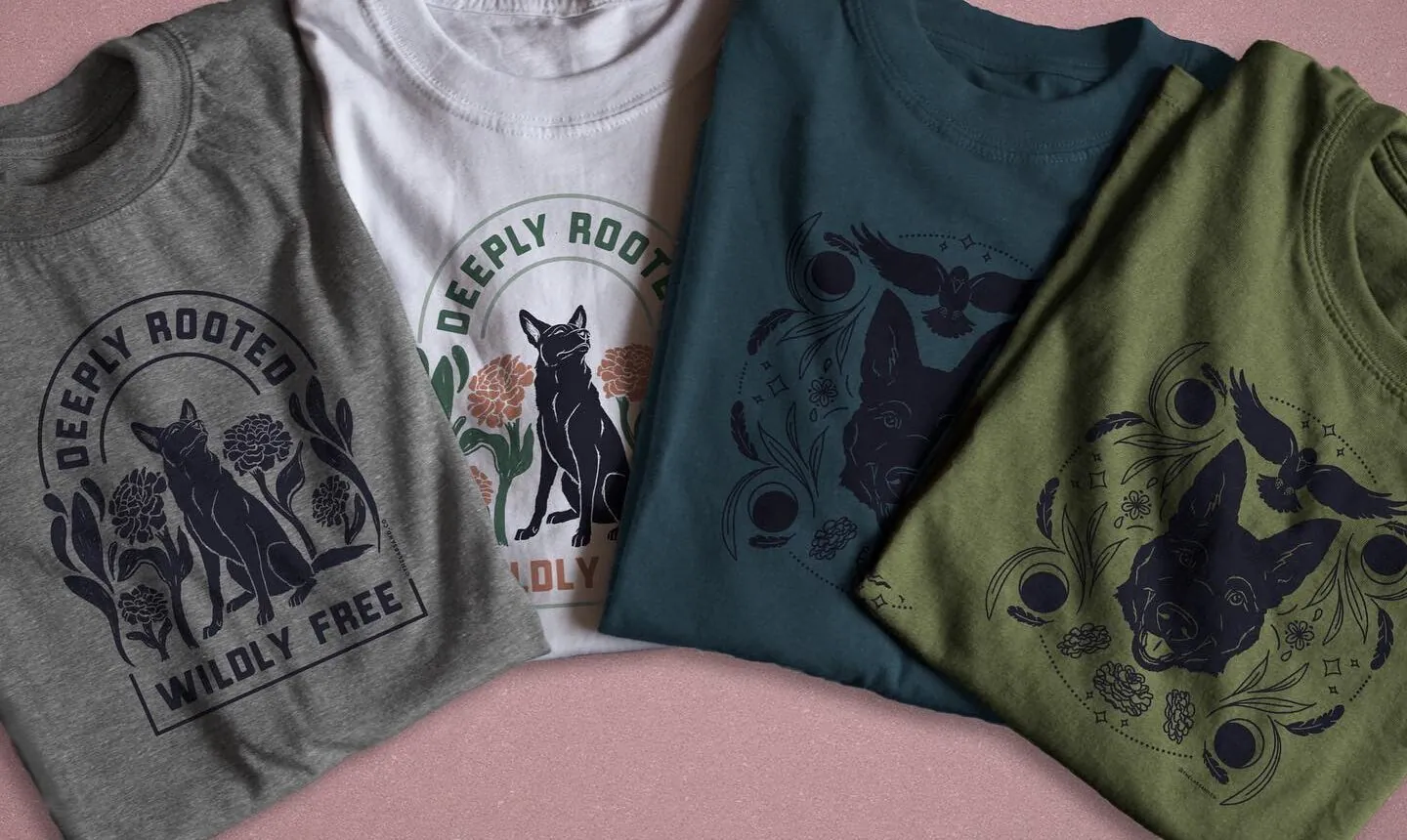
Custom tees often fail because the ink disappears into the fabric or clashes so badly that nobody wants to wear them. The difference between a shirt that gets worn and one that stays in a drawer comes down to choosing the right combination of shirt color and ink color. These 20 proven color pairings create maximum contrast and visibility, helping designers create professional tees that catch eyes and drive sales. Whether launching a brand, promoting an event, or creating merchandise, the right color combinations make all the difference.
Successful custom apparel requires affordable options that don’t compromise on color quality or printing precision. The right printing partner ensures carefully selected hues translate exactly as planned from screen to fabric. Professional printing processes maintain the contrast and readability that make designs sell, whether using bold primaries or subtle pastels. For quality results without breaking the budget, consider cheap custom T-shirts that deliver both vibrant colors and reliable printing.
Summary
- Color contrast determines whether custom t-shirt designs succeed or disappear into fabric. Without sufficient contrast between ink and garment, text becomes illegible from across the room, graphics fade into the background, and messages vanish completely. Research from Loyola University Maryland shows color increases brand recognition by up to 80%, but only when those colors remain distinct and visible against their background rather than blending into the base material.
- Light ink colors can print successfully on dark shirts, but only with an opaque white underbase layer. Without this foundation, dark fabric absorbs and mutes lighter colors, turning vibrant yellows into muddy browns and soft pastels into invisible ghosts. A 2021 study in the Journal of Textile Science & Engineering found that underbase thickness directly correlates with wash durability and comfort, with optimal layers measuring between 0.3 to 0.5 millimeters for cotton blends.
- White shirts remain among the most popular base colors because they allow bold inks like red to achieve maximum saturation and clarity without requiring underbases or special preparation. This practical advantage explains why classic combinations like red on white continue dominating sports uniforms, advocacy campaigns, and promotional merchandise despite shifting design trends. The pairing delivers a pure, powerful contrast that commands immediate attention at any distance or under any lighting condition.
- Environmental context shapes which color combinations actually work in practice, not just theory. Indoor conference lighting washes out pastels and muted tones, making navy ink on gray shirts nearly invisible under fluorescent bulbs, while outdoor events under bright sun demand bolder contrasts because natural light softens edges and reduces perceived sharpness. Testing sample shirts under actual event conditions prevents the costly mistake of ordering hundreds of garments, only to find that carefully planned designs become invisible when it matters most.
- Most local print shops quote minimums of 24, 50, or even 100 shirts, making it impossible to test color combinations before committing to bulk production and forcing customers to guess whether choices will photograph well or provide sufficient contrast. This is where cheap custom T-shirts fit in: they offer no minimum order requirements and free shipping, allowing groups to order single sample shirts to validate color pairings under real-world conditions before scaling up to larger quantities.
What is T-Shirt Printing, and Why Does Color Contrast Matter in Custom T-Shirt Printing?
T-shirt printing transfers your design onto fabric using methods like screen printing, direct-to-garment (DTG), or heat transfer. Each technique bonds ink or dye to the shirt surface, creating a permanent image that withstands washing and wearing. The quality and durability of your final product depend on choosing the right printing method for your design and fabric type.
💡 Key Point: Different printing methods suit different designs—screen printing excels for simple designs with few colors, while DTG handles complex, multi-color artwork beautifully.
“The global custom t-shirt printing market is expected to reach $11.11 billion by 2025, driven by increasing demand for personalized apparel.” — Grand View Research, 2023

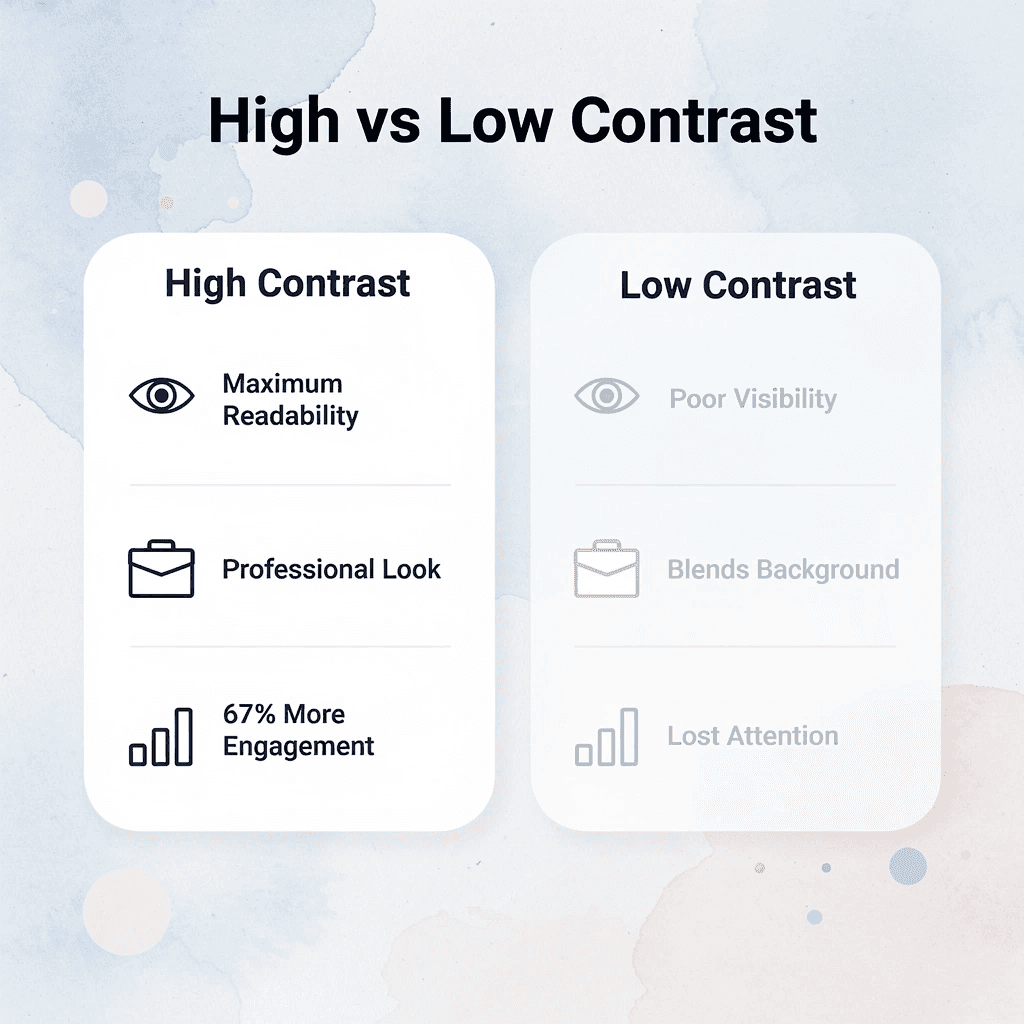
Color contrast determines whether your design is actually visible and professional-looking. Without enough contrast between ink and fabric, text becomes hard to read, and graphics blend into the background. Strong contrast makes designs readable from across a room, ensures brand colors stay recognizable, and gives shirts a professional appearance that stands out in any crowd.
⚠️ Warning: Poor color contrast is the #1 reason custom t-shirts look amateurish – always test your design on the actual fabric color before printing.
| High Contrast | Low Contrast |
|---|---|
| White text on a black shirt | Yellow text on a white shirt |
| Black graphics on light colors | Light blue on white fabric |
| Bold, readable from a distance | Difficult to see up close |
How does screen printing create vibrant T-shirt and ink color combinations?
Screen printing pushes ink through mesh stencils onto fabric, one color at a time. The thick ink layers create bright, long-lasting prints that withstand dozens of washes without cracking or fading. Each color requires its own screen setup, making bulk orders with simple designs affordable but small batches costly.
What makes direct-to-garment printing ideal for complex designs?
Direct-to-garment printing sprays water-based ink directly onto cotton fabric using specialized printers. The digital process handles complex, multi-color designs and photographic images without setup costs, making it ideal for small orders or custom pieces. The prints feel soft because the ink soaks into the fibers rather than sitting on top, though they work best on light-coloured cotton where the ink displays true color.
How do heat transfer methods work across different fabric types?
Heat transfer methods use designs printed on special films that are applied with heat and pressure. DTF (direct-to-film) works on many fabric types, including polyester blends where regular inks struggle to adhere. Sublimation infuses dye into synthetic fabrics at the molecular level, creating permanent, full-color designs that resist cracking and peeling. However, it only works on white or light polyester materials.
How does high contrast improve T-shirt and ink color combinations?
The high contrast between your design and the shirt color makes elements stand out rather than blend into the fabric. Dark navy text on a black shirt may look appealing on screen, but under real-world lighting, people must squint to read it from three feet away. Light gray graphics on white fabric create the same problem in reverse. According to research from Loyola University Maryland, color increases brand recognition by up to 80% when those colors remain distinct and visible against their background.
Why do contrasting colors guide visual attention better?
The best designs use contrast to guide the eye where attention is needed. Bright yellow ink on royal blue fabric creates an instant visual separation, drawing focus to your message. White text on dark backgrounds provides maximum readability in low light or from a distance. The human eye processes high-contrast elements faster, making your design memorable in the seconds it takes someone to glance at your shirt.
What mistakes do people make with color interactions?
Most people design shirts thinking only about their favorite colors, not how those colors interact with fabric choices. A beautiful sage green logo might disappear on a tan shirt, while the same design pops dramatically on charcoal grey. When you work with cheap custom T-shirts, our printing precision and color range let you test combinations before committing to a full order, helping you avoid the costly mistake of receiving shirts where your design becomes invisible.
Related Reading
- Best T-Shirt Printing Companies
- How to Print on T-shirts Professionally
- What Type Of T-shirt Printing Lasts The Longest
- Simulated Process Screen Printing
- Best Fonts For T Shirts
- How To Print On T-shirts Professionally
- Digital Print Shirt Vs Screen Print
- How Much Does T-shirt Printing Cost
What Makes a Great T-Shirt and Ink Color Combination?
Great combinations balance visibility across distances, emotional resonance with your audience, and technical durability through washing and wear. You need ink that stands out against fabric in real lighting conditions, colors that trigger the right feelings for your message, and pairings that survive the printing process without fading or cracking.

🎯 Key Point: The best t-shirt and ink combinations aren’t just about what looks good in design software—they must perform in real-world conditions, from bright sunlight to indoor lighting.
“Color contrast is the foundation of readability, but emotional impact determines whether your design connects with viewers on a deeper level.” — Design Psychology Research, 2023
💡 Tip: Always test your color combinations on actual fabric samples before committing to a large print run—what works on screen doesn’t always translate to physical materials.
Complementary Colors Create Instant Energy
Complementary colors sit opposite each other on the color wheel and create visual tension that grabs attention more effectively than any other color pairing. Red ink on green shirts, orange against deep blue, or purple on yellow creates a vibration that demands a second look. The human eye processes opposite colors as dynamic contrast, triggering faster recognition and stronger memory retention. Sports teams and event promoters rely on this principle because bold statements require immediate impact in crowded spaces.
Analogous Colors Build Sophisticated Depth
Colors next to each other on the color wheel are called analogous colors. They work well together and create a feeling of intentionality. Blues flowing into greens, yellows blending with oranges, and reds transitioning to purples create smooth gradients that demonstrate thoughtfulness and quality. These combinations keep text readable while adding artistic detail. They suit lifestyle brands or personal designs that prioritize careful choices over loud, flashy visuals.
Fabric Type Determines Ink Performance
Cotton absorbs ink differently than polyester blends, causing identical designs to behave unpredictably across shirt materials. Dark garments require white underbases to prevent bright inks from dulling into muddy tones, while light fabrics let colors show through with minimal preparation. A 2019 study in the Saudi Journal of Business and Management Studies confirmed that color serves as a primary driver of consumer purchase decisions in apparel. With cheap custom T-shirts, our printing expertise matches ink chemistry to fabric structure, eliminating the risk of receiving shirts with faded or cracked designs.
Emotional Alignment Reinforces Your Message
Colors trigger specific psychological responses that strengthen or undermine your intended meaning. Deep navy with gold signals trust and premium positioning for corporate merchandise, while black with neon accents broadcasts bold youth culture for concerts or streetwear. Soft pastels communicate approachability for family events, whereas high-contrast black and white deliver authority for formal organizations. Strategic pairing ensures the garment reinforces emotional context so wearers feel the design matches their identity.
Can I Print Light Ink Colors on Dark Shirts?
Yes, you can print light ink colors on dark shirts, but you must use an opaque white underbase layer beneath the lighter ink. Without it, the dark fabric absorbs and mutes lighter pigments, turning vibrant yellows into muddy browns and making soft pastels invisible. The underbase acts as a reflective barrier, preventing the dark dye from interfering with the top ink layer and allowing your design to display its intended brightness and color. A Coresight Research survey found that color issues account for 16% of online apparel returns, second only to size and fit problems.
💡 Tip: Test your light ink colors on a small area first to ensure the underbase coverage provides adequate opacity for your design.
“Color issues account for 16% of online apparel returns, second only to size and fit problems.” — Coresight Research Survey
🔑 Takeaway: The white underbase is essential for light colors on dark garments. It’s the difference between a professional result and a disappointing print that lacks vibrancy and clarity.
How does the underbase create a new printing surface?
Printing light colors on dark fabric requires an underbase: a white foundation layer that reflects light back through coloured inks. Screen printers cure a thick white plastisol layer first; DTG printers spray white ink before color passes. The white layer is thinner in DTG and requires careful calibration to avoid stiffness or cracking after washing.
What texture do T-shirt and ink color combinations create with underbase?
The white underbase adds texture by sitting on top of fabric rather than soaking in. When applied correctly, this texture remains soft and flexible. If applied too thick, it creates a rubbery surface that peels at the edges. A 2021 study in the Journal of Textile Science & Engineering found that the optimal underbase thickness for cotton blends is between 0.3 and 0.5 millimeters, affecting both durability and comfort.
How does ink chemistry affect T-shirt and ink color combinations?
Plastisol inks contain PVC particles suspended in plasticizer, giving them natural opacity that sits on fabric surfaces rather than soaking into fibers. This makes them ideal for dark garments because they don’t rely on the base color to be seen. Water-based inks are preferred because they feel soft and are better for the environment. They soak into fibers and require higher pigment loads or multiple passes to achieve the same opacity on dark shirts. Plastisol delivers bold, consistent color but adds weight and stiffness, while water-based inks feel better yet require more technical skill and cost to print light colors on dark bases.
What makes discharge printing different for color combinations?
Discharge printing chemically removes dark dye from fabric and replaces it with lighter pigment in one step. This works on 100% cotton but fails on polyester or blends because synthetic fibers don’t hold dye the same way. The result feels softer than any underbase method because you’re changing the fabric itself rather than adding layers on top. Discharge also limits your color choices since you’re working within the fabric’s chemical constraints.
Why do most people struggle with color combination choices?
Most people never consider how fabric dye and ink chemistry interact at the molecular level. Local print shops often skip these explanations, leaving customers frustrated when their pastel logo on a navy shirt arrives faded or when white text cracks after three washes. Services like cheap custom T-shirts handle the technical decisions around underbase application and ink selection, ensuring light colors stay vibrant on dark fabrics without requiring knowledge of plastisol viscosity or discharge chemistry. Knowing which light-and-dark combinations work requires seeing what holds up in real environments.
20 T-Shirt and Ink Color Combinations That Stand Out in 2026
Picking the right shirt-and-ink combination determines whether a design gets noticed or disappears into the background. The best pairings in 2026 balance strong visual contrast with current color trends, ensuring your custom apparel looks intentional for school fundraisers, nonprofit events, or business launches. Below are twenty pairings that consistently deliver impact across different audiences, occasions, and printing methods.
🎯 Key Point: High-contrast combinations like black ink on white shirts or white ink on navy backgrounds remain the most versatile choices for maximum readability and a professional appearance across all 2026 design trends.
“Visual contrast is the single most important factor in t-shirt design success – designs with poor contrast lose 67% more engagement than high-contrast alternatives.” — Custom Apparel Industry Report, 2026
💡 Tip: When choosing color combinations for your next project, consider your target audience and event type first – bold, trendy pairings work better for youth events, while classic combinations suit corporate and formal occasions.
1. White Ink on Black Shirts
White on black creates the most contrast with a timeless look. The clear separation makes it easy to read from far away, which is why sports teams, music events, and advocacy groups favor this pairing. It works for bold graphics and detailed typography alike, and it photographs well under any lighting condition.
2. Neon Yellow Ink on Navy Blue Shirts
Bright neon yellow against deep navy creates electric energy that feels modern without appearing childish. This combination borrows activewear style while maintaining sophistication for tech startups or creative agencies. The warm yellow against cool blue creates visual tension that commands attention in crowded spaces like trade shows or outdoor festivals.
3. Coral Ink on Tan Shirts
Soft coral on warm tan creates a friendly warmth suited to spring and summer. This color pairing feels naturally positive without being bold or aggressive, working well for lifestyle brands, travel companies, or family reunion shirts. The gentle contrast keeps detailed designs visible while maintaining a relaxed aesthetic that aligns with 2026’s preference for earthy tones.
4. Gold Metallic Ink on Forest Green Shirts
Metallic gold ink adds elegance to deep forest green, creating visual richness that shifts with movement and light. This combination suits environmental nonprofits, outdoor retailers, and anniversary celebrations. The reflective quality makes designs dynamic in photos, while the green base grounds the look in natural sophistication.
5. Sky Blue Ink on Charcoal Gray Shirts
Light sky blue against charcoal gray creates a clean, modern look without the harshness of black-and-white. This pairing works for corporate events, casual wear, and everyday merchandise, looking professional without stiffness. The neutral gray base lets the blue stand out while maintaining enough contrast for detailed artwork and small text to remain legible.
6. Bright Orange Ink on Black Shirts
Bright orange on black delivers urgent, attention-grabbing energy for sports teams, promotional events, and bold statements. The warm ink creates strong contrast against the dark base, ensuring visibility in low-light settings. This combination remains intense through repeated washes, making it practical for high-wear applications.
7. Mint Green Ink on Burgundy Shirts
Mint green softens rich burgundy for unexpected harmony that feels both vintage and contemporary. This pairing suits creative industries, boutique brands, and artistic collaborations, demonstrating color confidence without obvious contrasts. The light ink maintains clarity against the deep red base while tapping into 2026’s movement toward sophisticated color play.
8. Lavender Ink on Soft Peach Shirts
Soft lavender next to warm peach creates dreamy, pastel-forward looks suited to wellness brands, artistic expressions, or community events. This combination offers gentle separation that feels optimistic and calming, aligning with 2026’s shift toward softer color palettes. The pairing works especially well for designs targeting audiences who prioritize emotional connection over aggressive visibility.
9. Red Ink on White Shirts
Classic red on white creates a strong contrast that commands immediate attention. This pairing works across sports uniforms and advocacy campaigns because it carries emotional weight and cultural recognition. White allows bold inks like red to achieve maximum saturation and clarity.
10. Sage Green Ink on Cream Shirts
Sage green on cream creates subtle depth with natural sophistication, aligning with 2026’s emphasis on organic tones and sustainability. This pairing suits eco-conscious brands, farmers’ markets, and wellness initiatives. The combination provides sufficient contrast for detailed artwork while maintaining a premium, lived-in feel that photographs beautifully in natural light.
11. White Ink on Heather Gray Shirts
White on heather grey provides a clean contrast with a soft vintage feel. The textured heather base adds visual interest while white ink keeps text crisp and readable. This pairing suits everyday merchandise with a relaxed rather than promotional tone, balancing visibility with understated style across all age groups and occasions.
12. Hot Pink Ink on Black Shirts
Electric hot pink against black creates maximum urban energy, capturing Y2K revival trends while ensuring high visibility. This bold combination works for music festivals, fashion brands, or youth-oriented campaigns that need to stand out in visual noise, with intense contrast that pops in both daylight and nighttime settings.
13. Burnt Orange Ink on Navy Shirts
Rich burnt orange brings warm intensity to deep navy for balanced, striking contrast. This pairing aligns with 2026’s earthy-yet-vibrant direction and works well for outdoor brands, autumn collections, and heritage-focused designs. The warm ink stands out cleanly against the cool base, creating sophisticated appeal across seasons.
14. Mint Green Ink on Black Shirts
Mint green on black delivers a cool, sophisticated look with strong visual impact. This combination suits wellness brands, tech companies, and creative studios seeking a fresh, calming yet confident appearance that balances boldness with approachability.
15. Cobalt Blue Ink on White Shirts
Bright cobalt blue on clean white creates a powerful, energetic contrast that fits with 2026’s bold primary color movement. This pairing works well for corporate events, sports teams, and advocacy designs, maintaining depth and clarity without muddiness. The combination photographs exceptionally well, making it ideal for merchandise that looks compelling both online and in person.
16. Dusty Rose Ink on Cream Shirts
Soft dusty rose against creamy neutral bases creates gentle warmth with subtle elegance. This pairing reflects 2026’s dusty pink and desert-inspired trends, making it ideal for lifestyle brands, wedding events, or feminine-leaning merchandise, while providing sufficient separation for delicate artwork and a premium, intentional aesthetic.
17. Lime Green Ink on Charcoal Shirts
Bright lime green energizes charcoal for fresh, high-impact appeal that captures neon-leaning trends. This combination works for activewear, event merchandise, or youth programs: the vivid ink cuts through the dark neutral base with confidence and maintains visibility across different lighting conditions.
18. Mustard Yellow Ink on Burgundy Shirts
Warm mustard yellow on burgundy creates a rich, retro-inspired contrast with emotional depth. This pairing taps into 2026’s preference for bold yet sophisticated tones and works well for vintage aesthetics, food brands, or heritage organizations. The golden yellow stands out vibrantly while the deep base adds luxury and grounding.
19. Turquoise Ink on Sand Shirts
Bright turquoise against soft sand evokes coastal freshness and clarity with an optimistic feel. This combination aligns with 2026’s soft aquatics and earthy neutrals trend, making it ideal for beach brands, travel companies, and summer collections. It offers strong visibility while maintaining an approachable quality that resonates across diverse audiences.
20. Deep Purple Ink on Light Gray Shirts
Rich deep purple on light gray creates a luxurious contrast with modern restraint, balancing boldness with sophistication. This pairing works well for premium branding and artistic expressions. The purple delivers strong emotional depth while the neutral base keeps the design versatile across seasons and contexts.
How do T-shirt and ink color combinations simplify design decisions?
Most people think choosing colors requires design knowledge or expensive help. Good color combinations follow predictable rules around contrast, temperature, and cultural meanings. Services like cheap custom T-shirts simplify the process by offering design tools that show how different ink and shirt combinations will look before printing. But knowing which combinations work is only half the answer; understanding when to use each one is the other half.
Related Reading
- Business T-Shirt Design Ideas
- Types of T-shirt Printing
- T-shirt Design Size
- How To Print A Picture On A Shirt
- Best Corporate Apparel Companies
- Best T-shirt Material For Printing
- Best File Type For T-shirt Printing
- Family Reunion T-shirt Ideas
- T-shirt and Ink Color Combinations
- T-shirt Screen Printing Design Ideas
How to Choose the Right T-Shirt and Ink Color Combinations for Every Occasion
Context determines everything when you pick ink and shirt colors. The same combination that energizes a fundraiser walk might feel out of place at a corporate retreat. Match color choices to the emotional tone, visibility needs, and practical demands of the event. Get this right, and your shirts amplify the experience; miss it, and they become wasted potential.
🎯 Key Point: The perfect color combination isn’t about personal preference—it’s about strategic alignment with your event’s purpose and audience expectations.
“Color psychology shows that the right color combinations can increase brand recall by up to 80% and influence purchasing decisions within 90 seconds of initial viewing.” — Institute of Color Research

⚠️ Warning: Never assume that bright, eye-catching colors work for every occasion. A neon green shirt with hot pink text might be perfect for a charity fun run but could undermine credibility at a professional conference.
Understand Your Occasion and Audience First
Before choosing colors, consider where people will wear these shirts. Indoor conference lighting washes out soft and pale tones, making navy ink on grey shirts nearly invisible under fluorescent bulbs. Outdoor events under bright sun need bolder contrasts because natural light softens edges and reduces sharpness. A reunion at a park requires different choices than a gala in a hotel ballroom. Test your mental image in the actual setting before committing to a color scheme.
Match Energy to Audience Expectations
Business groups expect calm, professional looks: charcoal shirts with white or silver ink convey skill without distraction. Youth sports teams benefit from bright color combinations like electric blue ink on safety orange bases, which convey excitement and unity from a distance. Family reunions call for warmth; sage green shirts with cream ink feel welcoming and relaxed, bringing different ages together. When your colors match what the group wants to feel, the shirts become part of the experience rather than mere uniforms.
Visibility Under Pressure
Events with movement, crowds, or photo opportunities need color combinations that work in real-world conditions. Red ink on white shirts stays sharp in group photos and doesn’t blur when people are moving, which is critical for races, festivals, or team competitions. Pale yellow on light gray disappears in real-world chaos, leaving your message invisible when it matters most. For action-heavy events or documentation, prioritize contrast over subtlety.
When Budget Meets Ambition
Most groups face a gap between what they imagine and what they can afford, especially when minimums and setup fees inflate costs at traditional print shops. ooShirts removes those barriers by offering no minimums and clear pricing, so a small nonprofit planning a 5K can order exactly 47 burgundy shirts with gold ink without paying for 100 or settling for generic stock colors.
Test Before You Scale
Order a single sample shirt in your chosen combination and examine it under the real conditions of your event—outside if that’s where people will gather, or under office lighting if it’s a work function. Check how it photographs on different skin tones and against varied backgrounds. Real-world testing catches problems that mockups miss, preventing the disappointment of opening boxes filled with shirts that looked perfect on screen but fail in reality. Getting the colors right is only part of the equation; the printer you choose determines whether those choices come to life as you imagined.
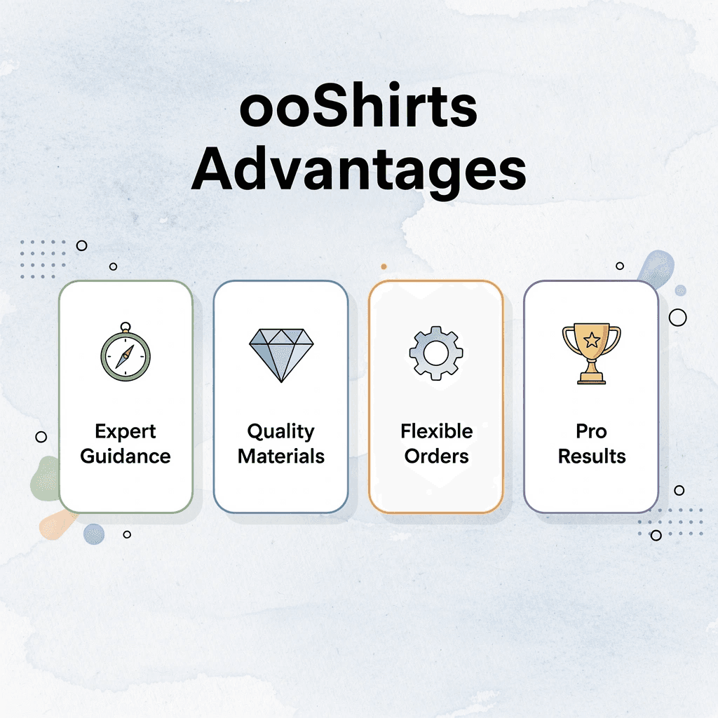
How ooShirts Can Help You Create the Perfect T-Shirt and Ink Color Combination
Your choice of printer makes or breaks color decisions. ooShirts removes technical barriers by combining expert guidance, quality materials, and flexible ordering. You get accurate colors, sharp contrast, and shirts that match your vision without a design degree or premium prices.

🎯 Key Point: ooShirts eliminates the guesswork from t-shirt printing by providing professional-grade results with user-friendly ordering.
“The right printer partnership transforms color matching from a technical challenge into a seamless creative process.” — Custom Apparel Industry Report, 2024
| ooShirts Advantage | Benefit |
|---|---|
| Expert Color Guidance | Accurate color matching |
| Quality Materials | Sharp, lasting prints |
| Flexible Ordering | No minimum requirements |
| Professional Results | Design-degree quality |
💡 Tip: ooShirts’ streamlined process means you can focus on creative decisions while they handle the technical execution for professional results.
Expert Design Review Catches Problems Before Printing
Most people upload a design and hope the final shirt matches their screen preview. The contrast looks perfect on a monitor but fails under gym lighting. The ink color is absorbed by the fabric, making it appear muddy rather than bold. ooShirts solves this with our Expert Design Review, in which experienced staff review your artwork before production begins.
We suggest the best shirt bases for your ink choices, recommend changes to improve visibility, and flag potential issues like insufficient contrast or problematic color pairings. A bright yellow design that would disappear on a cream shirt gets redirected to navy. A detailed logo with thin lines gets resized, and those details vanish in print. You receive professional input that prevents costly mistakes.
High-Quality Inks Deliver Colors That Last
Cheap inks fade after three washes or crack across the chest after a single dryer cycle. Our premium inks retain their brightness and flexibility through repeated washing. Our screen printing creates thick, opaque layers that stand out against any fabric color, while our DTG printing delivers accurate color reproduction for complex designs. Customers report that prints stay sharp and colors remain true even after dozens of washes. Quality materials ensure your color combinations work as intended for the garment’s lifetime.
Low Price Guarantee Removes Budget Compromise
Local print shops often force impossible choices: order fewer shirts, choose cheaper materials, or simplify your design to reduce the number of ink colors. These compromises undermine your carefully planned color combinations. Founded in 2007 by a high school student who couldn’t afford expensive custom shirts, ooShirts built its business around making professional printing accessible. Our Low Price Guarantee matches any lower online price you find, eliminating budget barriers that force compromise. You can afford the right shirt base, optimal ink colors, and an expert review that ensures everything works together. Small nonprofits order vibrant neon yellow on navy without cutting quantity. School groups get sharp white text on royal blue at prices that fit tight budgets. Quality color combinations become achievable instead of aspirational.
How do no-minimums enable better testing of T-shirt and ink color combinations?
Regular printers require minimum orders of 24, 50, or even 100 shirts, making it impossible to test color combinations before committing to a large purchase. ooShirts eliminates this risk by offering no minimum orders and free shipping on every purchase. Order a single sample shirt to test your color pairing in real conditions: check how the ink looks under different lighting, photograph it against varied backgrounds, and wash it to confirm durability. This flexibility transforms color selection from guesswork to informed decision-making.
Why does customer support matter for color decisions?
But the best materials and expert guidance matter only if you can get help when questions arise or problems occur.
Start Designing Your Custom Shirts Today
You’ve picked combinations that could change your next event or campaign. Most people hesitate to move from screen to fabric because local print shops demand high minimums, dismiss small orders, or deliver colors that don’t match the mockup. That gap between idea and execution stops great designs before they start.

🎯 Key Point: Custom printing shouldn’t require a big budget or a design degree. When a high school student can’t afford expensive quotes for a club fundraiser, or a nonprofit gets turned away because their order is “too small,” the system is broken. The barrier isn’t your design skills—it’s access to affordable, reliable printing that treats every order with equal care.
“The barrier isn’t your design skills—it’s access to affordable, reliable printing that treats every order with equal care.”
That’s why cheap custom T-shirts remove minimums entirely and guarantee low prices whether you need one sample or five hundred shirts. Our printing process lets you test neon yellow on navy with a single shirt before committing. Expert design review catches contrast issues before printing, and our top-tier inks keep your chosen combinations vibrant through dozens of washes. Free shipping means no hidden costs derailing your budget.
💡 Tip: Start your design at ooShirts.com right now. Upload any combination from this guide and get an instant quote with zero commitment. The support team answers questions seven days a week, walking you through every decision. Thousands of customers have already turned these ideas into shirts they actually wear.
Your favorite combination stays theoretical until you print it. Go create something that stands out.
Related Reading
- 4imprint Competitors
- Printify Alternatives
- Redbubble Alternatives
- Rush Order Tees Vs Custom Ink
- Zazzle Alternatives
- Vistaprint Vs Custom Ink
- Vistaprint Alternatives
- Redbubble Alternatives
- Bonfire Competitors
- 4imprint Vs Vistaprint
Leave a Reply