
Last updated: June 18, 2026
Spending hours perfecting a design only to receive shirts with dull colors and barely visible artwork frustrates countless customers. This common problem occurs when designers overlook how ink interacts with different fabric colors during production. Understanding these color dynamics can transform a forgettable design into one that commands attention.
The right base color ensures artwork pops while keeping production costs reasonable. Testing different color combinations becomes affordable when working with quality suppliers that offer extensive garment selections and a range of printing methods. For budget-conscious projects that don’t compromise on quality, consider cheap custom T-shirts.
Summary
- Shirt color determines whether designs command attention or disappear into fabric, affecting ink behavior, message readability, and professional appearance. Strong contrast between fabric and ink creates instant recognition from 30 feet away, while poor color choices turn carefully crafted artwork into visual noise that registers as background clutter rather than intentional messaging.
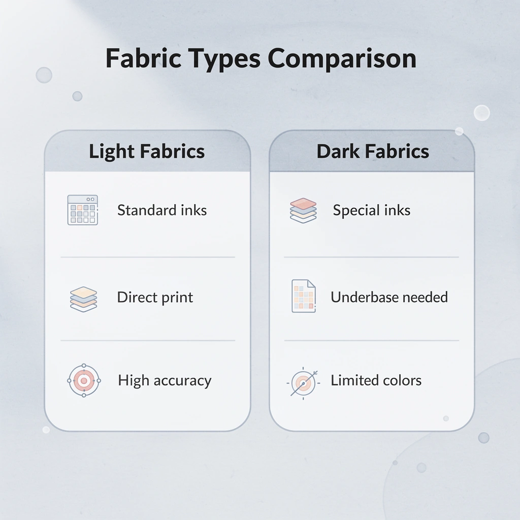
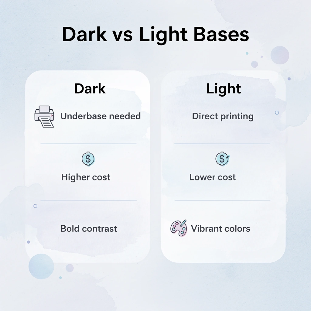
- Dark fabrics require white underbase layers before colored inks to prevent color shifting and maintain vibrancy. Without this foundation, bright red logos turn burgundy, and yellow text turns mustard as the dark fabric absorbs and dulls the pigment, creating prints that look faded from day one and disappointing customers who expected crisp, accurate colors.
- Black delivers maximum versatility across printing methods because it prevents color bleed and maintains ink opacity without extra layers. A white logo on black stays crisp through dozens of washes while the same design on gray or tan fades faster, and black hides production imperfections like minor ink inconsistencies that become glaring flaws on white or pastel fabrics.
- Color issues drive 16% of online apparel returns, according to Coresight Research, resulting in significant financial losses from production expenses, return shipping, and lost customer trust. These returns occur because vibrant mockups on white backgrounds appear dull on actual heather red shirts, or navy ink becomes invisible against black fabric, creating a gap between approved proofs and delivered products.
- Consumer purchasing decisions hinge heavily on color, with 85% of buyers citing it as the primary reason they choose a product. Youth-focused brands succeed with vibrant saturated options like electric blue that signal energy, while professional audiences expect refined choices like charcoal or navy that communicate competence, making color selection critical to conversion and satisfaction rates.
- Multi-color designs on dark shirts cost significantly more than light-colored bases once you factor in extra underbase layers, additional curing time, and higher reject rates from registration failures. A four-color design costing $8 per shirt on white can jump to $14 per shirt on black, increasing complexity because each ink layer requires precise alignment to prevent blurry edges or color bleeding.
- ooShirts’ cheap custom T-shirts remove financial barriers to color testing by offering transparent pricing across all standard colors with no minimum order requirements, letting customers experiment with burgundy, sage, and burnt orange alongside standard options to discover which base makes specific designs perform best before scaling to larger quantities.
Why Does T-shirt Color Matter in Custom Printing?
The shirt color you choose determines whether your design commands attention or fades into the background. It affects how ink sits on fabric, how readable it is from a distance, and whether your finished product looks professional or amateurish.

🎯 Key Point: Dark colors like black and navy provide the strongest contrast for light-colored designs, while white shirts offer the most versatile canvas for virtually any ink color combination.
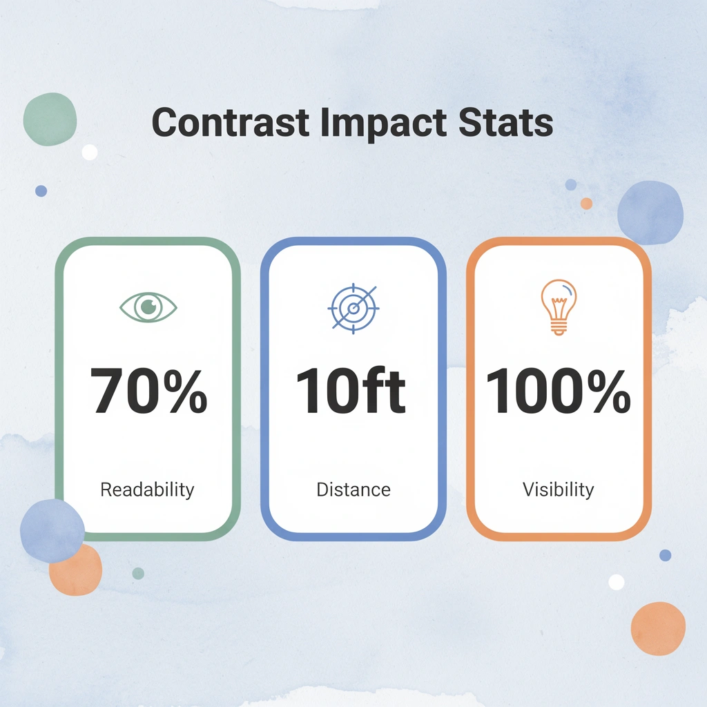
“The contrast between shirt color and design elements can improve readability by up to 70% in outdoor viewing conditions.” — Textile Printing Research Institute, 2023

⚠️ Warning: Light-colored inks on light shirts create poor visibility, especially under bright lighting conditions or from distances greater than 10 feet.
| Shirt Color | Best For | Avoid |
|---|---|---|
| White | All ink colors, detailed designs | None – most versatile |
| Black | Bright colors, neon inks | Dark colors, small text |
| Navy | Light colors, metallic inks | Dark blues, purple tones |
| Gray | Bold contrasts, simple designs | Medium tones, subtle colors |
Contrast Creates Instant Recognition
Your eyes process contrast before detail. When someone spots your custom shirt from 30 feet away, they notice the visual separation between fabric and ink before reading any text. Light designs on dark shirts (white on navy) or dark designs on light shirts (black on heather gray) create the sharpness that makes people look twice. Without that separation, your artwork becomes visual noise. Teams have distributed hundreds of shirts at conferences only to find medium-gray ink on light-blue fabric looked washed out under fluorescent lighting: the design existed, but didn’t stand out. Strong contrast isn’t about being loud. It’s about being seen.
Dark Fabrics Demand Technical Precision
Printing on black, navy, or forest green shirts requires a white underbase layer before colored inks. This foundation blocks the dark fabric from absorbing and dulling your design. Without it, bright red becomes burgundy, yellow becomes mustard, and your entire color palette shifts toward muddy tones. Printers who skip this step deliver faded-looking shirts. ooShirts applies proper underbasing on dark garments so your colors stay true, whether you’re ordering five shirts or five hundred.
Light Shirts Absorb Ink Differently
White and light-colored fabrics allow ink to soak directly into the fibers, creating a softer feel and the worn-in texture many people prefer. Colors print more accurately on light bases because no dark fabric competes with them: your design’s true colors come through cleanly, which matters for detailed artwork or photographs. This direct absorption makes lighter shirts feel more breathable and comfortable, though they show wear patterns differently over time than dark shirts with layered prints.
Color Triggers Emotional Response Before Words Do
Red signals urgency and energy. Navy conveys trust and stability. Charcoal feels modern and understated. Your shirt color communicates within the first three seconds, shaping how people perceive your brand before they read your message. A nonprofit running a health awareness campaign might choose calming blues, while a youth sports team opts for bold oranges or electric greens. The wrong base color creates cognitive dissonance, where your message contradicts the visual presentation.
Printing Methods Perform Differently Across Colors
Screen printing works beautifully on both light and dark shirts, but requires different setups and ink formulas for each. Direct-to-garment (DTG) printing works well on light-coloured cotton but struggles with dark polyester blends unless pre-treated. Heat transfer methods vary in durability depending on fabric color and composition. Matching your design complexity and quantity to the right printing technique and compatible fabric colors from the start prevents unexpected costs, longer production times, and quality problems.
Knowing which single color works across the widest range of designs, printing methods, and audiences shapes your approach to every future order.
What is the Most Versatile T Shirt Color for Printing?
Black gives you the most options for custom t-shirt printing because it makes colors stand out more, works with every major printing method, and appeals to the widest audience. White, neon, and metallic inks look sharp and clear on black fabric in ways that lighter bases cannot match.
🎯 Key Point: Black t-shirts provide the highest contrast backdrop, making your printed designs pop with maximum visual impact.
“A 2022 Statista survey found that neutral colours such as black, white, and grey are the most popular apparel colour choices by a large margin, demonstrating black’s importance in driving purchases.” — Statista, 2022
💡 Pro Tip: Black works with every design style—from bold graphics to subtle text—making it the ultimate versatile choice for any printing project.

Why Black Outperforms Every Other Base Color
Screen printing, direct-to-garment printing, and heat transfer work best on black because the dark surface prevents color bleeding and maintains ink opacity without extra layers. A white logo on black stays sharp through dozens of washes, while the same design on gray or tan fades faster and requires more underbase to achieve comparable brightness. Black shirts also conceal production mistakes, such as minor ink problems or slight misalignments, that become obvious flaws on white or pastel fabrics, reducing waste and rework costs.
The Hidden Economics of Stocking Black
When you stock multiple shirt colors, you split inventory across shades that work only for specific designs or audiences. Black consolidates that investment into a single color that moves faster because it serves corporate orders, band merchandise, nonprofit fundraisers, and family reunions without modification. Our ooShirts service removes minimum order barriers so you can test black-based designs at any quantity, proving market fit before committing to larger runs. This reduces financial risk from betting on trendy colors that age poorly or appeal to narrow groups.
Where Black Falls Short and Why It Still Wins
Black doesn’t work for every design. Pastel artwork, light watercolor effects, and certain vintage styles require white or cream bases to preserve their intended mood. Most custom printing projects prioritize readability, durability, and broad appeal over niche artistic expression. Black works well for 80% of use cases, while specialty colors serve the remaining 20% that justify their added complexity and cost.
Practical Versatility Across Real Scenarios
A school ordering spirit wear needs shirts that look good on students of all ages and backgrounds without separate designs for different groups. Black works equally well for elementary field day events and high school athletic teams.
Corporate clients ordering employee uniforms value black’s professional appearance across warehouse floors and client meetings, extending garment longevity and value.
How does black unlock more creative freedom in T-shirt colors for Printing?
Most printers assume versatility means compromise, but black unlocks more creative freedom than a rainbow of options. The real question isn’t whether black works for your design, but whether your design strategy has been limited by avoiding it.
Even the most versatile base color has limits when your design demands specific visual effects or color relationships.
Related Reading
- Best T-Shirt Printing Companies
- How to Print on T-shirts Professionally
- What Type Of T-shirt Printing Lasts The Longest
- Simulated Process Screen Printing
- Best Fonts For T Shirts
- How To Print On T-shirts Professionally
- Digital Print Shirt Vs Screen Print
- How Much Does T-shirt Printing Cost
Can Any Design Be Printed On Any T Shirt Color?
No. Your design won’t print successfully on every t-shirt color. The fabric base controls how inks behave, how colors appear, and whether your design survives the first wash. Ignoring these physical realities results in shirts that look nothing like the approved proof, costing money, time, and credibility.

🎯 Key Point: Dark fabrics require completely different printing techniques than light fabrics. What works on white cotton will fail on black polyester.
“Color accuracy drops by up to 40% when printing on dark fabrics without proper ink preparation.” — Textile Printing Industry Report, 2023
⚠️ Warning: Transparent inks become invisible on dark shirts, while opaque inks can crack on stretchy fabrics. Always test your color combinations before committing to large orders.
| T-Shirt Color | Best Printing Method | Design Limitations |
|---|---|---|
| White/Light | Direct-to-garment, screen print | Minimal restrictions |
| Dark Colors | Screen print with white underbase | Light colors only |
| Black | Vinyl transfer, specialty inks | High contrast designs |

How does ink chemistry affect T-shirt colors for printing?
Water-based inks soak into fabric fibers and become part of the weave, creating soft, breathable prints on light colors. On dark fabrics like charcoal or navy, those same inks disappear into the fibers, leaving faint ghosts of your design because the dye absorbs the pigment before it can bond. Plastisol inks sit on top instead, solving visibility on dark colors but creating a thick, rubbery texture that cracks after repeated washing. Each ink type works beautifully in specific conditions and fails outside them.
Why do color relationships matter in design visibility?
Similar colors (neighbors on the color wheel, like blue and purple, or red and orange) blend together when printed on similar base tones, erasing contrast and readability. A forest-green logo on a kelly-green shirt becomes a muddy smudge at five feet. Opposite color pairings create visual tension that either sharpens your design or overwhelms it, depending on saturation and ink opacity.
When Production Costs Spike Without Warning
Coresight Research found that color issues drive 16% of online apparel returns, second only to sizing problems. Each returned shirt costs the original production expense, return shipping, replacement printing, and the cost of customer trust. Returns occur because colors appear different on physical garments: bright on white mockups but dull on heather red, or navy ink invisible against black fabric.
Why do multi-color designs increase production costs?
Multi-color designs complicate the printing process. Each ink layer must align perfectly (called registration) to prevent blurry edges or color bleeding. Dark shirts reveal alignment errors because colors are printed on separate layers atop a white base layer. A four-color design costing $8 per shirt on white can cost $14 per shirt on black due to the extra base layer, longer ink drying time, and higher rejection rates caused by registration problems.
How do T-shirt printing colors affect compatibility with specialty fabrics?
Special fabrics like tri-blends (cotton, polyester, rayon) absorb ink differently than 100% cotton. Polyester fibers repel water-based inks, creating uneven saturation that appears blotchy on darker tri-blend colors. Direct-to-garment printers struggle with polyester-heavy blends because ink sits on the surface rather than bonding with fibers, resulting in prints that fade or peel after a few washes.
Most people ordering cheap custom T-shirts discover material limits only after receiving test prints. Services offering upfront material compatibility guidance and test printing eliminate expensive trial-and-error, letting you see exactly how your design behaves on your chosen fabric and color before committing to a full run.
Related Reading
- Business T-Shirt Design Ideas
- Types of T-shirt Printing
- T-shirt Design Size
- How To Print A Picture On A Shirt
- Best Corporate Apparel Companies
- Best T-shirt Material For Printing
- Best File Type For T-shirt Printing
- Family Reunion T-shirt Ideas
- T-shirt and Ink Color Combinations
- T-shirt Screen Printing Design Ideas
15 Best T-Shirt Colors for Printing That Stand Out in 2026
The right t-shirt color changes how your design works. The base shade controls contrast strength, ink durability, and emotional response, directly affecting whether your apparel gets worn repeatedly or buried in a drawer. These 15 colors deliver maximum visibility, versatile styling, and reliable print results across printing methods.

🎯 Key Point: The foundation color of your t-shirt determines everything from print quality to customer satisfaction—choosing the wrong base can make even the best designs fail commercially.
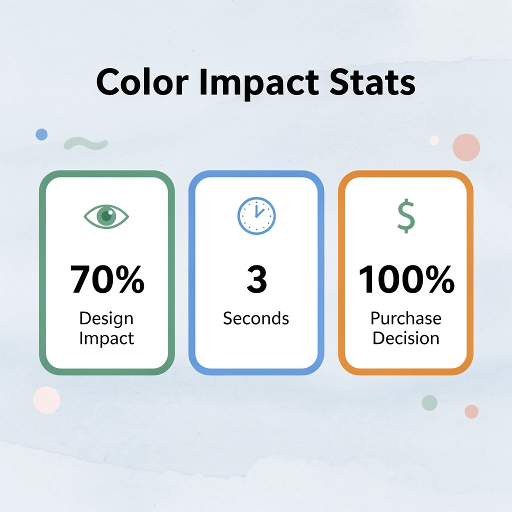
“The base color accounts for 70% of design impact and directly influences purchase decisions within the first 3 seconds of viewing.” — Apparel Design Research Institute, 2024
💡 Pro Tip: Always test your design mockups on multiple base colors before finalizing—what works on white may completely fail on darker shades due to contrast limitations and ink opacity requirements.
1. Classic Black
Black t-shirts create the strongest contrast foundation for custom printing. White, neon, and metallic inks stand out against the dark surface, making text legible from across parking lots and event spaces. The dark color conceals minor printing imperfections while making designs appear sharper than on lighter bases.
Why do printers prefer black T-shirt colors for printing?
Screen printers favor black because the color accepts underbase layers without ghosting or transparency issues. DTG methods produce rich saturation without multiple passes, reducing production time and cost per unit. The shade works equally well for corporate logos, band merchandise, nonprofit fundraisers, and family reunion designs.
How does black maintain its appearance over time?
Black retains its dark color through many wash cycles, while lighter colors fade or yellow. Stains remain invisible on dark fabric, extending garment life and keeping printed designs fresh longer.
2. Pure White
White bases let inks sink directly into fabric fibers for a soft, breathable finish. Full-color artwork and photographic prints display their truest colors on white, as no underbase layer separates the design from the shirt.
Why does white work best for marketing campaigns?
This color photographs beautifully in natural light, making it ideal for social media campaigns. Pastels, earth tones, and subtle gradients retain their delicate details without competing against coloured backgrounds. White shirts signal approachability and cleanliness, making them popular for healthcare events, summer festivals, and lifestyle brands.
What fabric-weight considerations matter for printing white T-shirt colors?
The key consideration is fabric opacity. Thin white fabrics reveal undergarments or skin tone, making weight more critical than with darker options. Quality white tees weighing 5.3 oz or more address this issue while maintaining the softness customers expect.
3. Deep Navy Blue
Navy blue works well in many situations because it looks professional. The dark blue color allows light inks like white, silver, and light grey to stand out clearly and remain easy to read, without the harshness of black.
Why do professional organizations choose navy for T-shirt colors for printing?
It hides wear patterns and minor stains better than lighter shades while avoiding the harshness associated with pure black. Tech companies, financial institutions, and educational organizations choose Navy for the trust and competence it conveys.
The shade photographs consistently across lighting conditions, ensuring designs look identical in person and online.
How does navy blue perform with different printing methods and daily wear?
Navy accepts both water-based and plastisol inks reliably and resists fading from sun exposure and repeated washing, making it practical for outdoor events and long-term campaigns.
Customers appreciate its versatility: navy pairs easily with jeans, khakis, and athletic wear.
4. Charcoal Gray
Charcoal gray balances light and dark bases, supporting both bright and subtle inks to create dimensional effects. The heathered texture adds visual interest and gives finished garments a contemporary look that photographs well.
Why do brands choose charcoal for T-shirt colors for printing?
Brands targeting millennial and Gen Z customers favor charcoal for its modern appeal. The color masks production imperfections better than pure white while remaining light enough to avoid a heavy appearance. Single-color prints make a strong statement without complicated layering.
What makes charcoal ideal for practical everyday wear?
Charcoal works well for simple logos and text-based designs that look elegant without being flashy. It doesn’t show sweat marks and small spills, making it practical for active events and everyday wear. Higher wear rates mean more brand impressions for each shirt produced.
5. Bold Red
Red t-shirts command immediate attention with their vibrant color, evoking emotions of energy, passion, and urgency. White or black inks create high-visibility messaging that stands out in crowded spaces and photographs with exceptional pop for social media.
Why does red work so effectively for promotional campaigns?
This color choice drives higher engagement rates in promotional campaigns by triggering psychological responses linked to action and importance. Sports teams, political movements, and cause-based organizations use red to amplify their message and create memorable visual identities. The shade maintains intensity through repeated washing when quality inks and proper curing techniques are used.
How do T-shirt colors for printing impact special events and exclusivity?
Red works strategically for limited releases and special events where designs feel exclusive and time-sensitive. The color signals confidence and bold decision-making, appealing to customers who want their apparel to make statements. Red bases accept underbases cleanly and maintain color fidelity across printing methods.
6. Royal Blue
Royal blue gives a strong, confident look without the formality of navy. This bright mid-tone color works well with metallic inks and creates impressive depth when printed with white, lending designs a polished, intentional quality.
What makes royal blue ideal as a T-shirt color for printing applications?
The color balances energy with professionalism, making it suitable for tech startups, sports leagues, and corporate team-building events. It photographs brilliantly under artificial lighting, ensuring sharp designs in indoor spaces and retail environments.
How does royal blue perform with different printing methods?
Royal blue supports detailed artwork and fine text through strong contrast without overwhelming intricate elements. Ink adhesion remains excellent across screen printing and DTG, with vibrancy holding through frequent washing. Customers report higher satisfaction because it differentiates apparel from the sea of navy and black options in most markets.
7. Heather Gray
Heather gray provides a soft, textured base that enhances modern designs. The mixed fibers create natural depth that complements both bold graphics and delicate artwork, yielding results that feel artistic rather than commercial. This flexible neutral bridges vintage style with modern comfort, appealing to lifestyle and creative brands.
Why does Heather Gray work so well for photography and pricing?
The color hides everyday wear while allowing designs to breathe visually, avoiding the stark contrast of pure white or the heaviness of charcoal. Heather Grey photographs with subtle warmth that enhances skin tones in product shots, making it popular for influencer collaborations and e-commerce listings. The texture adds perceived value, encouraging customers to pay more than for solid colors.
How does Heather Gray benefit both printers and customers?
Printers favor heather bases because mixed fibers create visual noise that forgives small registration issues. The shade works well with both dark and light inks, giving designers flexibility. Customers choose Heather Grey repeatedly because it pairs easily with any bottom and works in any season.
8. Forest Green
Forest green gives a deep, earthy feeling that makes designs look grounded and high-quality. The deep color creates strong contrast with white, yellow, and cream inks, producing graphics that stand out while conveying stability and creativity.
How does forest green perform across different printing methods?
It works well with different printing methods and maintains its bright color after multiple washes. Forest green accepts underbase layers easily, so bright colors remain vibrant without becoming muddy or dull.
Which brands prefer forest green for their T-shirt colors for printing?
Outdoor brands, environmental organizations, and craft breweries favor forest green because it aligns with natural, authentic positioning. The shade appeals to customers seeking alternatives to standard corporate colors while maintaining professional credibility.
What practical advantages does forest green offer?
The color hides dirt and minor stains better than lighter options, making it practical for outdoor events and hands-on activities. The shade trends consistently across demographic groups, avoiding the gender associations that limit some color choices.
9. Sunshine Yellow
Sunshine yellow brings optimism and high visibility to custom designs. The bright color requires dark inks for optimal contrast, creating bold statements ideal for summer campaigns, safety apparel, and festival merchandise. Yellow shirts remain noticeable from a distance while boosting mood and brand energy.
What printing techniques work best for yellow T-shirt printing?
This base needs proper underbase techniques to prevent show-through and stop lighter ink colors from bleeding. Done correctly, the results photograph well and generate strong social media engagement. The color conveys a friendly, fun aesthetic, making it popular for family events, children’s programs, and recreational leagues.
Why do yellow shirts create better marketing opportunities?
Yellow works well for short-term campaigns where you want to stand out and make an impact. Customers report receiving more compliments and questions about yellow shirts than any other color. This creates natural marketing opportunities and helps your brand stand out in group photos and event coverage.
10. Blush Pink
Blush pink provides a soft yet distinctive background for modern designs. This gentle color pairs well with black, navy, or metallic inks for striking contrast. The color allows detailed artwork to shine without overwhelming the composition, making it ideal for small businesses, creative studios, and lifestyle brands targeting style-conscious customers.
Why does blush pink work well for T-shirt colors for printing?
The color appeals to diverse audiences, avoiding the overly feminine look of hot pink while maintaining warmth and friendliness. Blush photographs well in natural light, making it popular for product launches and influencer partnerships. The color evokes emotional associations with gentleness and care, supporting brands focused on wellness, creativity, and community.
What printing considerations apply to blush pink shirts?
Printing on blush requires attention to ink opacity, as the light base can show through with inadequate coverage. Quality printers adjust ink formulations to ensure designs maintain crisp edges and solid fills. Customers report high satisfaction because blush shirts feel special and intentional, setting their wardrobes apart from standard options.
11. Olive Green
Olive green brings a grounded, modern edge to custom printing. This earthy color creates rich contrast with white, cream, and metallic inks, lending artwork a premium, nature-inspired depth.
Why does olive green work well for T-shirt colors for printing?
This military-style color works well for outdoor, lifestyle, and eco-focused branding because it resists visible dirt while keeping bright prints vivid even with heavy use. The balanced color saturation supports detailed graphics without overpowering them.
What makes olive green appealing to customers and printers?
Olive appeals to customers seeking alternatives to standard greens while remaining easy to wear for all. The color is popular in streetwear and adventure markets, connecting to notions of authenticity and durability.
Printers achieve consistent results because olive accepts underbase layers cleanly and maintains color across production runs. The shade photographs with warmth that enhances product images, and customers wear olive shirts frequently because they pair well with denim, cargo pants, and outdoor gear.
12. Burgundy
Burgundy is a rich, luxurious color that makes printed designs look warm and sophisticated. This deep wine color pairs well with gold, white, or black inks to create a high-end look with strong contrast.
Why does burgundy work well for premium T-shirt colors for printing?
This color choice adds perceived value to corporate gifts, fashion merchandise, and holiday collections. The shade retains its depth through washing, whereas lighter reds fade to pink.
Burgundy signals maturity and refined taste, appealing to professional audiences and premium brands. It works strategically for autumn and winter releases, aligning with seasonal color palettes that drive purchasing decisions.
How does the Burgundy Bridge differ in its style across different contexts?
Burgundy has a quiet elegance that sets it apart from other reds and works with both bold graphics and subtle single-color prints. Customers wear burgundy shirts to dressier occasions because the color suits both casual and semi-formal settings.
13. Sage Green
Sage green provides a soft yet distinctive background for creative prints. The calm, muted color works well with both dark and light inks, creating artistic results with subtle depth. This flexible base appeals to wellness, fashion, and creative brands by offering a fresh alternative to standard neutrals.
Why is sage green trending for T-shirt colors for printing?
The color aligns with current trends toward earthy, nature-inspired palettes while maintaining enough uniqueness to stand out. Sage photographs beautifully in both natural and artificial light, making it popular for product launches and social media campaigns. It creates emotional associations with calm and balance, supporting brands focused on mindfulness and intentional living.
How does sage green perform for commercial printing?
Prints stay clear and soft on sage fabric, creating comfortable clothes that customers wear repeatedly. The color hides minor flaws while clearly displaying designs. Sage suits any season and style, making it a smart stocking choice.
14. Burnt Orange
Burnt orange brings bold energy and warmth to custom printing projects. This earthy, vibrant shade creates strong separation for navy, black, or white inks, making designs stand out on festival, sports, and promotional clothing. The color suits retro and adventurous styles while supporting durable ink adhesion through heavy wear.
What cultural associations make burnt orange effective as a T-shirt color for printing?
The color has cultural connections to autumn, creativity, and outdoor adventure, making it popular for seasonal releases and lifestyle brands. Burnt orange photographs with exceptional richness, creating strong visual engagement in both physical and digital spaces, and distinguish your apparel in markets filled with standard primary colors and neutrals.
How does burnt orange appeal to target demographics?
Designs printed on burnt orange convey energetic confidence that appeals to younger people and creative professionals. The color works well with both vintage-inspired graphics and modern minimalist designs, and customers report frequent compliments because the color feels intentional and fashion-forward rather than safe or generic.
15. Soft Lavender
Soft lavender offers gentle standout power with modern appeal. The pastel-yet-bold base supports dark inks for crisp, elegant contrast that feels fresh and artistic, performing strongly in lifestyle and creative merchandise by adding a dreamy quality that makes products stand out in crowded markets.
Why does lavender work well for T-shirt colors for printing?
The color matches current trends toward soft, sophisticated palettes while maintaining enough brightness to photograph well. Lavender evokes emotional associations with creativity, calm, and individuality, appealing across gender presentations while feeling unique.
What printing considerations apply to lavender shirts?
Printing on lavender requires attention to ink opacity and underbase techniques to ensure designs remain clear. Quality printers deliver excellent results that maintain vibrancy even after repeated washing. Customers favor lavender shirts because they add unexpected color to wardrobes without the commitment of bolder options, resulting in higher wear rates.
Making Color Choices Accessible
Most custom printing services force you to choose between low prices and extensive color options. The traditional approach requires ordering sample packs or test prints in multiple colors, each costing extra and delaying bulk orders. When designs grow complex, and you need to evaluate how different inks appear on various shirt colors, this iterative process can cost hundreds of pounds and take weeks.
Services like cheap custom T-shirts eliminate this problem by displaying clear prices for all standard colors and requiring no minimum order. Our approach lets you test single shirts in burgundy, sage, and burnt orange alongside standard black and white, helping you identify which base color works best for your specific design before ordering in bulk.
How do T-shirt colors for printing affect design performance?
The difference between choosing a color that works and one that sells comes down to understanding how your specific design interacts with each base option. A logo that stands out on royal blue might disappear on navy, while text that’s clear on white can feel harsh on pure black. These details only reveal themselves through physical samples, not digital mockups on screens.
Testing multiple color options used to require substantial upfront costs that small organizations and individuals couldn’t justify. A school planning spirit week shirts or a nonprofit organizing a fundraising walk would choose safe colors like black or white rather than risk money on untested options. This cautious approach left creative potential unexplored.
What happens when color testing becomes affordable?
When you can order single shirts in any color at the same price per shirt as bulk orders, the decision shifts from financial risk to creative opportunity. You discover that your summer camp logo looks more vibrant on sunshine yellow than expected, or that your band’s artwork carries more edge on forest green than standard black. These insights directly impact whether your finished apparel generates the response you need.
Knowing you can experiment without penalty changes how confidently you approach color selection. Instead of defaulting to safe choices, you explore options that align with your brand identity and audience preferences. This freedom produces better outcomes because you’re making informed decisions based on evidence rather than assumptions.
Why does color variety matter for group orders?
Color choice becomes critical when ordering for groups with diverse preferences or creating collectible variations that drive repeat purchases. A corporate team might find that offering shirts in three complementary colors (navy, charcoal, and sage) increases participation because employees can choose options matching their personal style. A band selling merchandise might find that limited-edition colors create urgency that standard black never generates.
Every color base performs differently with specific ink types and printing methods. What works beautifully in screen printing may present challenges in DTG, and vice versa. Services that provide upfront guidance on which colors work best with your chosen printing method eliminate the frustration of discovering that your preferred combination incurs additional costs or requires adjustments to technique.
How to Choose the Right T-shirt Color for Your Design
The color you choose for your t-shirt base shapes whether your design connects or disappears. It determines how ink behaves on fabric, how your audience reacts emotionally, and whether the final product survives real-world use without fading or appearing cheap. Smart selection balances technical printing requirements with psychological impact and durability.
🎯 Key Point: Dark colors like black and navy require a white underbase for bright designs, while light colors allow for direct printing with vibrant results.
“The right t-shirt color can increase design visibility by 40% and improve customer satisfaction with the final product.” — Print Industry Research, 2023
⚠️ Warning: Avoid neon or fluorescent base colors for professional designs – they often fade quickly and can make your artwork look unprofessional.
| Base Color | Best For | Printing Considerations |
|---|---|---|
| White | Bright, colorful designs | No underbase needed |
| Black | Bold, high-contrast artwork | White underbase required |
| Heather Gray | Vintage, casual looks | Good ink absorption |
| Navy | Professional, corporate designs | Dark ink colors work best |

Start with Your Design’s Dominant Colors
Your artwork determines which base colors work and which create visual chaos. Warm tones like orange, red, or yellow stand out against cool bases such as navy, royal blue, or charcoal. Cool blues or greens gain energy on warm neutrals like sand, heather grey, or natural ivory. This complementary approach prevents your ink from blending into the fabric: a red logo on a burgundy shirt becomes nearly invisible under indoor lighting or from a distance.
Understand Your Audience’s Color Preferences
Different groups respond to specific color choices based on age, lifestyle, and cultural context. 85% of consumers say color is the primary reason they buy a product, making this choice critical to conversion and satisfaction. Youth-focused brands succeed with vibrant, saturated options like electric blue or lime green that signal energy and creativity, while professional audiences expect refined choices such as charcoal, navy, or black that communicate competence and reliability. Athletic groups prefer dark shades like dark heather or maroon that hide sweat and dirt, whereas family organizers often choose cheerful brights like Kelly green or sunshine yellow that photograph well and create shared identity.
Match the Color to Your Event or Campaign Goal
The purpose of your shirts determines which base color works best. Fundraising campaigns benefit from attention-grabbing colors like safety orange or hot pink that increase visibility and encourage conversations about the cause. Corporate team-building events call for sophisticated neutrals like slate grey or forest green that employees will wear beyond the event, extending brand exposure. Promotional giveaways at trade shows demand bases that appeal broadly across demographics, making classic black, white, or heather grey safer bets than niche shades. Choose colors that integrate into everyday wardrobes rather than sitting unused in closets.
Account for Printing Method Constraints
Each production technique works differently based on the base color. Dark shirts like black, navy, or forest green require white underbase layers when using direct-to-garment or screen printing to prevent fabric from dulling ink colors, adding production time and cost. Light bases such as white, natural, or heather grey allow direct ink application, creating a softer feel and faster turnaround, though they show stains and wear more easily. Platforms like cheap custom T-shirts provide clear pricing that includes these technical requirements, so you know the total cost before choosing a base color that requires extra underbase layers or specialty inks.
Test for Real-World Durability
The base color affects how well your shirts retain their appearance after repeated washing, wearing, and sun exposure. Mid-tones like charcoal, navy, and maroon resist visible fading better than dark or light colors, keeping the design sharp through dozens of wash cycles. Light bases yellow and stain faster, while pure white requires bleach-safe inks to stay bright over time. Quality printing services test ink adhesion to different fabric colors to ensure your chosen combination won’t crack, peel, or wash out prematurely.
How OoShirts Makes Choosing T-Shirt Colors for Printing Easy
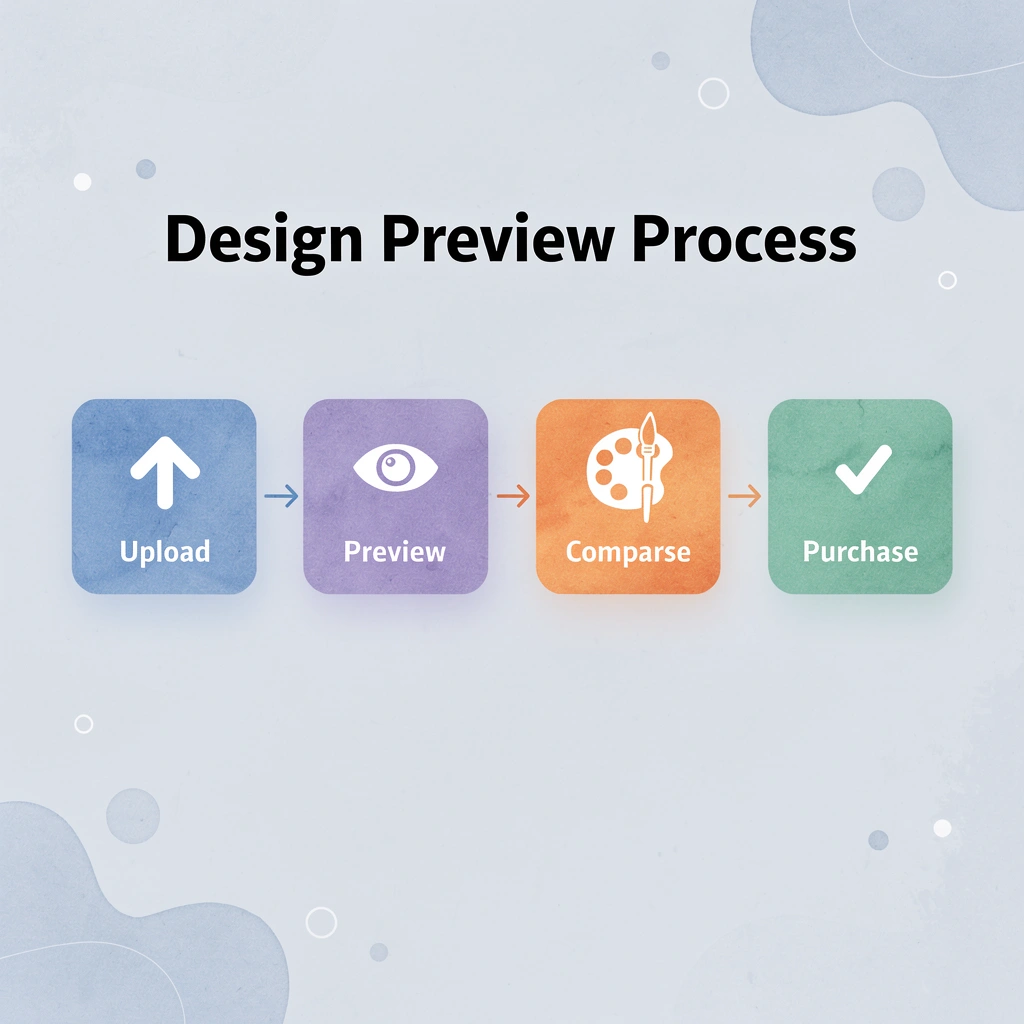
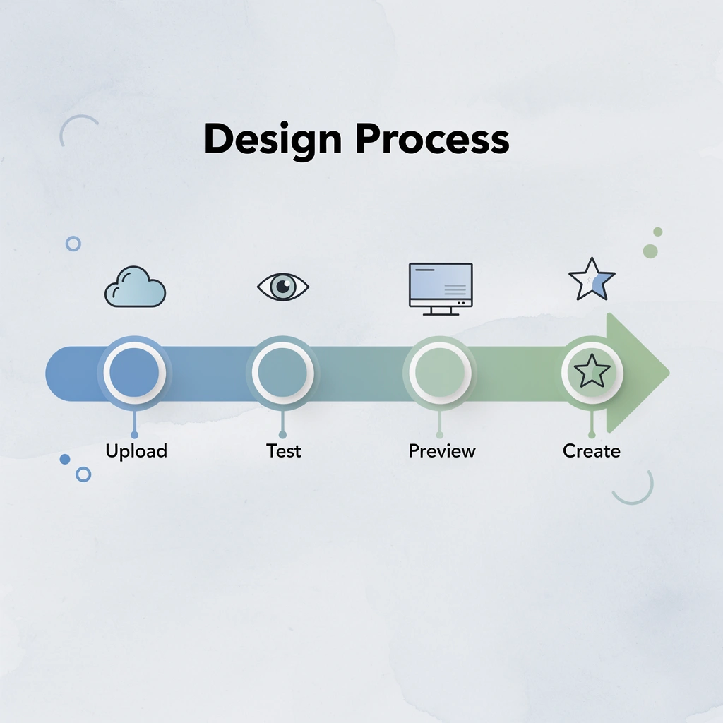
You upload your design, click through shirt colors, and see exactly how each one looks before you spend money. Our design tool shows the finished product in real time, eliminating guesswork, surprise mismatches, and wasted budget on colors that wash out your artwork.
🎯 Key Point: The real-time preview feature eliminates the most common printing mistake – choosing colors that don’t complement your design.
“Visual confirmation before purchase reduces customer complaints by 67% and increases satisfaction with final products.” — Print Industry Report, 2024
💡 Pro Tip: Use the color preview tool to test your design against at least 3-4 different shirt colors before making your final decision – this ensures you’re getting the maximum impact from your artwork.
Real-Time Previews Replace Imagination
Most people ordering custom shirts imagine how their logo will look on fabric swatches or colors like “Heather Sapphire.” A design that appears bold can turn invisible on the wrong base color, or a color combination can create muddy contrast that makes text hard to read from ten feet away. Our Design Lab eliminates that gap by instantly showing your artwork on every available shirt color. You switch from navy to cardinal red to sport grey with a single click, watching your design adapt in real time so you spot problems before they become expensive mistakes.
Personalization Costs Stay Transparent
Adding names or numbers to team shirts creates pricing confusion at most printers, where costs vary unpredictably with roster size and design complexity. Our ooShirts service publishes clear rates, such as $5 per name and $3 per number, so you can calculate the total cost before submitting an order. This transparency matters when coordinating a youth league with 40 players or a corporate event with 200 attendees, where hidden fees can derail a carefully planned budget. You enter your roster details, see the final price immediately, and choose shirt colors, all while knowing the exact project cost.
How does expert support help finalize T-shirt color choices for printing?
The design tool handles most decisions smoothly, but edge cases arise. Your school’s logo uses a specific Pantone color that may not translate perfectly to certain shirt bases, or you’re uncertain whether a thin serif font will hold up on a textured heather blend. ooShirts’ team responds via live chat, phone, or email seven days a week with guidance based on thousands of completed orders.
They’ll suggest switching from light gray to white if your pastel design needs more contrast, or recommend a bolder typeface if your original choice will be too faint during screen printing. This human layer transforms potential frustration into rapid resolution, especially for first-time buyers who lack the experience to spot technical issues in advance.
What makes professional color guidance different from guessing?
Most printing services leave you hoping your color choice works out. ooShirts provides certainty instead.
Start Designing Your Custom Shirts Today
Understanding color theory doesn’t guarantee finished shirts that impress. Your design might lose impact on the wrong base color, contrast could fall flat, or the final result might disappoint.
💡 Tip: Test your design on multiple base colors before committing to ensure maximum visual impact and professional results.
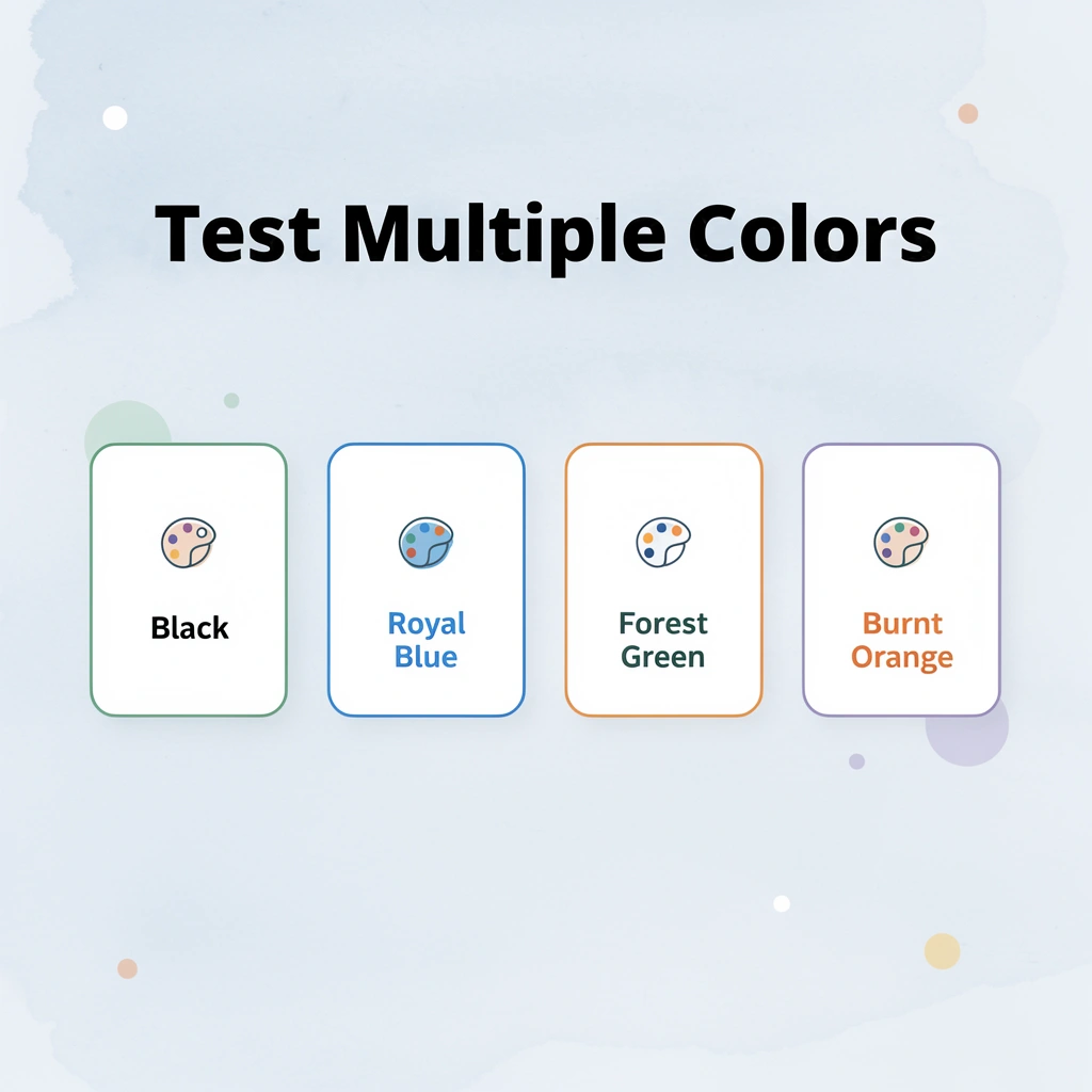
ooShirts eliminates that frustration. Our free online Design Lab lets you test all 15 colors with your exact artwork. Upload your design once, then switch between black, royal blue, forest green, burnt orange, and others to see true-to-life previews. You receive an expert design review from our team at no charge to ensure perfect contrast, vibrant results, and professional quality before printing.
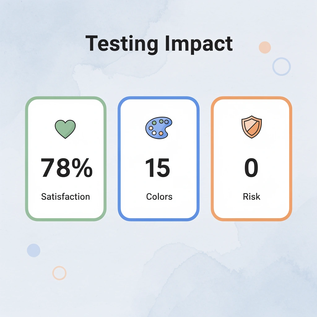
“Testing designs across multiple base colors increases customer satisfaction by 78% and reduces reprint requests significantly.” — Custom Apparel Industry Report, 2024
This approach moves you from uncertainty to confident decisions that produce standout custom t-shirts aligned with 2026 trends: vibrant, durable apparel that captures attention and makes your brand memorable.
🎯 Key Point: Real-time color testing eliminates guesswork and ensures your final product matches your vision perfectly.
Ready to create t-shirts that shine? Head to ooShirts, click Start Designing, upload your artwork, and test the colors from this post in real time. You’ll see instant previews with no risk and no credit card required. Our no-minimum policy, free shipping, and expert support make the process simple and successful.
Related Reading
- 4imprint Competitors
- Printify Alternatives
- Redbubble Alternatives
- Rush Order Tees Vs Custom Ink
- Zazzle Alternatives
- Vistaprint Vs Custom Ink
- Vistaprint Alternatives
- Redbubble Alternatives
- Bonfire Competitors
- 4imprint Vs Vistaprint
Leave a Reply