Typography is a key element in streetwear design, influencing brand identity and how your designs resonate with your audience. Whether you’re creating hoodies, t-shirts, or other apparel, here’s what you need to know:
- Why Typography Matters:
- It builds brand recognition.
- Connects your designs to urban culture.
- Ensures your message is clear and impactful.
- Streetwear Typography Basics:
- Inspired by graffiti styles like Wild Style, Bubble Letters, and Block Letters.
- Focus on bold strokes, clean edges, and balanced spacing for readability.
- Steps to Pick Fonts:
- Match fonts to your brand’s style (urban, minimalist, retro, etc.).
- Prioritize readability with size, contrast, and weight.
- Combine no more than 2-3 fonts for a polished look.
- Balance typography with other design elements like layout and negative space.
- Test fonts on actual clothing to ensure they work on fabric.
- 2025 Font Trends:
- Custom fonts tailored to brands.
- Y2K-inspired styles like chrome effects and glitch designs.
- Oversized text for bold statements.
To ensure your designs stand out, focus on readability, balance, and testing. Tools like ooShirts’ design lab can help you perfect placement and scaling before printing.
Creating A Typographic Streetwear Design in Photoshop …
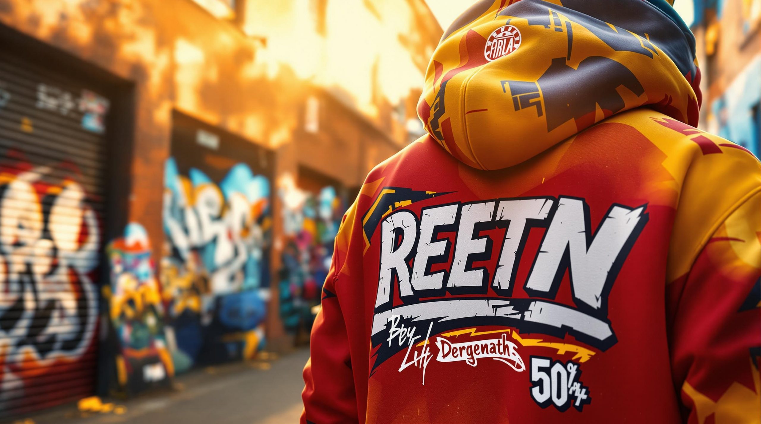
Streetwear Typography Basics
Typography in streetwear design goes beyond picking bold fonts. It’s deeply tied to urban culture, drawing from specific visual styles that make designs stand out on clothing.
Urban Style Origins
Streetwear typography traces its roots to New York’s graffiti scene of the 1970s and 1980s. Artists like TAKI 183 and SEEN introduced lettering styles that shaped today’s streetwear fonts:
- Wild Style: Features interconnected letters and sharp angles.
- Bubble Letters: Rounded, inflated shapes that emphasize boldness.
- Block Letters: Clean, geometric forms with sharp edges.
As hip-hop culture grew, it left a lasting mark on streetwear typography. For example, Supreme’s use of the Futura Heavy Oblique font in 1994 set a trend for bold, sans-serif designs that still influence streetwear today.
Common Font Features
Effective streetwear typography often includes these traits:
- Weight: Heavy fonts ensure visibility on fabric.
- Spacing: Generous letter spacing (tracking) improves readability, even from a distance.
- Contrast: Clear differences between thick and thin strokes.
- Scale: Fonts that work well at both large and small sizes.
Here’s a breakdown of key features and their uses:
| Feature | Purpose | Common Application |
|---|---|---|
| Bold Strokes | Ensures visibility | Logos, main text |
| Clean Edges | Improves print quality | Small text, intricate details |
| Consistent Weight | Creates visual harmony | Multiple text elements |
| Balanced Spacing | Enhances readability | Slogans, text layouts |
The best streetwear typography balances these elements while staying true to its urban roots. Modern designs often blend graffiti-inspired styles with contemporary techniques, resulting in fresh and memorable looks that resonate with today’s audience.
Keep in mind that streetwear typography must look good and stay readable when printed on various fabrics. Fonts need to maintain their impact across different garment types and printing methods. With these basics in mind, you’re ready to explore fonts that fit your streetwear vision.
5 Steps to Pick Streetwear Fonts
Match Fonts to Your Brand’s Style
Start by identifying your brand’s personality – whether it’s bold, edgy, minimalist, or retro. Urban-inspired designs call for fonts with distinct geometry and sharp edges.
| Brand Style | Font Characteristics to Look For |
|---|---|
| Urban/Edgy | Sharp angles, distressed details |
| Minimalist | Clean lines, evenly spaced characters |
| Retro-inspired | Vintage-style lettering, rounded edges |
| Contemporary | Geometric shapes, sleek modern curves |
Prioritize Readability
Make sure your text is easy to read by focusing on these key aspects:
- Size: Pick a font size that’s clear and legible.
- Contrast: Use colors that pop against the garment’s background.
- Weight: Opt for fonts with enough thickness to stand out in print.
Combine Fonts Thoughtfully
Stick to two or three fonts that work well together. A bold font for headlines pairs nicely with a simpler font for supporting text. Consistent spacing and alignment across fonts will keep your design polished. Also, ensure the typography integrates seamlessly with the rest of your design.
Balance Fonts with Design Elements
Your typography should complement other design components rather than compete with them. Focus on:
- Layout Hierarchy: Highlight larger text elements first to guide the viewer’s focus.
- Negative Space: Give the text room to breathe.
- Visual Flow: Arrange elements to guide the eye naturally.
- Proportion: Keep text size in harmony with the overall design.
Striking this balance will tie your font choices to the overall visual impact of your design.
Test Fonts on Actual Clothing
Before finalizing, see how your fonts look on real garments:
- Print a sample to test how the fonts appear on fabric.
- Ensure the design fits within typical printing dimensions [1].
- Evaluate how the fonts interact with the garment’s texture and colors.
sbb-itb-1cc5ba6
2025 Font Trends in Streetwear
Typography in streetwear is evolving, and 2025 brings bold new directions that redefine how fonts are used in this space.
Custom Font Design
In 2025, brands are ditching standard typefaces in favor of custom fonts that reflect their identity while staying clear and readable on fabric. These unique designs are becoming a hallmark of streetwear branding.
Some key features of custom fonts include:
- Tweaked traditional fonts with unexpected twists
- Hand-drawn details blended into digital formats
- Flexible letterforms that add movement and energy
- Exclusive ligatures and decorative touches tailored to the brand
Y2K and Tech-Inspired Fonts
The Y2K aesthetic is making a comeback, bringing with it chrome effects, pixelated designs, and glitch-inspired typography. These styles combine nostalgia with a modern edge, giving streetwear a retro-tech vibe.
Here’s a breakdown of popular Y2K typography styles:
| Style Element | Application |
|---|---|
| Chrome Effects | Metallic finishes on bold, striking letters |
| Digital Glitch | Pixelated distortions for a techy feel |
| LCD Display | Sharp, angular characters with tech vibes |
| Matrix-Inspired | Geometric patterns with a digital aesthetic |
Beyond these retro-tech influences, oversized text remains a powerful design choice.
Large Impact Text
Oversized fonts continue to dominate the streetwear scene in 2025, turning text into the star of the design. These bold styles focus on scale and placement to grab attention.
Key techniques for impactful text include:
- Using block letters that stretch across the entire garment
- Layering text to add depth and dimension
- Breaking up words strategically to create rhythm
- Mixing font sizes for a dynamic, eye-catching look
When working with oversized typography, keep these tips in mind:
- Scale matters: Make sure the text is bold and readable across the garment.
- Placement is key: Avoid seams and folds that could distort the design.
- Leave breathing room: Use negative space to keep layouts clean.
- Match the print method: Choose fonts that align with your printing technique.
These trends reflect how typography is becoming more than just text – it’s a central part of streetwear’s visual identity.
Print Your Designs with ooShirts
Once you’ve fine-tuned your typography, bring it to life with a reliable printing partner. ooShirts provides printing options designed to preserve the clarity and impact of your text-based designs on fabric. Use their design tool to perfect text placement and scaling before printing.
Try the ooShirts Design Tool
The online design lab lets you see how your typography will look on different garments. With this tool, you can:
- Preview text placement across various garment sizes
- Adjust font sizes for readability
- Experiment with color combinations on different fabric shades
- Layer design elements for added visual interest
This tool helps you fine-tune your designs and avoid issues like awkward text alignment or scaling problems.
Printing Options and Quality
Choosing the right printing method is key to making your design stand out. ooShirts offers two main options: screen printing and direct-to-garment (DTG) printing. Screen printing is great for bold, single-color designs, while DTG printing works best for detailed, multi-color designs. Both methods ensure durable, high-quality prints [1].
Flexible Ordering with No Minimums
Whether you want to test a single design or produce a large batch, ooShirts has you covered. Order samples, small runs, or full-scale production with ease. Basic t-shirts start at $3.51, and free shipping ensures you meet tight deadlines without extra costs.
Quick Tips Summary
Here’s a streamlined look at the key steps covered:
Font Selection Basics
- Pick fonts that align with your brand’s identity and tone.
- Prioritize clear, easy-to-read typography.
Technical Details
- Make sure your text fits properly within the printing area [1].
Design Tips
- Experiment with different fonts, sizes, outlines, and colors to make your text stand out [1].
- Keep a balance between readability and design to ensure your message is clear.
Production Advice
- Use the ooShirts preview tool to check your designs before printing.
- Try small test runs starting at $3.51 per shirt, with no minimum order requirements.