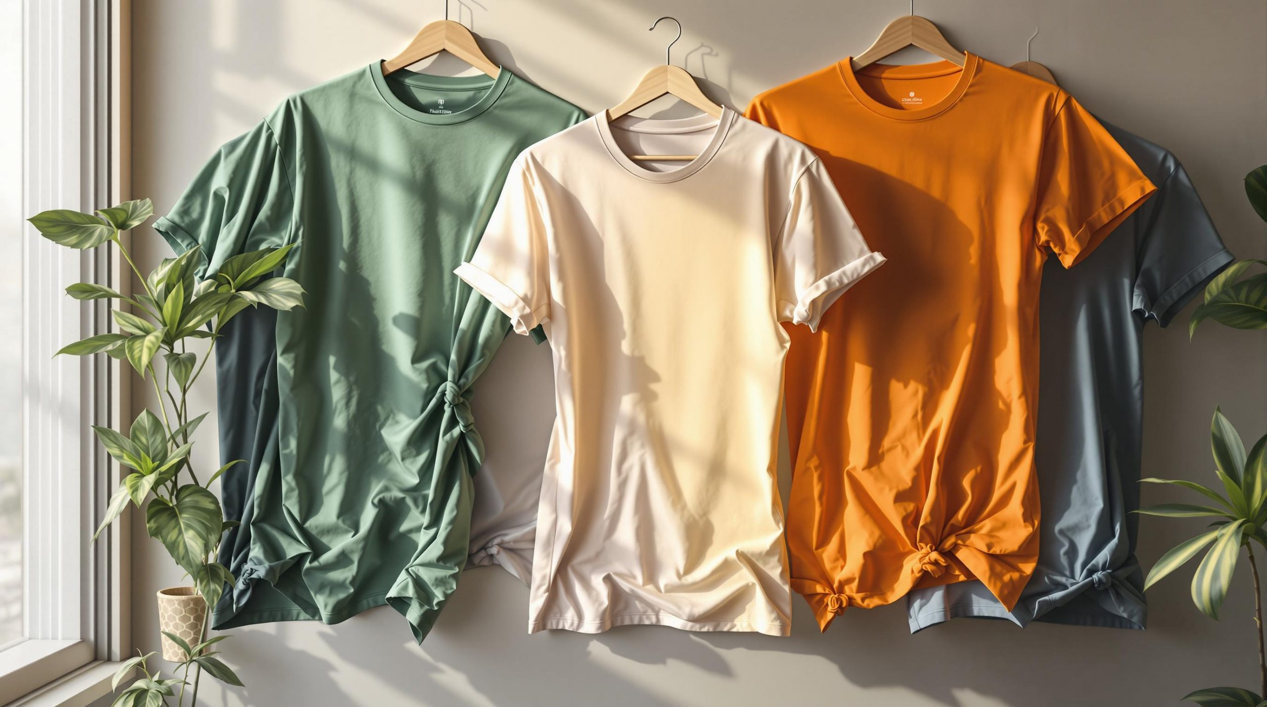
Where you position your design on a t-shirt can make or break its impact. Here’s a quick guide to 8 popular t-shirt design placements and how to use them effectively:
- Center Chest: High visibility; great for bold statements.
- Left Chest: Professional and subtle for branding or logos.
- Full Front: Covers the entire front for maximum attention.
- Upper Back: Perfect for team names or logos.
- Sleeves: Adds a unique, stylish touch.
- Bottom Front: Eye-catching and unconventional.
- Back Neck: Small and understated branding.
- Side-to-Side: Bold, full-width designs for a striking look.
Key Tips for Choosing Placement:
- Match design size with the placement area (e.g., large designs for full front, small logos for left chest).
- Consider the shirt’s purpose (e.g., casual, promotional, or team uniforms).
- Test your design using tools like ooShirts‘ mockups to ensure proper alignment and visibility.
- Factor in fabric type to avoid distortion or discomfort.
Pro Tip: Combine placements (e.g., small left chest logo + large back design) for a balanced, cohesive look.
A Complete Guide to Design Placements
How to Choose Design Placement
Picking the right spot for your t-shirt design can make a big difference in how it looks and functions. Here are some key factors to think about when deciding on placement.
Size and Scale
The size of your design plays a huge role in determining its placement. Large designs work well in areas like the center chest or full front, where there’s more space. Smaller logos or subtle branding are better suited for spots like the left chest pocket area or the back neckline.
Purpose of the Shirt
Consider how the t-shirt will be worn and the context in which it will be seen:
- For business settings, left chest logos are common.
- Team uniforms often require numbers on the back for visibility.
- Casual wear gives you more freedom to experiment with placement.
- If the shirt is meant to be layered, make sure the design stays visible under jackets or other clothing.
Fabric Type
The type of fabric can influence how your design looks and feels:
- Thick cotton works well for larger designs.
- Stretchy fabrics can distort designs if not placed carefully.
- Textured fabrics might require simple designs in prominent areas.
- Performance materials need placement that doesn’t interfere with breathability.
Testing Your Design
It’s always a good idea to visualize your design before finalizing its placement. Tools like ooShirts’ online design platform let you:
- Upload your artwork and position it exactly where you want.
- Adjust the size to match the scale of the shirt.
- Preview how the design looks from different angles.
- Save multiple versions to compare and choose the best option.
Testing helps you see how your design will look in real life and ensures the placement works.
Get Expert Advice
If you’re unsure, seek professional input. ooShirts offers design review services where experts check your placement to ensure it fits well with your artwork and shirt style. This can help you avoid mistakes and get the best results.
Design Balance
If your shirt has multiple design elements, make sure they work together. For example, a small logo on the chest can pair nicely with a larger design on the back, creating a cohesive and balanced look.
Choosing the right placement enhances both the appearance and practicality of your t-shirt. Using visualization tools and expert advice can help you make the most of your design.
1. Center Chest Designs
Placement Overview
The center chest area is a go-to spot for shirt designs. Positioned centrally, about 3-4 inches below the collar, it grabs attention right away. This placement is a favorite for casual outfits and promotional shirts due to its high visibility.
Standard Dimensions
The size of center chest designs depends on the shirt size. Here’s a quick guide:
- Small to Medium shirts: 8-10 inches wide, 6-8 inches tall
- Large to XL shirts: 10-12 inches wide, 8-10 inches tall
- 2XL and larger: Up to 14 inches wide, 11 inches tall
Make sure to adjust the dimensions to keep the design balanced with the shirt size. If you’re using ooShirts’ online tool, you can easily resize and preview your design across various sizes.
Design Tips
Creating a center chest design that stands out requires some thoughtful planning. Here are a few tips:
Vertical Placement
Position the design’s center about 7-8 inches below the collar seam for adult shirts. This ensures the design sits at eye level without clashing with the collar.
Design Shapes
- Square or rectangular: Align both horizontally and vertically for a clean look.
- Circular: Keep proportions in check to avoid an odd “bullseye” effect.
- Text-based: Use clear spacing between letters to ensure readability.
Color Choices
Pick colors that contrast well with the shirt. For example, dark designs pop on light shirts, while light designs stand out on dark ones.
Size Balance
The design should be noticeable from about 6 feet away but not overpower the shirt. Aim to keep the design within 40-50% of the shirt’s width for a balanced appearance.
With these tips, your center chest design will look polished and eye-catching.
2. Left Chest Logos
Placement Description
Left chest logos provide a polished and professional appearance, making them a popular choice for corporate clothing, uniforms, and business casual outfits.
Sizing Recommendations
Keep the logo size noticeable but subtle. It should fit well within the chest area without overpowering the garment. This balance helps maintain a refined look.
Design Tips
Shape and Layout
- Use compact, well-proportioned designs. Avoid long or stretched layouts, and stick with simple, clear shapes.
- Place any text near the logo – either below or beside it – with enough space to keep the design uncluttered.
Color Selection
- Pick colors that contrast well with the fabric to ensure the logo stands out. Limit the number of colors for a cleaner, more professional finish.
Production Considerations
- For embroidery, simplify detailed designs to ensure they stitch neatly.
- For screen printing, use vector files to achieve sharp, clean edges.
You can preview and refine your design using the ooShirts online design lab.
3. Full Front Coverage
Placement Description
Full front coverage designs take advantage of the entire front area of a t-shirt, making a bold visual statement. This placement works well for eye-catching artistic designs, clear brand messaging, or event merchandise that needs to stand out.
Typical Dimensions
For adult sizes, full front designs are usually 11 inches wide by 13 inches tall, but these dimensions can be adjusted depending on the shirt size and style. For youth sizes, reduce the dimensions proportionally to 9 inches wide by 11 inches tall to keep the design visually balanced.
Position the design about 3 inches below the collar neckline and ensure there’s at least 2 inches of space from the side seams. Adjusting the layout and production process can help you achieve the best results.
Design Tips
Here’s how to make the most of your full front design:
Layout Considerations
- Center the design both horizontally and vertically, keeping nearby garment features in mind.
- Think about how the design will look when the shirt is being worn, as fabric movement can change its appearance.
Size and Scale
- Adjust the design size proportionally for different shirt sizes.
- Use larger elements for focus and simplify smaller details to ensure clarity.
- Check the readability of text at various distances to ensure it’s effective.
Production Guidelines
- Create artwork at 300 DPI for crisp, high-quality prints.
- Convert text to outlines to avoid font compatibility problems.
- Use tools like the ooShirts design lab to preview your design before production.
Color Selection
- Pick colors that either complement or contrast with the shirt color.
- Add depth with halftones or gradients.
- Stick to 4-5 colors maximum for cost-efficient screen printing while maintaining visual appeal.
4. Upper Back Placement
Placement Description
The upper back is a great spot for team logos, corporate branding, and promotional designs. Positioned between the shoulder blades, about 4–6 inches below the collar, this area provides a flat surface that keeps the design smooth and easy to see. Proper measurements ensure your design stands out from every angle.
Typical Dimensions
- Adults: 8–10″ wide, 10–12″ tall, with 3″ clearance below the collar and 2″ from the shoulder seams.
- Youth: 6–8″ wide, 8–10″ tall, with proportional spacing for smaller sizes.
Design Tips
Layout Optimization
- Center the design horizontally between the shoulder seams.
- Position the artwork higher up to ensure visibility, even when seated.
- Keep critical elements away from the neckline to avoid obstruction by hair.
Print Specifications
- Use artwork with a resolution of 300 DPI for sharp prints.
- Check placement accuracy using the ooShirts design lab.
- Ensure fine details are at least 1/8″ thick for clarity.
Design Elements
- Stick to bold, simple graphics for better impact.
- Use text that’s at least 1″ tall for readability.
- Leave 1.5″ of space around key design elements to prevent overcrowding.
- Test how the design looks during movement to maintain visual appeal.
Color Selection
- Limit designs to 3–4 colors to keep screen printing costs manageable.
- Choose high-contrast color combinations for better visibility from a distance.
- Factor in different lighting conditions to ensure colors remain clear and vibrant.
sbb-itb-1cc5ba6
5. Sleeve Designs
Placement Description
Sleeve designs can bring a unique touch to your shirts. They can be placed on either sleeve, running vertically from the shoulder to the cuff or horizontally across the upper arm. This ensures the design stands out when the shirt is worn.
Typical Dimensions
The size of sleeve designs depends on the sleeve length and shirt size. Here’s a quick guide:
| Sleeve Type | Width | Height | Distance from Shoulder |
|---|---|---|---|
| Short Sleeve | 2.5–3.5″ | 1–2″ | 2–3″ |
| Long Sleeve | 2.5–4″ | 1.5–3″ | 2–4″ |
| Cap Sleeve | 1.5–2″ | 1–1.5″ | 1–1.5″ |
Design Tips
Keep your sleeve designs sharp and effective with these tips:
Print Orientation
For vertical designs, align the artwork parallel to the sleeve seams to prevent distortion. Horizontal designs should be centered between the seams and positioned 2–3 inches below the shoulder seam for the best look.
Size Adjustments
Make sure the design fits the sleeve width, leaving at least 0.5 inches of space from the seams. For youth sizes, reduce the dimensions by about 25%, keeping the spacing proportional.
Design Elements
- Stick to simple logos or text for smaller sleeve prints.
- Ensure text is at least 0.5 inches tall for easy readability.
- Avoid overly complex details that may lose clarity on fabric.
- Keep in mind fabric stretch – allow some extra space to accommodate flexibility.
Technical Details
- Use a resolution of 300 DPI for clear prints.
- Maintain a minimum line thickness of 0.5 point (0.007 inches).
- Test your design placement in an online design tool.
- Factor in the sleeve’s natural curve when arranging your layout.
Color Choices
Pick colors that complement the main shirt design. For sportswear or team uniforms, single-color designs often work best – they keep the look professional and help cut production costs.
6. Bottom Front Designs
Placement Description
Bottom front designs draw attention to the lower part of a t-shirt, offering a distinct way to enhance its look. This placement is ideal for designs that wrap around the sides or complement artwork on the upper chest. It helps create a visually pleasing and balanced appearance.
Design Tips
- Adjust the size of your design to fit the t-shirt’s dimensions appropriately.
- Center the design for a balanced look, or shift it slightly for a more dynamic effect.
- For wraparound designs, ensure the artwork flows naturally onto the sides and sticks to bold, simple graphics that stand out even when in motion.
- Avoid overly detailed designs that might get distorted by fabric folds.
- Check how the design looks from different angles to maintain its appeal.
- Pick colors that contrast well with the t-shirt, making the design stand out clearly.
7. Back Neck Designs
Back neck designs require careful attention to size and placement. Positioned just below the collar, this area is ideal for a small, understated design that adds a touch of detail without overwhelming the shirt.
Placement Tips
Keep the design scaled appropriately to fit the limited space while ensuring it remains clear and legible. Use mockups to test the placement and make sure the design looks balanced and subtle.
8. Side-to-Side Designs
Side-to-side designs stretch across the entire width of a t-shirt, offering a bold, horizontal layout.
Placement Description
This design style spans from one side seam to the other, creating a striking visual that stands out from traditional centered or vertical placements. It’s perfect for wide graphics, text-based designs, or decorative elements that thrive on a larger canvas. The full-width approach makes it ideal for panoramic artwork or wide typography.
Typical Dimensions
The exact dimensions will depend on the t-shirt size and the design’s overall proportions. It’s important to ensure the artwork complements the shirt’s dimensions without overwhelming it.
Design Tips
- Balance the space: Leave enough room around the design to prevent it from looking overcrowded.
- Watch the side seams: Avoid placing intricate details near the seams, as fabric folds can distort the design.
- Adjust for size: Scale the design to fit different t-shirt sizes without losing its impact.
- Think about the fabric: Some materials may stretch or wrinkle, so choose designs that still look great with natural fabric movement.
Always test the design with a mockup to ensure it looks sharp and remains readable across various t-shirt sizes and styles.
Print Methods and Design Tips
To create a high-quality t-shirt, it’s important to pick the right print method and carefully think about the size and placement of your design. These elements need to work together for the best results.
Choosing a Print Method
Each printing technique has its own strengths that can affect how your design looks. Whether you go for screen printing or digital printing, make sure your chosen method aligns with the placement area. Also, consider how the design’s size and placement will stand out.
Size and Proportion
Think about the t-shirt style, the printing method, and the complexity of your design. These factors should complement each other to create a polished and professional appearance.
Design Quality Tips
Focus on creating clear, well-balanced designs with sharp images and strong color contrasts. Thoughtful placement of text and graphics can improve visibility and give your design a more harmonious look.
Previewing with Design Tools
The ooShirts design lab lets you preview and tweak your layout. This tool helps you perfect your design placement across various shirt styles.
Getting a Professional Opinion
After finalizing your design, consider using expert review services. They’ll check if your design meets the technical requirements for your chosen print method and placement, ensuring a great final product.
Conclusion
The placement of your t-shirt design can greatly influence its overall appeal and effectiveness. With eight different placement options, there’s no shortage of creative opportunities. Each area offers its own unique purpose and visual impact.
Customer reviews highlight the importance of getting placement right. With over 12,370 reviews averaging 4.8/5[1], professional t-shirt printing stands out for its quality. Julie Morris from Circle Pines, MN shares:
“I have researched MANY places to buy screenprinted shirts and you have the best prices and great quality. You also have great turnaround times. Thanks!”
Whether you’re designing for a business, event, or personal project, experimenting with different placements can help you fine-tune your design for maximum effect. With design review services and daily support, you can ensure your placement aligns with both aesthetic preferences and technical standards. Sara Bos from Willmar, MN adds:
“I love these shirts! The shirt quality is fantastic, the color is great, and the logo looks perfect! I could not be happier with your company!”
These testimonials emphasize how thoughtful design placement can elevate your t-shirt’s overall impact. Strategic placement isn’t just about looks – it’s about making your message stand out.