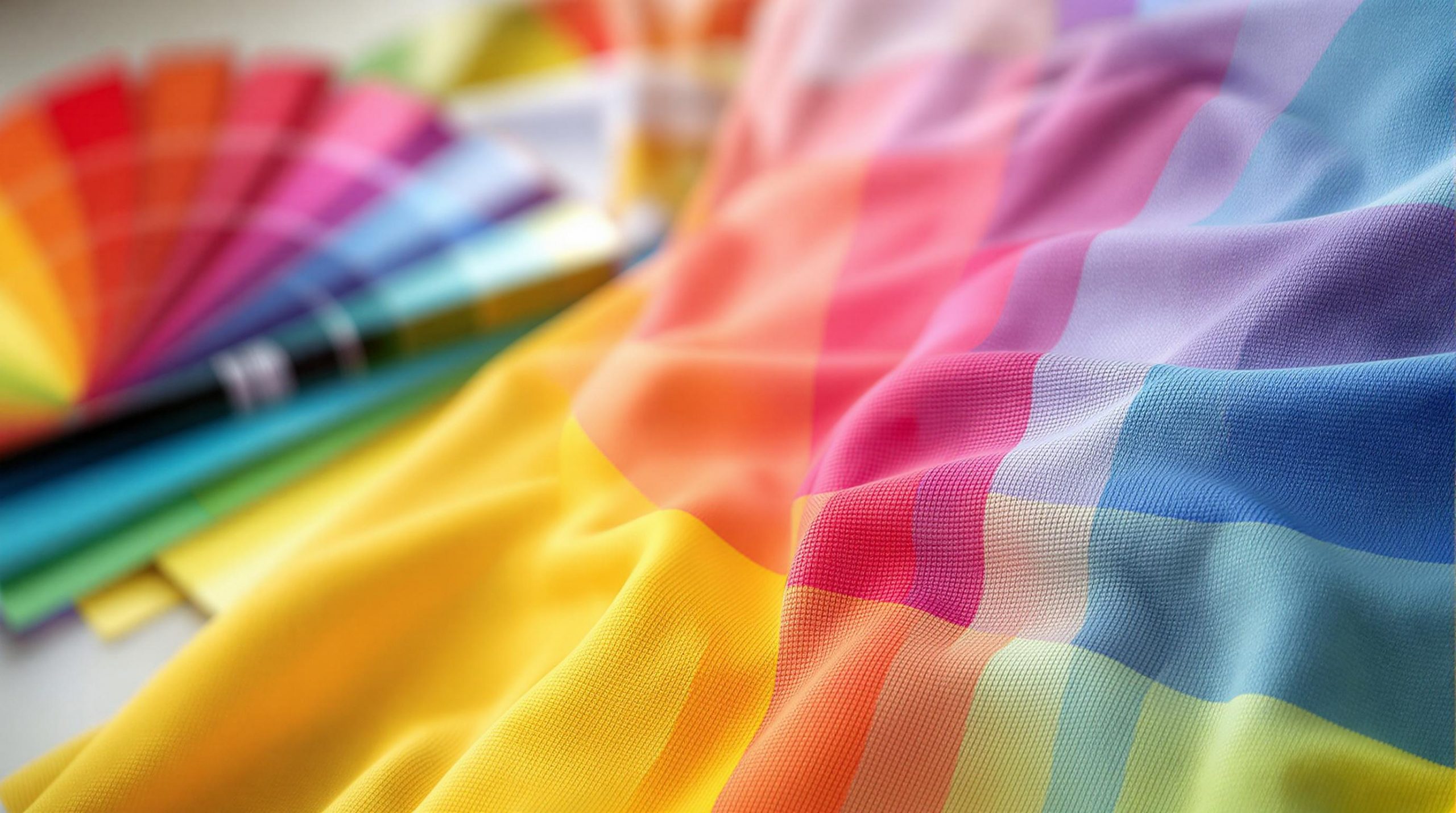
Color theory is the foundation of creating standout t-shirt designs. Here’s a quick breakdown:
- Understand the Color Wheel: Learn about primary (red, blue, yellow), secondary (green, orange, purple), and tertiary colors (red-orange, blue-violet, etc.) to build your palette.
- Warm vs. Cool Colors: Warm colors (red, yellow) energize; cool colors (blue, green) calm.
- Color Pairing Techniques:
- Complementary: High contrast (e.g., blue & orange).
- Analogous: Harmonious (e.g., blue, blue-green, green).
- Triadic: Balanced contrast (e.g., red, yellow, blue).
- Color Psychology: Use colors to evoke emotions – red for energy, blue for trust, green for health, etc.
- Fabric & Printing Impact: Consider fabric type and printing methods (screen vs. DTG) to ensure colors pop.
Use these tips to create t-shirts that are visually appealing, on-brand, and impactful.
Mastering Color Theory for Screen Printing (and Beyond)
Understanding the Color Wheel
Knowing how the color wheel works is essential for creating designs that match your brand’s style. When you understand how colors interact, you can design t-shirts that leave a lasting impression.
3 Main Color Types
The color wheel is built around three main groups of colors:
- Primary Colors: Red, blue, and yellow. These are the building blocks of all other colors and can’t be created by mixing other shades.
- Secondary Colors: Green, orange, and purple. These come from mixing two primary colors in equal amounts.
- Tertiary Colors: Created by blending a primary color with a neighboring secondary color. Examples include red-orange, yellow-green, and blue-violet, which can add depth to your palette.
Warm and Cool Colors
The “temperature” of colors plays a big role in setting the tone of your t-shirt designs:
- Warm Colors: Shades like red, orange, and yellow bring energy and vibrancy. They’re great for sportswear or designs meant to stand out, especially on light fabrics.
- Cool Colors: Hues like blue, green, and purple evoke calmness and professionalism. These work well for more reserved designs and look good on both light and dark fabrics.
Color Combination Methods
To create balanced and eye-catching designs, use these key color pairing techniques:
1. Complementary Colors
These are opposite each other on the color wheel, such as blue and orange. They create high contrast, making your designs bold and attention-grabbing.
2. Analogous Colors
These are three colors next to each other on the wheel, like blue, blue-green, and green. They create a harmonious look, ideal for understated and polished designs. This combo works especially well for nature-inspired themes.
3. Triadic Colors
These form an evenly spaced triangle on the color wheel, like red, yellow, and blue. They provide vibrant contrast while staying balanced, making them perfect for playful or festive designs.
When using these combinations, let one color take the lead while the others act as accents. This creates a clear visual hierarchy and keeps your design organized.
With these basics covered, the next step is to dive into how colors can shape emotions and communicate brand messages.
Color Psychology in Design
Color Meanings and Emotions
Colors can influence how people feel and respond to your designs. Here’s a quick breakdown:
- Red: Brings energy, passion, and urgency. Great for sports teams or bold, attention-grabbing designs.
- Blue: Reflects trust, stability, and professionalism. Ideal for corporate branding and business-focused designs.
- Yellow: Radiates optimism and energy. Perfect for youth-oriented or summer-themed projects.
- Green: Represents growth, nature, and health. Works well for eco-conscious and wellness brands.
- Purple: Suggests luxury and creativity. A strong choice for artistic or high-end designs.
- Black: Exudes sophistication and timelessness. A versatile option for various styles.
Matching Colors to Brand Message
Once you understand the emotions tied to colors, you can align them with your brand’s identity and target audience:
Professional Settings
- Stick with navy blue or charcoal gray as primary colors.
- Add subtle accents like burgundy or forest green.
- Keep the design clean and straightforward.
Creative Industries
- Experiment with bold, dynamic color combinations.
- Incorporate secondary colors for depth.
- Try gradients or overlays to add dimension.
Sports and Athletics
- Use high-energy color pairings.
- Create sharp contrasts for impact.
- Include bright accents to energize the design.
Colors Across Cultures
Colors carry different meanings depending on the cultural context. Here’s how they are often perceived:
Western Markets
- White symbolizes purity.
- Black is associated with sophistication.
- Red conveys excitement and energy.
Eastern Markets
- White can be linked to mourning.
- Red is seen as a symbol of good fortune.
- Gold is often tied to wealth and prosperity.
It’s crucial to research local color meanings to avoid unintentional miscommunication. Adjust your color palette for specific markets while staying true to your brand. Always test your color choices on different materials and request samples to ensure they look as intended.
Next, we’ll dive into techniques for selecting and balancing these color combinations effectively in your designs.
sbb-itb-1cc5ba6
Selecting Color Combinations
Choosing the right color combinations is key to creating clear and visually appealing t-shirt designs. Using the principles of the color wheel, you can craft designs that stand out and feel balanced.
3 Basic Color Schemes
Here are three simple approaches to picking colors that work well together:
Monochromatic Scheme
Stick to variations of a single color for a clean, cohesive look. For example, pair navy blue text with light blue accents and a medium blue background to add depth without overcomplicating the design.
Complementary Scheme
Pair colors that sit opposite each other on the color wheel, like red and green or blue and orange. These combinations create bold contrast and make designs stand out. To keep things balanced, let one color dominate while using the other as an accent.
Analogous Scheme
Choose colors that are next to each other on the color wheel, such as blue, blue-green, and green. This creates a harmonious feel, making it perfect for themed designs like nature-inspired or sportswear graphics.
Once you’ve picked a scheme, adjust the color ratios to maintain balance and avoid overwhelming the viewer.
Creating Balanced Color Palettes
A balanced palette ensures your design looks polished and easy on the eyes. One popular method for achieving this is the 60-30-10 rule:
- 60%: Dominant color
- 30%: Secondary color
- 10%: Accent color
For example, a black t-shirt (60%) with white graphics (30%) and red highlights (10%) creates a striking yet organized design. This approach keeps your design visually engaging without feeling chaotic.
Colors on Different Fabrics
The type of fabric and its base color can influence how your chosen colors appear on the finished product.
Dark vs. Light Fabrics
On dark fabrics, you’ll often need underbase printing to make the colors pop. Light fabrics, on the other hand, naturally display colors more vividly. Blended fabrics, like heathered materials, may slightly mute the colors, giving them a softer look.
Fabric Types and Color Performance
| Fabric Type | Color Output | Best For |
|---|---|---|
| 100% Cotton | Deep, saturated colors | Bold designs or detailed artwork |
| Cotton/Poly Blend | Muted, softer colors | Vintage-style designs |
| Performance Polyester | Bright, durable colors | Athletic wear or moisture-wicking garments |
Always consider the shirt’s base color and material when finalizing your palette. Test your color combinations under different lighting conditions to ensure they look great in any setting.
Improving Design Contrast
Learn how to use contrast effectively to make your t-shirt graphics and text stand out.
High vs. Low Contrast
Contrast in t-shirt design refers to the visual difference between elements. High contrast grabs attention, while low contrast creates a more understated look.
When to Use High Contrast
- Logos that need to be instantly recognizable
- Sports uniforms where text must be legible from afar
- Event merchandise with clear, bold messaging
Examples of high-contrast combinations: black on white, white on navy blue, yellow on black, and red on white.
When to Use Low Contrast
- Trendy streetwear styles
- Graphics with a vintage feel
- Subtle branding or decorative patterns
Examples of low-contrast combinations: light gray on white, navy blue on black, cream on light yellow, and forest green on black.
Next, let’s focus on making text elements easier to read.
Making Text More Readable
Clear and readable text is essential for any design. Several aspects can enhance text clarity.
Choosing the Right Font
| Font Style | Best Uses | Minimum Size |
|---|---|---|
| Sans Serif | Modern designs, short phrases | 0.5 inches |
| Serif | Classic styles, longer text | 0.75 inches |
| Script | Decorative accents, single words | 1 inch |
Tips to Improve Text Visibility
- Add a 1-2 pixel outline in a contrasting color.
- Use 2-3 pixel drop shadows to create depth.
- Adjust letter spacing by 10-15% to enhance readability.
Best Color Combinations for Text
- Use slightly thicker white text on dark backgrounds.
- Standard weight works well for black text on light backgrounds.
- Avoid placing text over busy patterns or images.
- For complex backgrounds, add a solid shape behind the text to improve visibility.
These strategies will ensure your designs are both eye-catching and easy to read.
Using ooShirts Design Tools
Design Lab Tutorial

Use the ooShirts Design Lab to try out different color combinations and refine your ideas. Here’s what you can do:
- Experiment with background colors and design elements.
- Use intuitive tools to apply color theory principles.
- Preview how your colors will look on different fabric types.
- Adjust text colors and outlines for better contrast.
Other features include:
- Customizing text with a wide range of fonts and colors.
- Adding outlines to make text pop.
- Uploading your own images while maintaining color accuracy.
- Accessing a clip art library with adjustable color options.
After finalizing your design, check the printing options to understand how your colors will appear on the finished product.
Print Methods and Colors
The printing method you choose impacts how your colors will look. ooShirts provides two main options:
| Print Method | Best For | Color Characteristics |
|---|---|---|
| Screen Printing | Large orders, solid color designs | Bold, durable colors |
| DTG Printing | Detailed designs, gradients | Precise color matching and photo-like quality |
To ensure your design looks great:
- Use the preview tool to see how your design works on different shirt colors and adjust for contrast.
- Keep in mind that colors may vary slightly depending on the fabric.
- Request a professional review for feedback on color balance.
Once your design is perfected, you’re ready to place your order.
Ordering and Delivery
Ordering is straightforward once your design is ready. Pricing depends on factors like:
- The number of colors in your design.
- The printing method you choose.
- The quantity of shirts.
- The shirt style and base color.
ooShirts prioritizes quality and accuracy. If your final product doesn’t match your approved design, they’ll redo it. Their support team is available every day via phone, email, or live chat to assist with any questions about colors or designs.
Make sure to save your design and request a review before finalizing your order.
Summary
Key Points Review
Here’s a quick recap of the main ideas:
- Color Wheel Basics: Primary colors (red, blue, yellow) are the starting point, with secondary and tertiary colors adding more variety to your palette.
- Color Harmony: Complementary, analogous, and triadic schemes help create visually pleasing designs.
- Contrast: Strong contrast enhances readability, especially for text on colored backgrounds.
- Fabric Matters: The color and material of the fabric can affect how your design turns out.
- Printing Methods: Screen printing delivers bold, solid colors, while digital printing is better for detailed gradients and photo-like designs.
Keep these points in mind when working on your designs with ooShirts.
Start Designing with ooShirts
Follow these steps to bring your ideas to life:
- Plan Your Design
- Pick a color scheme that matches your brand and complements the fabric.
- Think about how the fabric’s color will influence the final look.
- Decide on the best printing method for your design.
- Use the Design Lab
- Visit ooshirts.com and explore their design tools.
- Upload your own artwork or browse the clipart library.
- Experiment with different color combinations and preview how the design will look with various print methods.
- Finalize Your Order
- Double-check the placement of your design.
- Perform a final quality review.
- Choose your order quantity and shipping options.
Use these steps to create designs that stand out with ooShirts.