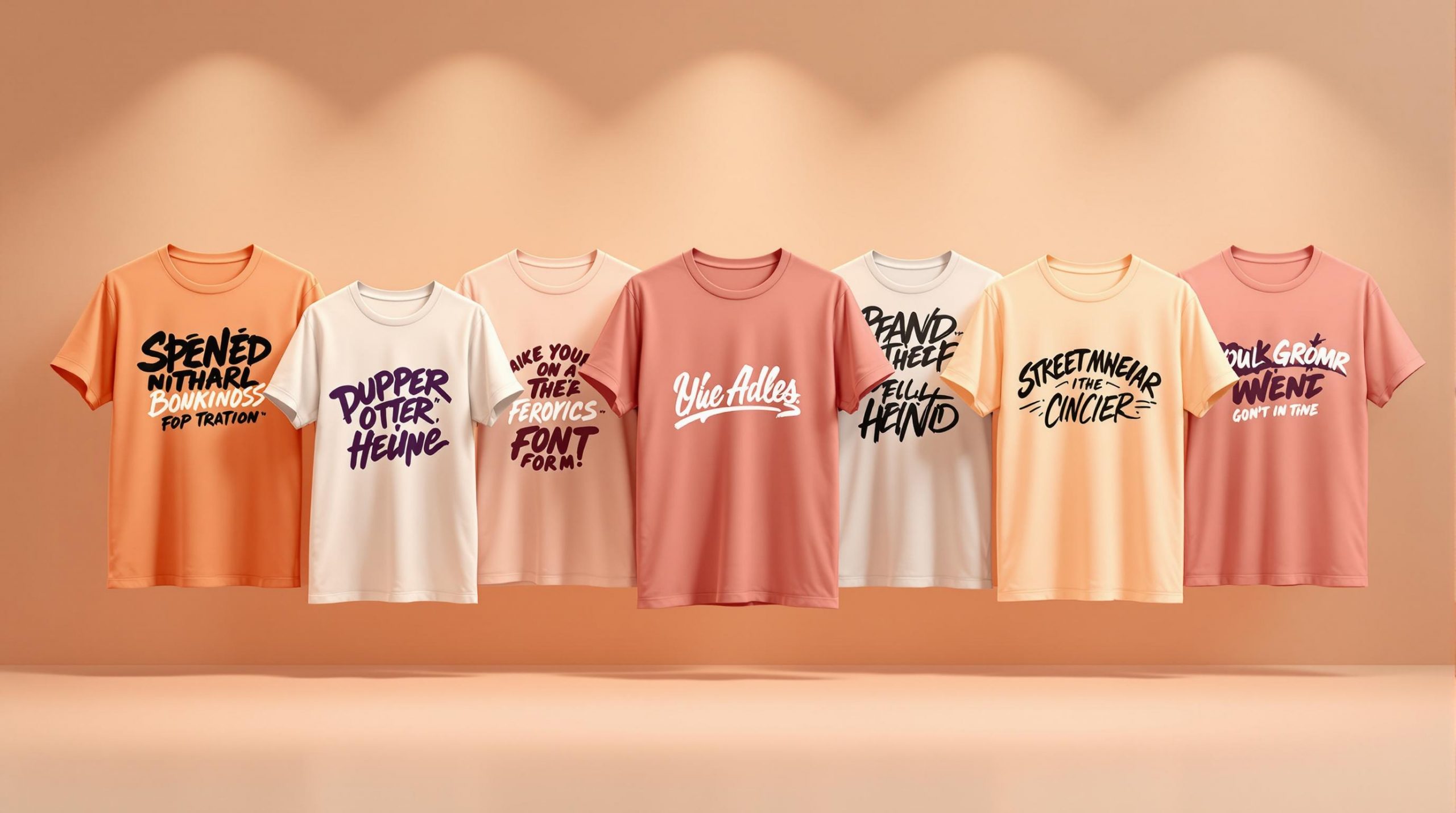
Looking for the perfect font for your streetwear t-shirt designs? Typography is essential in streetwear, helping convey bold statements and urban vibes. Below is a quick rundown of the 15 best fonts for streetwear, each offering unique styles and practical features for t-shirt printing:
- Bebas Neue: Sleek and condensed, perfect for bold logos and stacked layouts.
- Anton: Wide, bold letters ideal for slogans and headlines.
- Impact: Heavyweight and compressed, great for brand names and sports designs.
- Streetbrush: Graffiti-inspired, hand-painted style for urban themes.
- Urban Jungle: Sharp angles and curves for gritty, city-inspired designs.
- Graffiti Font: Spray-paint effect with bold, urban energy.
- Retroica: Vintage meets modern streetwear for standout graphics.
- Roadster: Retro automotive-inspired font with a modern twist.
- Vintage Queens: Retro serif font with smooth curves for a classic look.
- Sign Painter House Script: Casual, hand-painted strokes for personal touches.
- Brush Script MT: Flowing, brush-style font for a handcrafted feel.
- Streetwear: Clean, bold lines with a compact, urban aesthetic.
- BlowBrush: Bold, handwritten spray-paint style for edgy statements.
- Trashhand: Raw, gritty handwritten strokes for urban designs.
- Blacklisted: Sharp, geometric edges for bold, attention-grabbing text.
Quick Comparison
| Font Name | Style | Best Use Cases | Printing Notes |
|---|---|---|---|
| Bebas Neue | Sleek, condensed | Logos, stacked layouts | Easy to read at all sizes |
| Anton | Wide, bold | Slogans, headlines | Retains clarity in small sizes |
| Impact | Heavyweight, compressed | Brand names, sports designs | Works well with effects |
| Streetbrush | Graffiti-inspired | Urban themes, bold slogans | Best above 14pt |
| Urban Jungle | Sharp angles, curves | City-inspired graphics | Requires clean edges in printing |
| Graffiti Font | Spray-paint style | Statement pieces | High-contrast colors recommended |
| Retroica | Vintage-modern | Bold graphics | Scales well for various sizes |
| Roadster | Retro automotive | Chest logos, back prints | Crisp at small sizes |
| Vintage Queens | Retro serif | Classic, urban designs | Best for large prints |
| Sign Painter Script | Hand-painted strokes | Personal touches, brand names | Simple effects work best |
| Brush Script MT | Flowing brush style | Handcrafted, minimalist looks | Avoid cluttered layouts |
| Streetwear | Bold, clean lines | Logos, slogans | Balanced and easy to print |
| BlowBrush | Spray-paint inspired | Edgy statements | Space letters for readability |
| Trashhand | Gritty handwriting | Urban slogans, accents | High-contrast colors preferred |
| Blacklisted | Sharp, geometric | Bold headlines, logos | Minimal designs recommended |
Use this guide to choose fonts that align with your design goals and printing needs. Make sure to test layouts, sizes, and colors to ensure your designs stand out on any fabric.
10 Best Free Fonts For Streetwear Shirt Designs
Key Elements of Streetwear Fonts
Typography plays a big role in streetwear, and certain font traits stand out as crucial for this style.
Weight and Boldness
Thick, bold typefaces grab attention and stay legible, even on fabric. These heavier fonts convey a sense of power and confidence – key aspects of streetwear culture.
Flexibility in Sizing
Streetwear fonts need to look sharp at any size, whether it’s a bold logo across the chest or a smaller detail on a sleeve.
Urban Edge
- Sharp angles or rough, imperfect edges
- Graffiti-inspired styles that balance creativity and readability
Style Meets Functionality
The best streetwear fonts have clear spacing, consistent stroke widths, and strong contrasts. This ensures they pop on different fabric colors and stay durable over time.
Room for Customization
Good fonts allow for creativity. You can add outlines, shadows, textures, or experiment with layering and colors with ease.
Urban Influence
Streetwear fonts should reflect real urban culture, drawing inspiration from street art, sports lettering, and industrial aesthetics. These elements bring authenticity to the design.
1. Bebas Neue

Bebas Neue has become a staple in streetwear, known for its sleek, condensed letterforms and strong visual presence. This sans-serif font features tall, uniform capital letters that stand out, making it a top choice for bold t-shirt designs.
Key Features:
- Clean, vertical lines
- Uniform letter width
- Geometric structure
- Easy to read at different sizes
- Tight spacing between characters
Its balanced proportions make it perfect for centered and stacked layouts, creating a solid text block that works well for single words or multi-line phrases.
Best Uses for Bebas Neue:
- Brand names across the chest
- Bold statement phrases
- Size markers
- Dates or location details
- Simple logo designs
Why It’s Popular in Streetwear
Bebas Neue’s simple design allows for creative tweaks while staying readable. You can add effects like drop shadows, outlines, or textures without losing its bold impact. Even though it comes in a single weight, adjusting its size and spacing can create dynamic looks that fit the streetwear vibe perfectly.
2. Anton
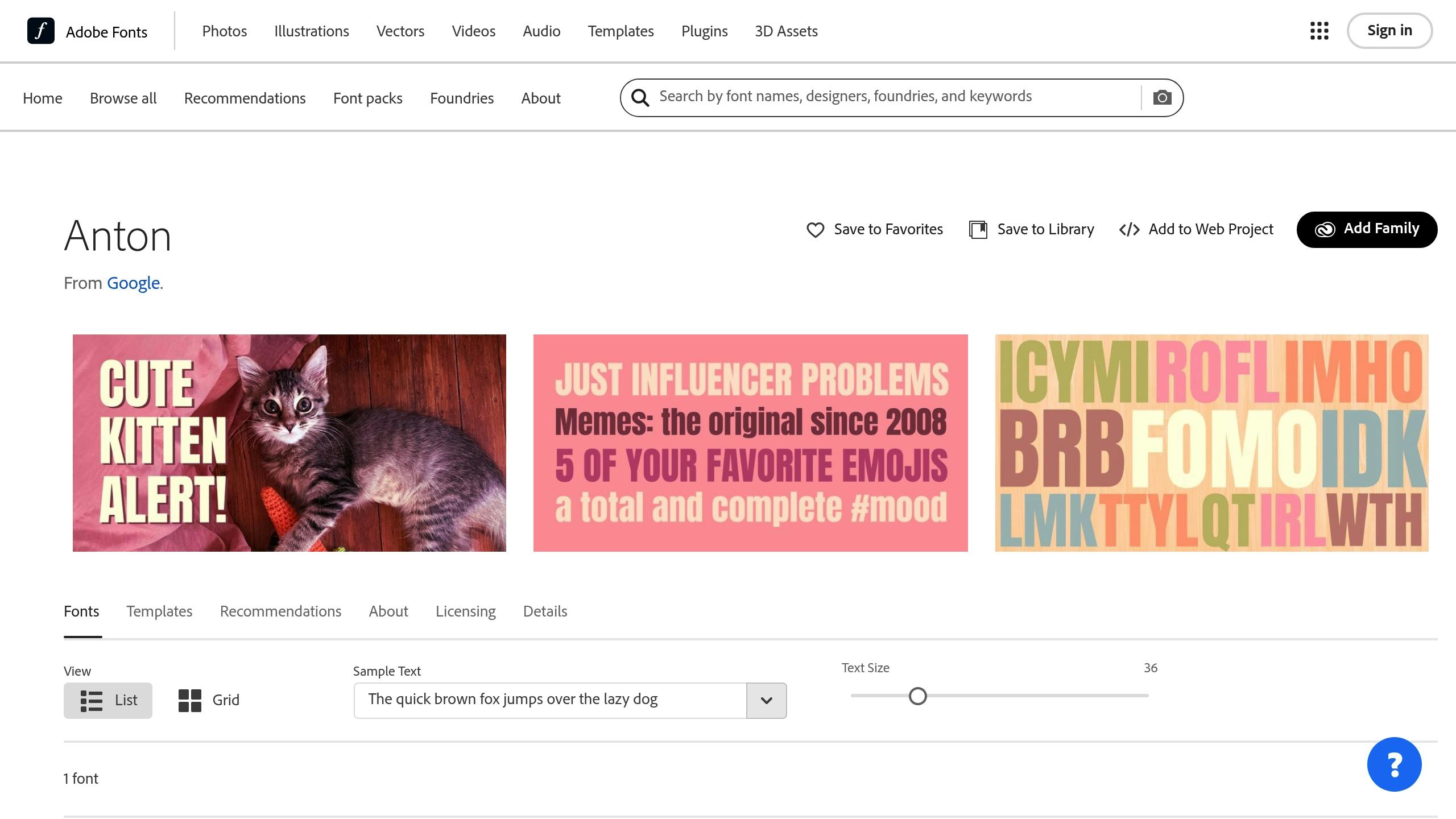
Anton is a bold sans-serif font that stands out in streetwear thanks to its striking presence. Compared to Bebas Neue, Anton has wider letterforms and a noticeable vertical focus. Let’s break down its features and how to use it effectively in streetwear designs.
Key Features:
- Tall, extended vertical strokes
- Well-balanced letter spacing
- Strong geometric design
- Sharp, clean edges for a polished look
Design Characteristics
Anton grabs attention with its increased x-height and open counters, ensuring excellent readability. Even when applying design effects or shrinking the size, it retains clarity and impact.
Best Uses for Anton:
- Large brand names
- Single-word designs
- Headlines
- Urban-style slogans
- Layered design elements
Design Tips for Anton
To make the most of Anton’s bold style, leave at least 0.5 inches of clear space around the text. Its vertical emphasis works particularly well for stacked layouts and centered designs.
Perfect Fit for Streetwear
Anton’s modern look fits a variety of streetwear styles, whether you’re going for simple, clean designs or more intricate compositions. It works beautifully in solid colors, outlined formats, or with effects like distressing and halftone patterns.
Technical Details:
- Main text size: 1–4 inches
- Minimum secondary text size: 0.5 inches
- Works well with both screen printing and digital printing
- Maintains sharp edges, even with specialty inks
Anton’s sturdy design ensures that text stays bold and readable, even after repeated washes. Its durability makes it a reliable choice for streetwear designs that demand both style and longevity.
3. Impact
Impact stands out as one of the most recognizable fonts in streetwear design, known for its bold style and compressed letterforms. Its striking appearance fits perfectly with streetwear’s focus on making a statement.
Key Features
- Heavyweight design
- Tight, condensed letterforms
- Small counter spaces for a compact look
Design Characteristics
Impact’s high x-height gives it a larger-than-life appearance, while its narrow structure allows for longer text to fit neatly without sacrificing readability – even from a distance.
Practical Uses
Impact aligns with streetwear’s bold, expressive style, making it a go-to choice for:
- Brand names: Perfect for creating strong, attention-grabbing logos.
- Athletic designs: Works well for jersey numbers or sports-inspired layouts.
- Urban graphics: Complements photo overlays and gritty designs.
- Social messages: Ideal for bold, eye-catching statements.
- Custom logos: A solid base for unique lettering treatments.
Design Tips
To get the most out of Impact, try adding extra spacing and experiment with effects like textures, outlines, gradients, or layering. These tweaks can add depth and personality to your designs.
Printing Considerations
With its thick strokes and sturdy structure, Impact holds up well across various printing methods. This makes it a dependable choice for t-shirt graphics and other apparel designs.
4. Streetbrush
Streetbrush captures the raw, energetic vibe of urban art with its hand-painted style, blending graffiti-inspired elements into streetwear designs while keeping text easy to read.
Key Features
- Brush-like, fluid strokes
- Varied line thicknesses
- Natural imperfections for an organic feel
- Semi-connected letters for a dynamic look
Where to Use It
Streetbrush works beautifully in a variety of streetwear design scenarios:
- Bold slogans: Great for making strong, attention-grabbing statements
- Brand tags: Perfect for creating artist-style signatures
- Highlight text: Adds emphasis to key design elements
- Street culture themes: Pairs well with urban-inspired graphics
Design Tips
To get the most out of Streetbrush:
- Add subtle texture overlays to amplify the hand-painted effect
- Adjust letter spacing for better readability
- Use contrasting backgrounds to make the strokes stand out
- Keep design height between 2–3 inches for balance
These adjustments help maximize its visual impact, especially in printed designs.
Technical Details
Streetbrush performs best in screen printing at sizes above 14pt. Its bold brushstroke details hold up across different printing methods, making it a dependable choice for t-shirts.
For a polished look, pair it with simple sans-serif fonts to highlight its artistic flair without overwhelming the design. Its mix of style and usability makes it a go-to option for streetwear designers.
5. Urban Jungle
Urban Jungle captures the gritty vibe of city life with its mix of sharp angles and smooth curves. This font works perfectly for streetwear designs, giving them a bold, urban feel.
Key Features
- Angular Geometry: Combines sharp edges with flowing curves.
- Variable Weight: Offers options from medium to extra bold.
- Custom Alternates: Includes multiple character variations.
- Extended Character Set: Features special symbols and numerals.
Design Applications
Urban Jungle shines in these design scenarios:
- Perfect for front-chest prints on apparel.
- Makes brand names pop with memorable logo designs.
- Delivers bold messaging for statement pieces.
- Complements urban-inspired collections with street art elements.
Technical Specifications
For the best results, stick to these settings:
- Minimum size: 16pt for clear readability.
- Recommended spacing: 10% letter spacing for balance.
- Print area: Works best at 8-12 inches wide.
- Weight selection: Use medium for smaller text and bold for headlines.
Styling Tips
To make Urban Jungle even more striking:
- Experiment with layering different weights for added depth.
- Add subtle texture overlays for a gritty look.
- Use negative space creatively to enhance the design.
- Keep baseline alignment consistent for a polished appearance.
These techniques help your designs stand out while staying true to their urban roots.
Print Considerations
Urban Jungle’s intricate design requires careful printing. Keep these points in mind:
- Ensure clean edges by using vector format.
- Use proper color separation for multi-color designs.
- Maintain strong contrast with the background for visibility.
- Pay attention to trapping in screen printing to avoid misalignment.
Following these steps ensures Urban Jungle delivers sharp, dynamic results in your designs.
6. Graffiti Font
Graffiti Font brings the energy of street culture to your designs with its spray paint-inspired style. It combines urban grit with readability, making it a great choice for t-shirts.
Key Features
- Spray Paint Effect: Mimics the strokes and drips of real spray paint.
- Versatile Character Set: Offers multiple variations for each letter.
- Adjustable Thickness: Available in weights from light to ultra-bold.
These features make Graffiti Font a standout option for streetwear designs.
Design Applications
Graffiti Font works well in various streetwear scenarios:
- Statement Pieces: Adds bold, attention-grabbing graphics to shirts.
- Brand Logos: Gives your brand a street-inspired edge.
- Exclusive Releases: Perfect for limited-edition collections.
- Urban-Themed Lines: Complements street culture-inspired fashion.
Technical Guidelines
For the best results on t-shirt designs, keep these tips in mind:
- Minimum Size: Use at least 24pt to preserve the font’s details.
- Letter Spacing: Stick between -5% and 0% for an authentic graffiti vibe.
- Print Width: Ideal sizes range from 10 to 14 inches.
- Color Combinations: High-contrast colors make the design pop.
Styling Recommendations
To make Graffiti Font stand out:
- Add depth with drop shadows, texture overlays, or gradients.
- Incorporate urban textures for a cohesive look.
- Keep baseline alignment consistent across all elements.
Print Specifications
Follow these steps for high-quality printing:
- Convert text to outlines before sending it to print.
- Use spot colors for consistent color reproduction.
- Ensure proper ink density for vibrant colors.
- Choose the right mesh count to capture fine details.
Design Variations
Here are some stylistic options and their ideal applications:
| Style | Best For | Recommended Size |
|---|---|---|
| Clean | Logos | 2-4 inches |
| Drip | Bold statements | 8-12 inches |
| Shadow | Layered designs | 6-10 inches |
| Outline | Minimalist looks | 4-8 inches |
7. Retroica
Retroica takes vintage style and pairs it with modern streetwear, creating a fresh take on urban design. It’s perfect for bold, dynamic graphics with a retro vibe.
Key Features
- Consistent stroke weight for a polished, uniform look.
- Adjustable letter spacing to fine-tune layouts for maximum visual appeal.
- A mix of classic signage aesthetics and edgy urban style.
- Available in multiple weights to match various design needs.
Retroica’s design works well across different streetwear applications. Whether it’s bold front chest graphics or intricate back prints, this font delivers. Use ooShirts‘ online design lab to bring your Retroica-inspired ideas to life with ease.
sbb-itb-1cc5ba6
8. Roadster
Roadster captures the essence of classic American street culture with its vintage-inspired lettering. This font merges retro automotive vibes with a modern urban twist, making it a great choice for designs that need a bold, nostalgic touch.
Key Features
- Dynamic Weight Distribution: Thicker horizontal strokes paired with sleek vertical elements for a balanced look.
- Customizable Spacing: Adjustable letter spacing to suit different design needs.
- Sharp and Clean Edges: Crisp terminals ensure clear results, even at smaller sizes.
- Versatile Styles: Comes in regular, bold, and outline versions.
Design Applications
- Front Chest Graphics: Perfectly proportioned for centered logos or text.
- Back Print Layouts: Makes a strong statement when used at larger scales.
- Sleeve Typography: The condensed version fits neatly along sleeves.
Roadster’s weight works well for single-color prints and stands out in multi-layer designs when you use the outline style as an accent. Combine it with simple sans-serif fonts for supporting text to achieve clean, professional layouts.
Technical Considerations
- Minimum size: 1 inch (25.4 mm) in height.
- Best results with high-contrast color schemes.
- Retains clarity with various printing methods.
- Scales effortlessly for both small logos and large back designs.
9. Vintage Queens
Vintage Queens combines detailed serifs with smooth, flowing curves, creating a retro aesthetic with a modern, urban twist. It’s perfect for blending classic sophistication with contemporary streetwear. Check out its bold style in different design scenarios below.
10. Sign Painter House Script
Sign Painter House Script brings a lively, hand-painted touch that stands out, especially on t-shirts. Its casual, flowing strokes add personality, making it a great choice for brand names or standout phrases.
Here’s how to make the most of it:
- Text Size: Adjust the size to ensure it’s easy to read.
- Colors and Outlines: Pair it with contrasting colors and outlines to highlight its unique style.
- Customization: Experiment with text size and keep effects simple to preserve its natural, hand-drawn feel.
These tips can help you seamlessly incorporate Sign Painter House Script into eye-catching designs.
11. Brush Script MT

Brush Script MT is a classic font that combines casual charm with an urban edge. Its flowing strokes mimic the look of brush handwriting, making it a great choice for streetwear designs.
This font works well for:
- Brand Names: Adds a natural, stylish touch to logos.
- Accent Text: Perfect for highlighting key elements in larger designs.
- Custom Messages: Gives a personal, handcrafted feel to text.
Here are some tips for using Brush Script MT effectively in streetwear designs:
- Layering: Pair it with solid backgrounds or geometric shapes to make it stand out.
- Spacing: Keep enough space between letters to maintain readability, as script fonts can appear cluttered when compressed.
- Size Control: Use font sizes above 1 inch (2.54 cm) to ensure clarity and legibility.
This font’s brush-like strokes are ideal for:
- Urban photography backdrops.
- Minimalist design features.
- Vintage-inspired layouts.
- Street art-inspired visuals.
For best results, create strong contrast – use dark Brush Script MT on light fabrics or the reverse. This ensures the text stays clear and visually striking.
Pro Tip: Skip extra decorations when using Brush Script MT. The font’s natural flow is already visually engaging and doesn’t need additional embellishments.
12. Streetwear
Streetwear is a font that embodies the edgy vibe of modern street culture. Its bold, clean lines and slightly rounded edges make it both striking and easy to read.
Here’s what sets it apart:
- Semi-condensed letters for a compact yet impactful look
- Even weight across the design for balance
- Sharp corners softened with subtle rounding
- Uniform stroke width for a polished feel
- A strong vertical focus that grabs attention
Perfect for logos, slogans, or bold t-shirt designs, Streetwear brings a strong urban style to the forefront.
13. BlowBrush
BlowBrush is a bold, handwritten font that channels the raw energy of street art. Its design mimics the look of spray paint, giving it a strong urban vibe.
Key Features:
- Variable stroke width: Thick midlines with edges that naturally taper.
- Irregular baselines: Letters appear to float, creating a sense of movement.
- Organic texture: Delivers a hand-painted, authentic feel.
- High contrast: Bold strokes ensure it’s easy to read.
BlowBrush is perfect for designs that need to grab attention. It works especially well for urban brand names, statement pieces, or single-word designs that need to stand out and exude street style.
If you’re using BlowBrush on t-shirts, make sure to space the letters enough to avoid overlap and keep the text readable. Its natural flow shines when sized proportionally, creating a balanced look on clothing.
For best results, pair BlowBrush with simpler fonts. This helps maintain focus on its bold style while keeping the overall design clean and balanced. It’s a great choice for projects with a strong, edgy aesthetic.
14. Trashhand
Trashhand is a handwritten font that channels the gritty energy of streetwear culture. Its free-flowing design mirrors the dynamic and bold nature of urban art.
Key Features
- Hand-drawn, organic strokes
- Unpredictable and lively letterforms
- Urban-inspired, raw aesthetic
- Natural variations in flow
- Unique character connections
Design Applications
- Eye-catching slogans and statement pieces
- Brand signatures with an urban flair
- Graphics inspired by city life
- Accent details in creative layouts
- Personalized, edgy messaging
Technical Guidelines
- Ensure a minimum height of 1 inch for readability
- Leave adequate spacing between letters for balance
- Opt for high-contrast color pairings
- Minimize additional design elements to keep the focus on the font
This font is perfect for projects that need a bold, street-inspired look. Its natural flow and raw style make it ideal for designs aiming to convey authentic urban energy.
Next, let’s dive into another font that takes urban design to the next level.
15. Blacklisted
Blacklisted is a striking font with sharp edges and bold letterforms that channel the raw vibe of street culture. Its edgy design makes it perfect for projects that need to reflect urban energy and attitude.
Key Features
- Strong geometric structure
- Well-balanced weight for visual harmony
- Clean, sharp-ended terminals
- Scales effectively without losing clarity
- Bold strokes with noticeable contrast
Design Applications
Blacklisted is ideal for:
- Eye-catching headlines and statement pieces
- Logos and brand names with an urban edge
- Streetwear and urban-themed collections
- Bold chest prints for apparel
- Special edition or limited-release designs
Technical Guidelines
- Minimum size: 1 inch for clear visibility
- Spacing: Leave 5-10% space between letters for balance
- Color contrast: Works best with high contrast color schemes
- Printing: Clean edges ensure precision
- Readability: Maintains clarity across different sizes
Best Practices
- Keep designs minimal to let the font shine
- Use solid backgrounds for better contrast
- Avoid heavy effects to maintain legibility
- Factor in negative space for clean layouts
- Pair with simpler fonts for any supporting text
Blacklisted brings a bold, urban aesthetic to your designs, making it a go-to choice for creative streetwear and edgy branding.
Best Practices for Streetwear Font Design
To make your streetwear t-shirt designs stand out and print perfectly, follow these practical typography tips. These guidelines will help your designs look bold and professional.
Font Pairing Principles
Combine fonts thoughtfully. For instance, pair bold fonts like Blacklisted or Bebas Neue with clean sans-serifs such as Helvetica or Arial for secondary text. This creates a striking yet balanced look.
Pay attention to text size and placement for maximum impact.
Size and Placement
- Main chest prints: 8–12 inches
- Secondary text: 2–4 inches
- Small details: at least 1 inch
Leave enough space around your text to keep it clear and readable.
Color Selection
Choose colors that make your text pop. Stick to:
- High-contrast combinations for better visibility
- A consistent color hierarchy to guide the viewer’s eye
- Colors that ensure readability on different fabric shades
Layout Considerations
A well-planned layout is key. Keep these in mind:
- Use consistent tracking (space between letters)
- Adjust kerning for tricky letter combinations
- Ensure balanced negative space for a clean look
Technical Specifications
For crisp and professional printing, follow these specs:
- 300 DPI resolution for sharp prints
- Use vector formats like AI, EPS, or SVG
- Maintain at least a 0.5 pt stroke weight
- Maximum print area: 14″×16″ for adult sizes
Common Design Mistakes to Avoid
Steer clear of these pitfalls:
- Crowding text elements too closely
- Using too many fonts in one design
- Ignoring proper spacing
- Overlooking print technology limitations
- Prioritizing style over readability
Design Testing
Before finalizing your design, test it thoroughly:
- View it at actual size from 3–10 feet away
- Check how it looks on different fabric colors
- Ensure it holds up after wash cycles
For extra assurance, try previewing your design using tools like ooShirts’ online design lab (ooShirts) to see how it will appear in print.
Conclusion
Picking the right font for your streetwear t-shirt design is essential to making bold, attention-grabbing designs. A thoughtful mix of typography, sizing, and layout can transform a simple concept into something eye-catching.
Pay attention to the technical details – like 300 DPI resolution and exact font specifications – to ensure sharp, professional results. Select fonts that not only reflect your brand’s style but also remain easy to read on various shirt colors and sizes. These details are just as important as the creative side of your design.
ooShirts offers a user-friendly online design lab where you can experiment with fonts, sizes, and colors while achieving sharp, high-quality prints. As Tiffany May shared:
“Shirts were delivered ahead of schedule. Friendly, knowledgeable customer service and very helpful art designers.” [1]
Here are a few tips for nailing your streetwear fonts:
- Balance the primary and secondary text for a cohesive look.
- Choose fonts that work well with your selected print method.
- Make sure your design fits neatly within the print area.
- Test your design across different sizes and shirt colors.
With basic t-shirts starting at $3.51, you can bring your streetwear ideas to life without sacrificing quality. By combining creative typography with precise printing standards, your designs will always stand out. High-resolution files and proper font settings ensure your designs look great and last.